14 Modern Home Styling Trends for Every Room
Modern home styling trends are the design directions that define the current moment’s aesthetic sensibility — specific ways of choosing materials, composing rooms, selecting color, and layering objects that feel simultaneously contemporary and genuinely livable, sophisticated without being sterile, and designed without being decorative in the purely surface sense. This article gives you 14 modern home styling trends across every room category — living room, bedroom, kitchen, bathroom, home office, and transitional spaces — so you understand not just what the trends are but why they work, how to implement them, and which elements of each trend will remain relevant long after the trend itself has been absorbed into the permanent vocabulary of good residential design.
A home styling trend that is worth following is not a trend that will require replacement in 18 months. The trends in this article are worth adopting because they represent genuine design intelligence — better ways of using materials, better approaches to composition, better understanding of how light and texture and scale work together — that happen to be culturally recognized in the current moment but that will continue to produce beautiful, livable rooms long after the cultural recognition has moved on. Here are 14 trends worth knowing — and selectively implementing.
Why Modern Home Styling Trends Matter for Everyday Living
Modern home styling trends draw from the convergence of several cultural, economic, and design-cultural forces that together determine what feels right, what feels dated, and what feels genuinely timeless at any given moment in residential design. The current period is specifically interesting because two apparently contradictory forces are operating simultaneously and productively: a move toward material quality and durability (the quiet luxury and investment-piece mentality that resists fast-fashion home decoration) and a move toward personal expression and warmth (the cottagecore, maximalism, and biophilic design movements that resist the cold perfection of the previous decade’s grey-and-white minimalism). The most sophisticated contemporary home styling navigates between these two forces — genuinely high quality and material-rich, but also warm, personal, and inhabited-feeling.
The design traditions most influential in the current moment are the Japandi synthesis (the meeting of Japanese wabi-sabi with Scandinavian hygge in a shared appreciation for natural materials, warm neutrals, and the beauty of functional objects), the quiet luxury aesthetic borrowed from fashion (which prizes material quality, restraint, and the confidence to choose less but better), and the resurgent interest in maximalism and personal collection display (driven by social media documentation culture and a post-pandemic desire for homes that feel genuinely owned rather than staged). A well-styled contemporary home draws from all three of these traditions selectively — restrained in its material palette and compositional intelligence, but warm and personal in its object choices and its comfort provision.
What Defines Each Trend
| Quality | Detail |
|---|---|
| Durability | Trends worth adopting are those that represent genuine design intelligence, not just current fashion |
| Adaptability | The best trends enhance existing room composition rather than requiring complete replacement |
| Livability | Every trend in this article makes rooms more pleasant to be in, not just more pleasant to photograph |
| Selectivity | No room should adopt every trend — the skill is in choosing which trends serve each specific room |
14 Modern Home Styling Trends for Every Room
1. Quiet Luxury — Quality Over Quantity in Every Room
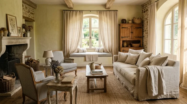
Vibe: The room is restrained — quiet luxury in the living room communicates through the quality of what is present rather than the quantity, where a single large ceramic object on a clear coffee table reads as more sophisticated than a collection of decorative objects crowding every surface.
Why it works: The quiet luxury trend is the most durable of all current styling directions because it is not a trend at all in the conventional sense — it is the application to interior design of the fashion principle that has governed couture since Coco Chanel: that genuine quality communicates itself without ornamentation, and that confident restraint is the mark of authentic design sophistication. A room styled according to quiet luxury principles invests in fewer, better objects — a single piece of genuine ceramic art rather than six mass-produced decorative objects, a solid walnut coffee table rather than a glass-and-chrome alternative, a quality linen sofa rather than a velvet sectional at the same price point — and maintains the surface clarity that allows each chosen object’s quality to be seen and appreciated.
How to get it: Apply the quiet luxury principle through subtraction first — remove 50% of the objects currently on every surface in every room and assess the result. The room that remains after this editing exercise is closer to the quiet luxury ideal than the room before the edit, because quiet luxury is primarily defined by what is removed rather than what is added. After editing, add only single pieces of genuine material quality: one large-scale artwork rather than a gallery of smaller prints, one quality ceramic rather than a collection of decorative objects, one statement lamp rather than multiple table lamps.
Quick Win: Remove everything from the coffee table and return only two objects (one tall and one flat — a single stem in a ceramic vase and a quality art book, for example). The visual transformation of the room from that single change is immediate and significant.
Shop The Look
- Natural linen sofa oat upholstered
- White oak coffee table minimal
- Single large ceramic vessel display
- Unlacquered brass floor lamp quality
- Art book display coffee table quality
Also view: 20 Contemporary Wall Art Decor Options for Modern Style
2. Warm Minimalism — The End of Cold Grey Interiors
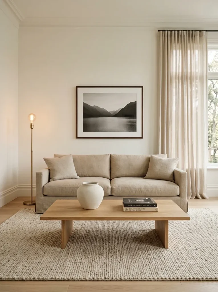
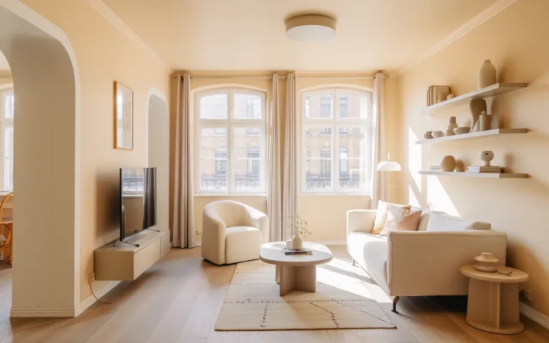
Vibe: The room is warm — warm minimalism is the correction of cold minimalism’s primary failure — the grey palette and cool materials that produced beautiful photographs but uncomfortable, unwelcoming rooms — replacing cool tones and synthetic materials with warm wood, natural linen, and warm white walls that deliver the visual calm of minimalism without its thermal coldness.
Why it works: Warm minimalism represents the design world’s collective recognition that the grey-white-chrome minimalism of 2012–2020 was visually compelling in photography but physiologically uncomfortable in daily habitation — cool-toned rooms consistently test lower on subjective comfort ratings and higher on stress markers than warm-toned rooms of equivalent material quality. The shift to warm minimalism retains the spatial intelligence of minimalism (restraint, clear surfaces, thoughtful composition) while replacing the cool material palette (grey paint, chrome fixtures, cool-white linen) with a warm material palette (warm white paint, unlacquered brass, warm-cream linen, natural jute, white oak) that is both more materially honest (natural materials in their natural warm tones) and more physiologically comfortable.
How to get it: The specific material changes that most effectively convert a cold grey interior to a warm minimalist one are: replacing cool-grey or cool-white wall paint with a warm white (a white with yellow-red undertone rather than blue or purple — Benjamin Moore White Dove or Sherwin-Williams Alabaster are the most widely recommended); replacing chrome and brushed nickel hardware with unlacquered brass or matte black equivalents; replacing synthetic upholstery with natural linen or wool; and replacing cool-blue-grey area rugs with natural jute, sisal, or warm-toned wool alternatives. These four material changes typically convert a cold grey interior to a warm minimalist one without requiring any structural changes.
Shop The Look
- Warm white interior paint yellow-red undertone
- Unlacquered brass hardware replace chrome
- Natural linen upholstery fabric warm
- Natural jute rug warm floor
- White oak furniture coordinate warm
3. Biophilic Design — Living Plants as Primary Room Elements
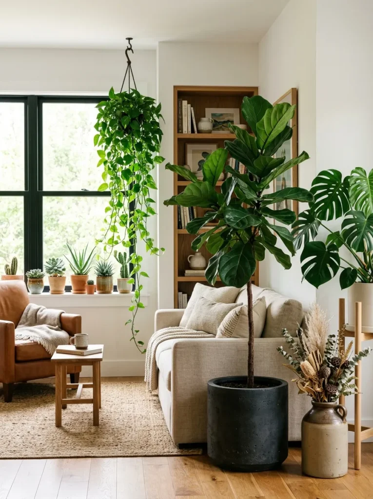
Vibe: The room is alive — biophilic design implemented with plants at three distinct height levels creates an indoor landscape that genuinely changes the room’s atmospheric quality, introducing the biological presence and organic visual complexity that manufactured objects cannot replicate.
Why it works: Biophilic design — the integration of natural elements (particularly living plants) into the built interior — is one of the most evidence-based trends in residential design because its psychological and physiological benefits are among the most consistently documented in environmental psychology research. Exposure to living plants reduces cortisol, lowers blood pressure, improves mood, and increases the subjective rating of room quality by people who have not been told the plants are present. The trend’s current cultural prominence is driven by the recognition that biophilic principles produce measurably better living environments — not just visually better rooms but physiologically better ones. The key distinction between genuine biophilic implementation and token plant placement is scale and distribution: one small plant on a windowsill is a decoration; three large plants at varied heights distributed throughout the room is a biophilic design decision.
How to get it: Implement the three-plant strategy: one large architectural plant (fiddle-leaf fig, olive tree, monstera deliciosa, or bird of paradise) at 4–6-foot height in the room’s primary visual zone, one mid-scale plant on a plant stand in the secondary visual zone, and one trailing or cascading plant at upper level (on a shelf or hanging from the ceiling) in the room’s remaining zone. All three should be positioned within a reasonable distance of natural light. The pot material should be consistent with the room’s material palette — dark concrete or warm ceramic in a minimalist or warm minimalist room, natural terracotta in a warm or Mediterranean room, black ceramic in a darker or more dramatic room.
Shop The Look
- Fiddle leaf fig tree live 5 foot
- Monstera deliciosa live large
- White oak plant stand modern
- Trailing pothos live ceiling hook
- Dark concrete floor pot large plant
4. Curved and Organic Furniture Forms
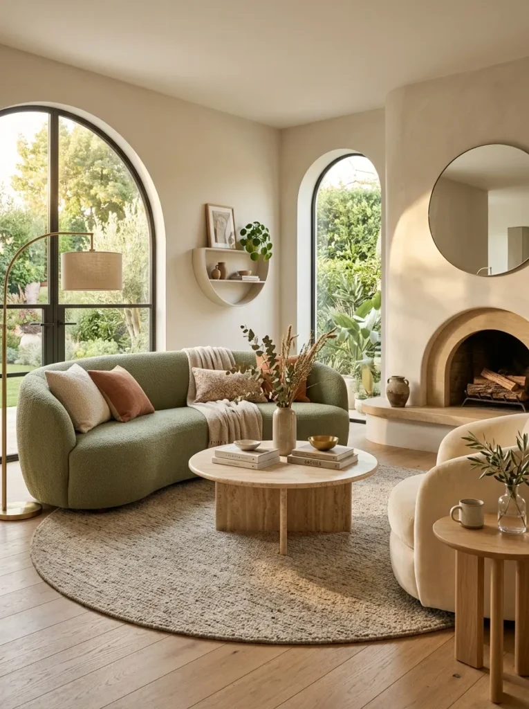
Vibe: The room is soft — curved and organic furniture forms create a visual softness and spatial fluidity that rectangular furniture cannot achieve, where the arching sofa back, the round coffee table, and the curved armchair together create a room that feels genuinely welcoming at the compositional level.
Why it works: The curved furniture trend represents a genuine psychological and compositional correction to the decade-long dominance of rectangular, angular furniture — specifically the recognition that right angles, while spatially efficient and compositionally clear, create environments that the nervous system reads as more alert and less relaxed than environments with curved forms. This is not merely aesthetic preference — research in environmental psychology consistently shows that spaces with curved forms produce lower arousal states (more relaxed, less vigilant) than geometrically equivalent spaces with angular forms. The curved sofa specifically is the most impactful single curved furniture piece in a living room because the sofa’s arching back profile creates the room’s largest curved line, softening the room’s composition at its most prominent piece.
How to get it: The most impactful single curved addition to any room is the sofa — a curved or arching-back sofa in a quality upholstery material (boucle, velvet, or linen) transforms the room’s compositional character more dramatically than any other single furniture change. The round coffee table is the second most impactful — round tables are spatially more efficient than rectangular in many configurations (no sharp corners to navigate) and compositionally more interesting in their relationship to a curved sofa. Round and oval area rugs complete the curved composition at floor level.
Shop The Look
- Curved sofa arching back boucle sage
- Round coffee table travertine stone
- Curved armchair cream velvet
- Round side table white oak
- Round area rug warm neutral
5. Japandi — The Synthesis of Japanese and Scandinavian Design
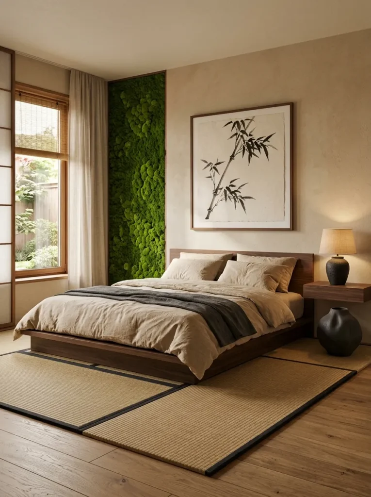
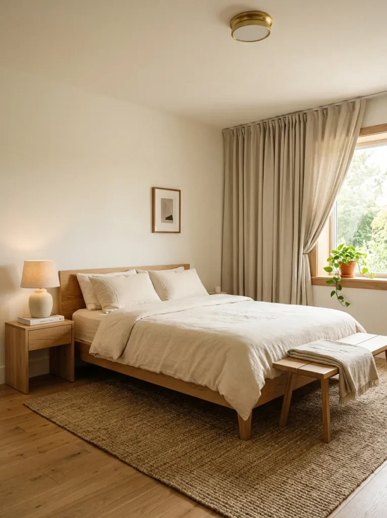
Vibe: The room is contemplative — Japandi design in the bedroom creates the specific quality of a space designed for genuine rest and reflection, where the dark walnut furniture, the restrained single ceramic object, the warm oat linen, and the botanical print create a room that feels simultaneously aesthetically sophisticated and genuinely restorative.
Why it works: Japandi is not merely a combination of Japanese and Scandinavian aesthetics — it is the synthesis of their shared core principle: that objects of genuine material quality in simple, honest forms create more satisfying environments than complex, decorated objects regardless of budget. The Japanese wabi-sabi tradition (finding beauty in natural imperfection, transience, and incompleteness) and the Scandinavian hygge tradition (creating environments of warmth, comfort, and social ease) share the recognition that material quality and simplicity create more livable rooms than decoration and complexity. Japandi specifically synthesizes these by combining the Japanese preference for dark, contrasting materials and compositional asymmetry with the Scandinavian preference for warm, natural materials and hygge comfort.
How to get it: The three material decisions that most effectively achieve a Japandi aesthetic: a low-profile platform bed in dark walnut or matte black (the Japanese platform height preference combined with Scandinavian natural wood material); natural linen bedding in warm oat or warm cream (Scandinavian textile warmth in a Japanese palette of natural undyed fiber); and one dark ceramic or stone object of genuine sculptural quality as the sole decorative element in the room (the Japanese wabi-sabi single-object principle expressed through a material that the Scandinavian tradition also prizes). The Japandi bedroom contains no superfluous objects — every element is either functional (the bed, the lamp, the bedding) or a single, deliberate aesthetic statement.
Shop The Look
- Low platform bed dark walnut minimal
- Warm oat linen bedding organic
- Dark ceramic sculptural object floor
- Wall mount bedside shelf dark walnut
- Japanese botanical print wall art
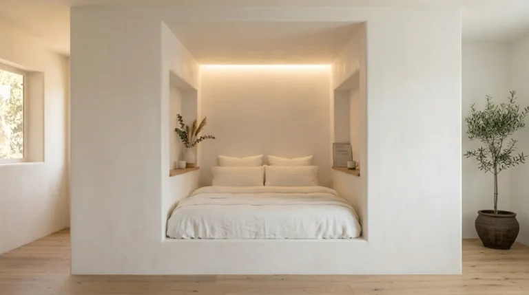
6. Limewash and Plaster Wall Textures
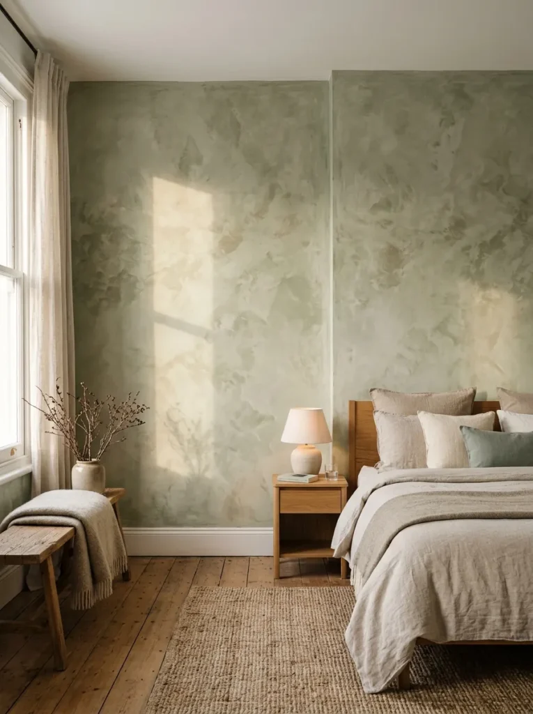
Vibe: The wall is textural — a limewash feature wall creates a surface of organic color depth and material warmth that reads as a primary room design element in its own right, eliminating the need for art or decoration on the wall while providing more visual interest than any flat-painted surface could offer.
Why it works: Limewash and Roman clay plaster wall textures are among the most enduring trends in contemporary home styling because they address the flat-painted wall’s fundamental limitation — it is the same color at every point of its surface, which means it provides zero visual interest at close range and only color information at distance. A limewash or plaster wall has visible material depth (the surface that the lime or clay creates has genuine micro-relief) and tonal variation (the application technique creates areas of slightly different tone within the same overall color) that reward close inspection and change in character under different light conditions. Morning light on a limewash wall reads differently from afternoon light and differently again from warm evening artificial light — the wall is a living material element that evolves through the day rather than a static painted surface.
How to get it: Portola Paints Classico Limewash and Romabio Classico Limewash are the most widely available quality limewash products for residential application. Roman clay from Portola Paints and American Clay’s Earth Plaster are the most widely available clay plaster alternatives. All four products can be applied DIY with a wide natural bristle brush in a cross-hatching motion ($60–$120 in material for a standard bedroom feature wall). Professional application ($4–$10 per square foot in labor) provides more consistent results on large or complex wall surfaces. The feature wall approach (one wall in texture, remaining walls in smooth warm white) is the most widely accessible entry point.
Shop The Look
- Limewash paint Portola Classico dusty sage
- Roman clay plaster warm greige
- Natural bristle brush wide limewash
- Romabio lime wash interior set
- Limewash color sample warm tone
7. Statement Ceilings as the Fifth Wall
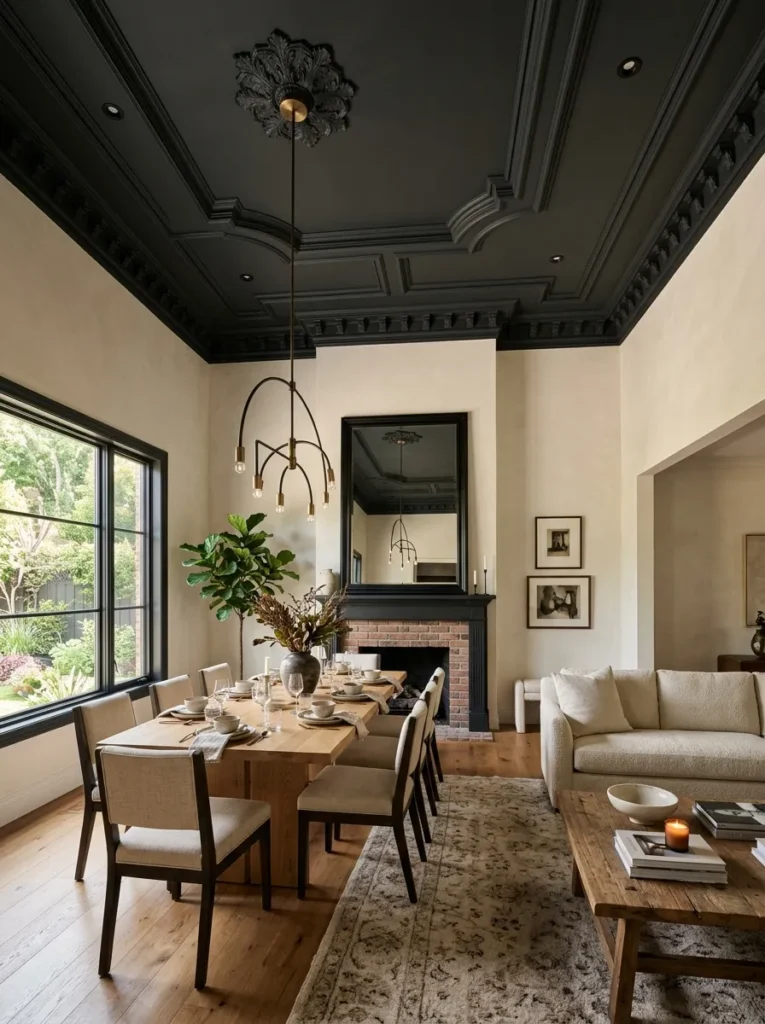
Vibe: The ceiling is active — a statement ceiling treated with paint, wood paneling, or architectural detail transforms the room’s upper plane from a blank white backdrop into an active design element, creating an enclosed, architectural quality that standard white ceilings cannot approach.
Why it works: The “fifth wall” concept — treating the ceiling as a designed surface rather than as a blank functional overhead — is the styling intervention that most changes a room’s perceived proportion and atmosphere for the investment required. A ceiling painted in a deep tone (continuing the wall color to the ceiling or using a separate deep tone on the ceiling alone) creates an enclosing, intimate quality that makes a room feel deliberately proportioned rather than defined by accident. A ceiling with wood plank paneling (simple 1×6-inch shiplap or tongue-and-groove in natural white oak) creates warmth overhead that the room reads as architectural luxury rather than decorative addition. The practical case: ceilings are typically the room’s largest single painted surface and the least expensive surface to apply material to (no furniture to move, no baseboard to cut around) — making statement ceilings one of the highest-impact and most cost-effective room transformations available.
How to get it: The three most accessible statement ceiling approaches, in order of cost and complexity: ceiling painted in the same deep tone as the walls (the simplest — one can of the existing wall paint, applied overhead for $0 additional material cost if you already have the wall paint); ceiling painted in a contrasting deep tone (deep forest green, warm charcoal, or rich navy, $25–$50 in ceiling paint); and ceiling with tongue-and-groove or shiplap wood paneling ($2–$5 per square foot in materials, plus installation labor for a professional installation). All three approaches are reversible with repainting if the result is not as intended.
Shop The Look
- Deep forest green ceiling paint flat
- Warm charcoal ceiling paint matte
- Tongue and groove ceiling plank white oak
- Shiplap ceiling panel installation
- Ceiling paint roller extension pole
8. Vintage and Antique Integration in Contemporary Rooms
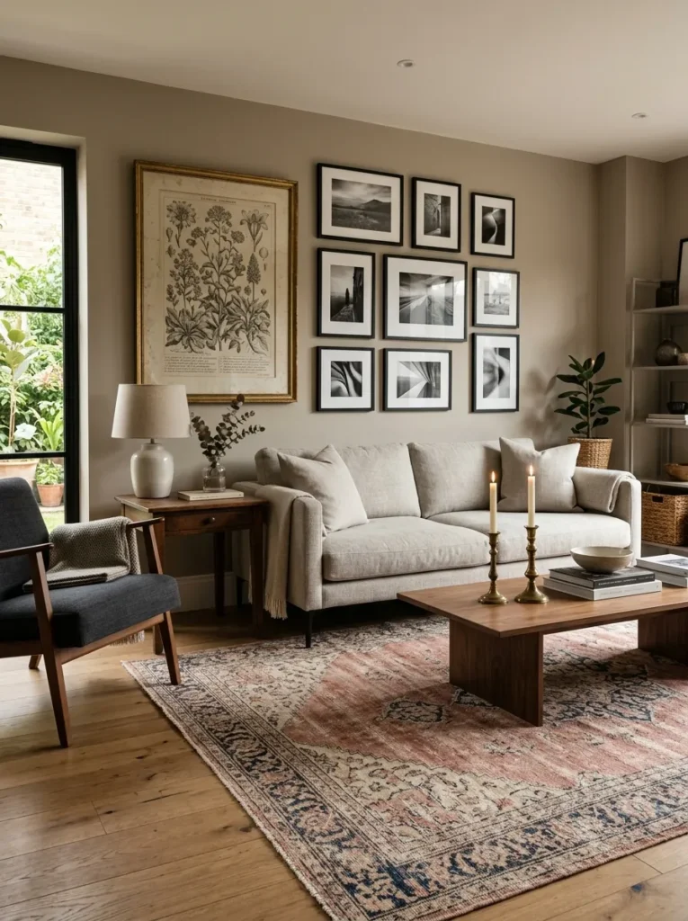
Vibe: The room is collected — the integration of vintage and antique pieces within a contemporary room creates the quality of a space assembled with genuine taste and time, where the aged patina of a vintage rug and the tarnished brass of antique candlesticks communicate ownership and accumulated care in a way that exclusively new rooms cannot.
Why it works: The vintage integration trend is gaining momentum because it represents the most direct available correction to the interchangeable, catalog-assembled quality of rooms furnished exclusively from contemporary retailers. A room where everything was purchased from the same retailer in the same season communicates consumption rather than ownership — it has no accumulated character, no material history, no evidence of genuine individual taste operating over time. A room where contemporary furniture is mixed with a vintage rug, an antique mirror, and inherited ceramics communicates a more authentic kind of personal style — the specific combination of objects in that specific room exists nowhere else and could not be replicated by anyone who had not made exactly those discoveries at exactly those places and times.
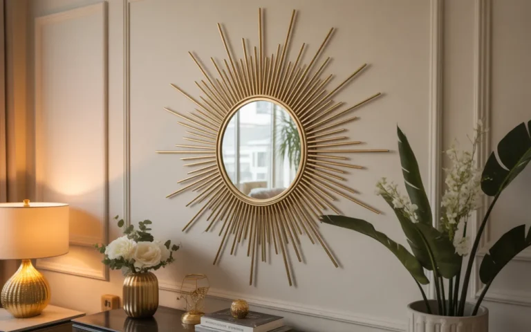
How to get it: The most effective vintage integration strategy for contemporary rooms is the graduated approach — begin with one or two vintage or antique elements that work within the room’s existing contemporary palette, assess the result, and add subsequently. The three vintage elements with the highest impact in contemporary rooms are: a faded vintage rug (which warms and deepens the room’s floor level without introducing any visual complexity that competes with contemporary furniture), antique brass or silver objects on the coffee table or mantel (which add the warm metallic patina that new production cannot replicate), and one antique or vintage framed print or painting integrated into an otherwise contemporary gallery wall.
Shop The Look
- Vintage Persian rug faded neutral
- Antique brass candlestick pair thrift
- Aged gilt frame vintage print art
- Vintage wood side table patina
- Antique ceramic vessel display
9. Sustainable and Natural Material Focus
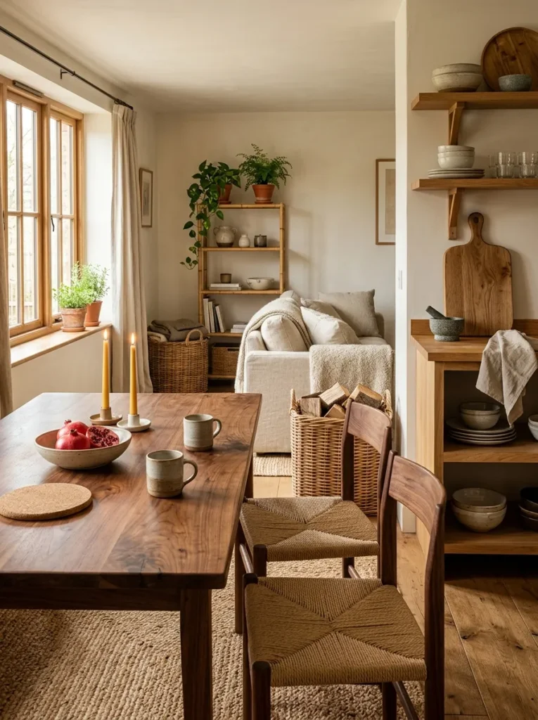
Vibe: The room is authentic — a commitment to genuine natural materials throughout a room creates the specific quality of material honesty that mass-produced synthetic alternatives cannot approach, where every surface and every object communicates its genuine origin through visible grain, natural variation, and the warmth of organic material.
Why it works: The sustainable natural material trend is the most values-driven of all current styling directions — it represents the intersection of environmental consciousness (natural materials have dramatically lower embodied carbon than most synthetic alternatives), aesthetic preference (natural materials improve with age and use in ways that synthetics do not), and the post-pandemic shift toward genuinely livable homes (natural materials create warmer, more tactilely pleasant environments than synthetic ones). The material honesty principle at the core of this trend — using materials that are what they appear to be, rather than materials that simulate something else — also produces the most beautiful interiors over time, because natural materials develop character and patina while synthetic simulations merely age.
How to get it: Apply the natural material principle as a replacement protocol — when any existing household item requires replacement, replace it with a natural material equivalent rather than a synthetic one. Plastic cutting board replaced with end-grain wood; acrylic throw replaced with wool or cashmere; synthetic rug replaced with jute or wool; paraffin candles replaced with beeswax; resin decorative objects replaced with ceramic or stone. The cumulative effect of this replacement protocol over 12–24 months produces a room with dramatically improved material quality at a total cost comparable to purchasing the synthetic alternatives.
Shop The Look
- Solid wood cutting board end grain
- Wool throw natural fiber quality
- Natural jute rug sustainable floor
- Beeswax candle natural unscented
- Ceramic vessel sustainable natural
10. Dark and Moody Color in Unexpected Rooms
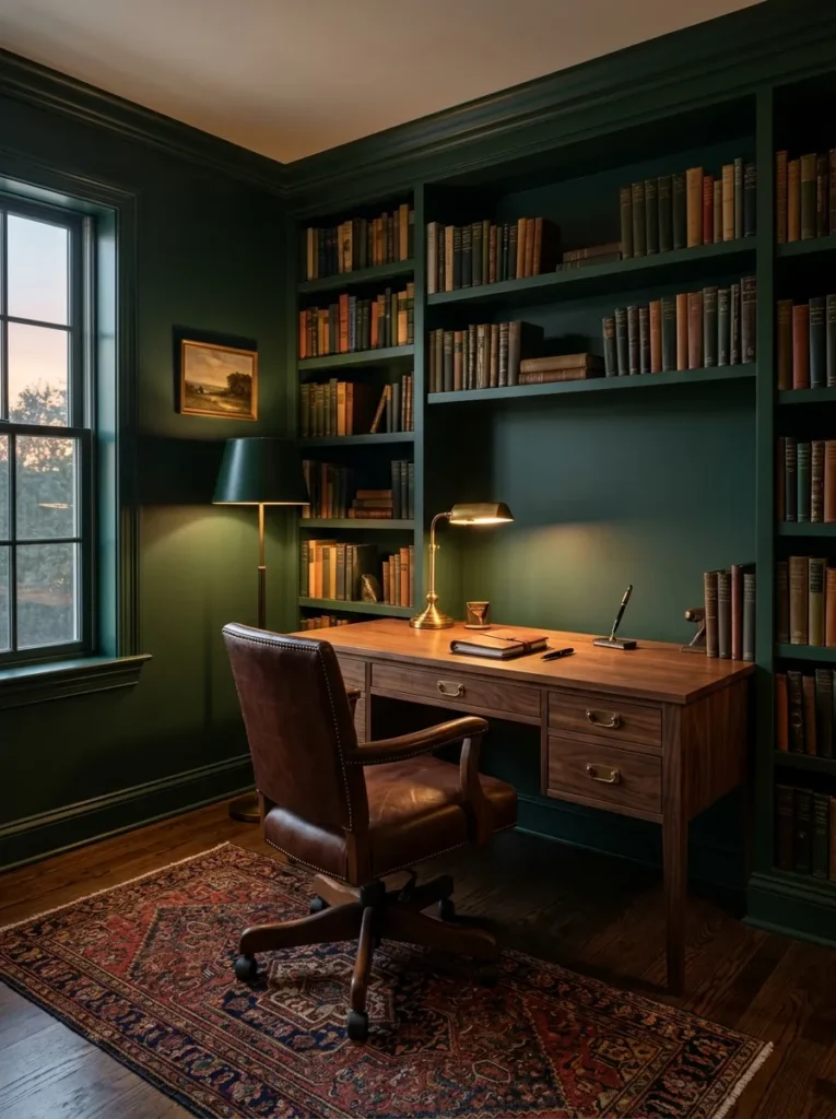
Vibe: The room is intimate — deep color in an unexpected room (a bathroom that is typically white, a home office that is typically neutral) creates the specific intimacy of a space that has been deliberately designed for focused experience rather than functional adequacy — the dark walls make the room feel private, considered, and genuinely its own world.
Why it works: The dark and moody color trend represents a specific design intelligence — the recognition that different rooms have different experiential requirements, and that some rooms (the home office where sustained concentration is the goal, the bathroom where private ritual is the function, the dining room where evening gathering is the primary use) benefit from the focused, intimate atmosphere that dark walls create rather than the open, bright atmosphere that most rooms receive by default. Dark walls in the specific rooms where intimacy and focused experience are the primary design goals is not a bold trend choice but a functionally intelligent one — the dark home office really does support better focus (reduced peripheral visual distraction), and the dark jewel-box bathroom really does create a more genuinely luxurious bathing experience than the standard white tile alternative.
How to get it: Choose the room where the dark color will be most functionally beneficial — the home office (where focused work benefits from reduced visual distraction), the dining room (where evening entertaining benefits from candlelit atmosphere), or the bathroom (where private ritual benefits from jewel-box enclosure). Select a warm dark tone (forest green, warm charcoal, or deep navy with warm undertone — avoid cool-toned darks that create coldness rather than warmth). Apply in flat or matte finish — any sheen on a dark wall creates reflections that disrupt the atmospheric quality. Pair exclusively with warm light sources and warm material furniture.
Shop The Look
- Deep forest green paint matte flat
- Deep navy warm interior paint
- Warm walnut desk dark room
- Unlacquered brass fixture dark room
- Warm charcoal paint unexpected room
11. Maximalist Shelf Styling and Object Display
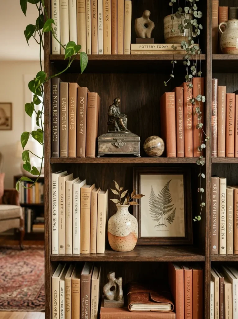
Vibe: The shelf is rich — sophisticated maximalist shelf styling creates the most personally revealing room element available, where the specific combination of books, ceramics, plants, and curated objects tells the story of the inhabitant’s intellectual and aesthetic life in a way that no single-category display can approach.
Why it works: The maximalist shelf styling trend represents the pendulum’s healthy swing away from the empty-shelf minimalism that produced beautiful Instagram photographs but cold, impersonal rooms where the shelving existed as a design element rather than as a record of genuine inhabitation. Sophisticated maximalism differs from mere clutter through its organizational intelligence — books organized by color family (not alphabetically, not by subject, but by the warm or cool tonal register of their spines), objects grouped by material or visual weight rather than by category, plants providing organic relief at irregular intervals, and strategic empty spaces (20–30% of shelf area) providing breathing room that allows each grouping to read as intentional rather than as an overflow of possessions.
How to get it: Begin with the books — remove all book jackets (the underlying hardcovers are almost always more beautiful than the commercial jacket) and organize by spine color in a warm color palette progression (cream to tan to warm brown to terracotta to deep burgundy, for example). Place one ceramic or sculptural object per shelf at irregular intervals — not every shelf, not centered, but at the compositional positions that create visual rhythm across the full bookshelf. Add one trailing plant per every other shelf at alternating positions (left side of one shelf, right side of the next) for organic relief. Group three or four small objects (different materials, different heights) into one deliberate still-life on one shelf.
Shop The Look
- Book collection warm spine organization
- Ceramic vessel small shelf display
- Trailing pothos plant shelf display
- Sculptural object natural stone bronze
- Tarnished silver box display object
12. Outdoor Living Integration — Extending Home Style Outside
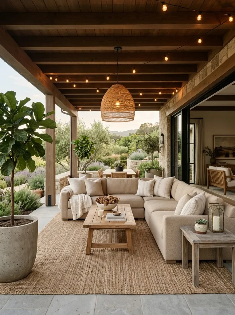
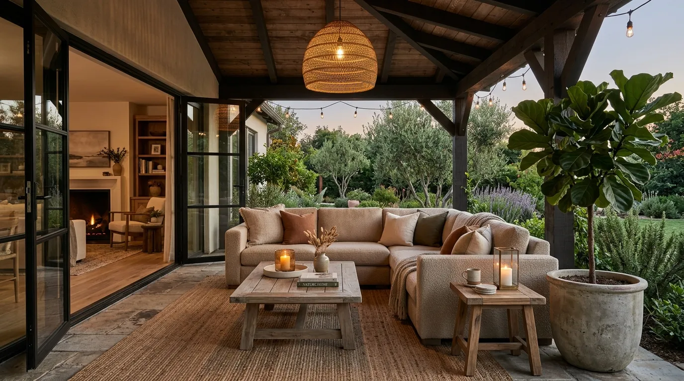
Vibe: The outdoor space is seamless — a covered outdoor living area styled with the same design intelligence as the interior living room creates a genuine room extension that dramatically expands the home’s effective living area while maintaining the material quality and compositional intelligence of the indoor spaces it connects to.
Why it works: The indoor-outdoor integration trend represents the recognition that the quality difference between indoor and outdoor furniture, textiles, and lighting has been dramatically reduced by material technology advances — performance fabrics (that resist UV, moisture, and staining while looking and feeling like quality linen or boucle), weather-resistant natural teak and concrete furniture, and outdoor-rated LED lighting systems now allow outdoor spaces to be styled with the same quality materials and compositional intelligence as indoor rooms. The trend is specifically relevant in covered or partially covered outdoor spaces (patios, pergolas, covered terraces) where the material requirements are less extreme than in fully exposed areas. An outdoor space styled to this standard adds genuinely usable square footage to the home for 6–8 months of the year in most climates.
How to get it: Apply the same compositional intelligence to the outdoor space as to the indoor rooms: one quality outdoor sofa in a performance fabric (Sunbrella or similar, available from outdoor furniture specialists), one weather-resistant natural material coffee table (teak, stone, or concrete), one outdoor-rated natural fiber rug or weather-resistant rug, one quality outdoor pendant or string lighting system, and one substantial outdoor plant. The outdoor space should have the same maximum-three-objects-per-surface discipline as the indoor spaces — the outdoor coffee table should have one candle lantern and one small plant, not a collection of accumulated outdoor accessories.
Shop The Look
- Performance fabric outdoor sofa oat
- Teak outdoor coffee table weathered
- Outdoor area rug weather resistant
- Rattan outdoor pendant light
- Large outdoor plant ceramic pot
13. Kitchen Open Shelving with Curated Display
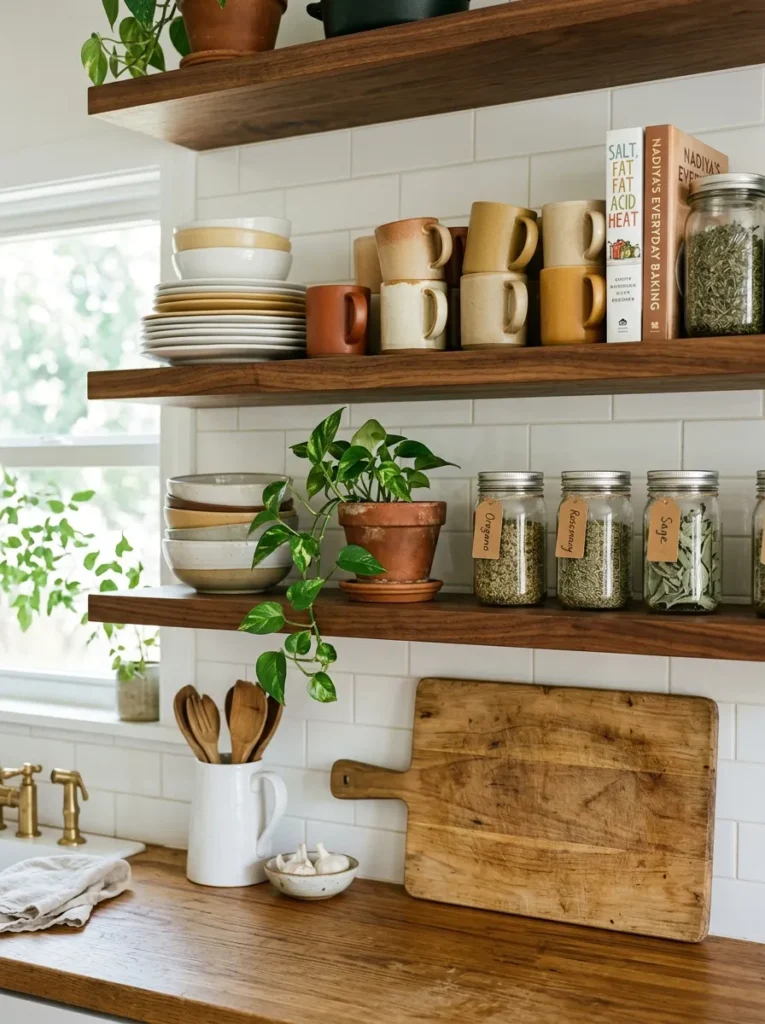
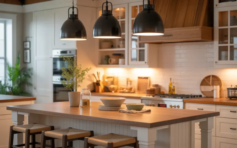
Vibe: The kitchen is functional and beautiful — curated open kitchen shelving that displays genuinely used kitchen objects with compositional intelligence creates the specific quality of a kitchen where beauty and function are inseparable — the ceramic plates are beautiful because they are stacked in order and they are used daily.
Why it works: Open kitchen shelving replaces the closed upper cabinet’s functional limitation (the contents are hidden and therefore the space reads as closed and compressing) with a display opportunity that simultaneously stores kitchen essentials and communicates the kitchen’s material quality and the household’s aesthetic sensibility. The trend’s cultural momentum comes from the recognition that the kitchen objects most households own — quality ceramics, good glassware, wooden boards, quality cookbooks — are genuinely beautiful and deserve display rather than concealment. The curation challenge is the key skill: open shelving that displays too many objects, or objects without compositional organization, reads as clutter; open shelving with precisely chosen objects in a deliberately organized composition reads as the most beautiful kitchen element available.
How to get it: Replace the most visible pair of upper kitchen cabinets (typically the cabinets flanking the range hood, which are the most visible from the kitchen’s entry) with two floating shelves in the same material as the kitchen’s countertop edge or cabinetry. Apply the curation discipline: each shelf gets a maximum of one collection (stacked plates, arranged mugs) plus one or two individual objects (a plant, a cookbook, a wooden board). The collection must be genuinely organized (mugs with handles facing the same direction, plates in descending size order) for the display to read as curated rather than merely stored without doors.
Shop The Look
- White ceramic dinner plate stack display
- Ceramic mug set warm tones varied
- Floating shelf kitchen natural wood
- Quality cookbook warm spine display
- Small terracotta pot kitchen herb
14. Personalized Art and Print Collections
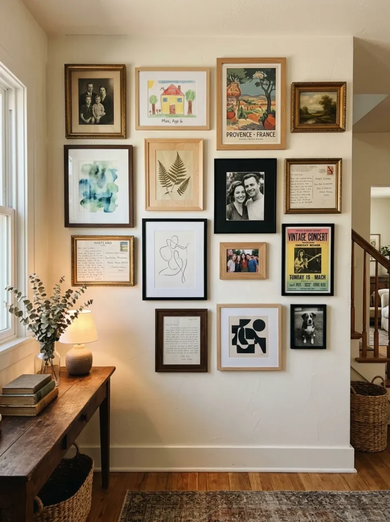
Vibe: The gallery is personal — a gallery wall that mixes personal photographs, children’s art, vintage prints, and quality artwork in varied frames creates the most genuinely individualized room element available — a display that could belong to only this specific household and no other, communicating genuine life history rather than generic aesthetic preference.
Why it works: The personalized art trend represents the most direct available response to the decade of social-media-optimized gallery walls — the perfectly curated, matching-framed, all-botanical-print or all-black-and-white gallery walls that look beautiful in photographs but communicate nothing about the person who lives in the room. A genuinely personal gallery wall — one that includes a child’s drawing alongside a quality print, a family photograph alongside a vintage poster, a handwritten letter alongside a pressed botanical — communicates authentic inhabitation and genuine emotional investment in the room’s contents. This authenticity is the specific quality that the quiet luxury, warm minimalism, and vintage integration trends are all reaching toward in their different ways: the evidence that this room belongs to a specific person with specific relationships, memories, and aesthetic sensibilities.
How to get it: Assemble the gallery from genuinely meaningful objects first — family photographs, children’s artwork, inherited prints, postcards from significant travels, reproductions of artworks with personal significance — and purchase quality prints to fill compositional gaps in the arrangement rather than beginning with purchased prints and adding personal elements. Frame personal photographs at the same quality level as purchased art prints — a well-framed family photograph reads as art; the same photograph in a clip frame reads as a snapshot. Use three frame materials maximum (matte black, natural wood, and one warm metallic — antique gold or brass) for visual cohesion within the variety.
Shop The Look
- Matte black frame set gallery varied
- Natural wood frame gallery set
- Antique gold frame small medium
- Family photograph black white print
- Gallery planning template floor layout
How to Apply These Trends Selectively and Intelligently
The single most important principle in applying home styling trends is selectivity — not every trend is appropriate for every room, and attempting to implement all 14 trends in a single room produces visual confusion rather than design sophistication. Each room has a primary design requirement (the bedroom’s primary requirement is rest support; the kitchen’s primary requirement is functional efficiency; the home office’s primary requirement is focused work) and the trends worth applying are those that serve that primary requirement rather than competing with it. The Japandi trend’s dark, contemplative aesthetic serves the bedroom beautifully and serves the kitchen poorly. The maximalist shelf styling trend serves the living room and home office beautifully and serves the bathroom poorly. Matching trend to room function is the first filtering step before any specific styling decisions are made.
The most common home styling mistake in trend implementation is applying a trend visually without understanding the design intelligence behind it — reproducing the look of the trend without the reasoning that makes the look work. Quiet luxury implemented without genuine quality in the chosen objects produces not quiet luxury but empty minimalism. Biophilic design implemented with a single small succulent rather than multiple genuine plants at varied heights produces not biophilia but a token gesture. Vintage integration using reproduction vintage-look objects rather than genuine aged pieces produces not authentic collected character but a staged period aesthetic. In every case, understanding why the trend works is what allows the correct implementation — the objects, materials, and compositions that actually produce the intended effect rather than its superficial appearance.
Three cross-room styling improvements that implement multiple trends simultaneously with a single set of decisions: replace all light bulbs in the home with warm 2700K LED versions ($20–$40 for all rooms) which simultaneously advances the warm minimalism trend (warmer light), the quiet luxury trend (more flattering light for both rooms and people), and the Japandi trend (candlelight-adjacent warmth appropriate to the contemplative aesthetic); add one large indoor plant to each primary room ($60–$150 for large specimens) which simultaneously advances the biophilic trend, the natural material trend, and the warm minimalism trend; and clear all surfaces to a maximum of three objects each ($0 — through subtraction) which simultaneously advances the quiet luxury trend, the warm minimalism trend, and the Japandi trend.
A complete home styling transformation implementing all 14 trends selectively and appropriately across all rooms is not a one-weekend project but a 6–12-month intentional evolution of the home’s material character — adding, editing, and replacing as budget allows, always in service of the specific room’s specific function and the household’s genuine aesthetic direction. The most important single tool in this process is the edit — the ongoing discipline of removing objects that no longer serve the room’s function or composition, because the edit is what creates the space for each subsequent quality addition to have its full impact.
Frequently Asked Questions About Modern Home Styling Trends
Which of these 14 trends has the most impact for the least cost?
Warm minimalism — specifically the combination of removing 50% of objects from every surface, replacing cool-white light bulbs with warm 2700K equivalents, and adding one large indoor plant to the primary living area — produces the most dramatic cross-room impact for the lowest total cost ($20–$80 in bulbs and one plant purchase). The subtraction component costs nothing and is responsible for approximately 60% of the visual improvement, because the most common home styling problem is not insufficient quality in the existing objects but insufficient visual space around them. Warm 2700K light makes every existing object and surface appear warmer and more material-rich. The large plant introduces the scale of biophilic element that genuinely transforms the room’s atmospheric quality. Together, these three changes implement three distinct trends (warm minimalism, quiet luxury, biophilic design) at a cost under $100 for most households.
How do I prevent my home from looking trend-follower rather than genuinely designed?
The distinction between a trend-follower’s home and a genuinely designed home is the evidence of personal authenticity — objects, art, and textiles that clearly belong to a specific person with specific relationships and specific aesthetic development rather than objects that communicate consumption from current trend-appropriate sources. The specific practices that create genuine design rather than trend following are: incorporating vintage and antique pieces that were acquired over time rather than purchased simultaneously as a trend-following exercise; displaying personally meaningful art and objects alongside quality prints and ceramics; using natural materials in their actual natural colors rather than trend-appropriate colorways; and maintaining the quiet luxury principle of keeping only objects that are genuinely meaningful rather than objects that are trend-appropriate.
How long will these trends remain relevant?
The 14 trends in this article have been selected specifically because they represent genuine design intelligence rather than purely cultural fashion — each one makes rooms more livable, more material-honest, or more compositionally sophisticated, which means each one will produce better rooms regardless of the cultural moment. Quiet luxury, warm minimalism, biophilic design, natural materials, and Japandi aesthetics are all expressions of design principles that have produced excellent rooms for decades and will continue to do so. The trends most likely to feel dated in 5–7 years are those most dependent on specific formal vocabulary (curved furniture forms, specific limewash color choices, specific maximalist shelf styling approaches) while the trends most likely to remain permanently relevant are those based on material principle (natural materials, genuine quality, personal authenticity, biophilic integration).
Can I mix multiple trends in a single room?
Yes — the most sophisticated contemporary rooms typically draw from three or four trends simultaneously, with the selection of trends guided by the room’s specific function and the household’s aesthetic direction. The most naturally compatible trend combinations are: quiet luxury plus warm minimalism plus vintage integration (all three emphasize material quality and compositional restraint); Japandi plus biophilic design plus natural material focus (all three emphasize natural materials and organic presence); maximalist shelf styling plus personalized art plus vintage integration (all three emphasize accumulated personal aesthetic history). The combinations to approach more carefully are those where the trends’ visual registers conflict — for example, maximalist shelf styling and quiet luxury have directly opposed approaches to object quantity, so implementing both simultaneously in the same room requires very precise calibration.
What room should I start with when implementing these trends?
Start with the room you spend the most time in — for most households, this is the living room or the primary bedroom. The living room benefits most from the quiet luxury, warm minimalism, biophilic design, curved furniture, and vintage integration trends. The bedroom benefits most from warm minimalism, Japandi, natural material focus, and statement ceiling trends. The kitchen benefits most from the open shelving curation, natural material, and sustainable material trends. The home office benefits most from the dark and moody color, Japandi, and personalized art trends. Beginning with the room where the improvement will have the most daily impact — the room you enter most frequently and spend the most waking hours in — ensures that the investment of time, attention, and budget produces the maximum daily return in your actual quality of life.
Ready to Style Your Home with Modern Intelligence?
These 14 trends cover the full spectrum of what the current moment’s most sophisticated home design thinking offers — from the material confidence of quiet luxury and the thermal warmth of the warm minimalism correction, to the biological richness of biophilic design and the formal softness of curved furniture, from the philosophical synthesis of Japandi and the material depth of limewash plaster walls, to the atmospheric drama of dark moody color and the accumulated authenticity of vintage integration, from the values clarity of sustainable natural materials to the personal depth of genuine art collections assembled over time. You do not need all 14 — you need the three or four that most directly improve your specific rooms’ specific functions and most authentically reflect your specific aesthetic direction. Start with the edit: clear every surface, keep only what is genuinely meaningful or genuinely beautiful, and sit with the resulting rooms for a week before adding anything back. What you see in that week — what the room needs, what it is asking for — will tell you exactly which trends are worth implementing and in which rooms. Pin the ideas that named what your home is already reaching toward — those are the ones worth following first.