15 Luxury Interior Decor Ideas for Every Room
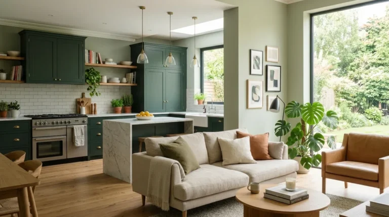
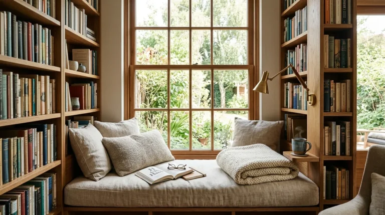
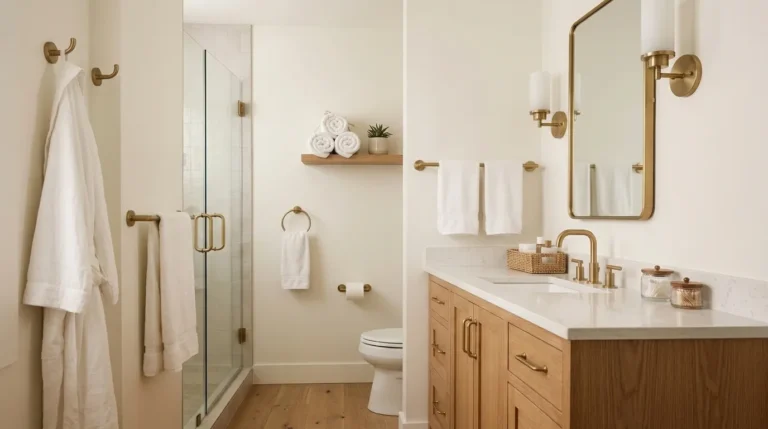
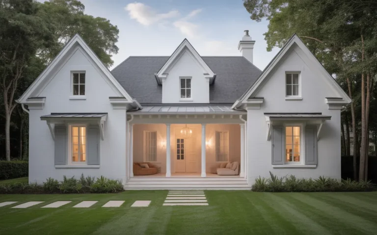
Luxury interior decor refers to the design approach that prioritizes material quality, considered proportion, sensory richness, and the specific quality of spaces that have been thought about carefully rather than furnished quickly — producing rooms that feel genuinely generous, warm, and visually satisfying regardless of whether the investment behind them was $500 or $50,000. This article gives you 15 luxury interior decor ideas that work across every room in the home — from the entry hall to the primary bedroom — and across every budget level, because genuine luxury is a design quality achievable through intention and material intelligence rather than through spending alone.
Picture a home where every room has a quality that is difficult to name but immediately felt — where the light seems to come from the right places, where the surfaces carry visual weight and textural interest rather than flat finish, where the furniture sits in the right relationship to the space around it, and where the whole environment produces a specific feeling of ease, warmth, and considered order. That is what luxury interior design at its best achieves — not the display of expense but the evidence of thought. Here are 15 ideas worth saving — and stealing.
Why Luxury Interior Decor Works So Well
Luxury interior decor succeeds as a design approach because it operates from principles of design quality that are independent of cost — proportion, material honesty, light quality, textural layering, and the specific relationship between furniture scale and room scale — and these principles produce genuinely superior spatial experiences when applied correctly regardless of the price of the individual components. The design philosophy draws from the great European interior design traditions — the French classical apartment, the English country house, the Italian palazzo — which share the insight that luxury in a room is produced by the relationship between elements rather than by the individual cost of any element. A room with correctly proportioned furniture, warm light, and one genuinely beautiful material is more luxurious than a room full of expensive objects in the wrong proportions under the wrong light.
The materials that define genuinely luxurious interior spaces are those with inherent depth — materials that reveal more about themselves under sustained looking than they do in a glance: hand-knotted wool rugs whose pile depth changes with viewing angle, unlacquered brass hardware whose patina develops uniquely with use, natural linen whose woven irregularity is visible up close, honed marble whose veining is different at every point, hand-thrown ceramic whose making marks are legible to any observer who holds the piece, aged timber whose grain and surface history tell a specific material story. These materials share the quality of authenticity — they are visibly what they are, and their age and use improve rather than diminish them.
The luxury interior decor movement in contemporary residential design has evolved significantly from its earlier association with ornate, expensive, and formal spaces toward a more considered, quieter, and material-focused aesthetic that prioritizes warmth and authenticity over ostentation. The most admired contemporary luxury interiors — those that generate the strongest engagement across design publications and social platforms — share a quality of deliberate restraint: rooms where the budget has been concentrated in a few genuinely excellent materials rather than distributed across many mediocre ones, and where the styling reflects subtraction rather than addition.
Even the most modest residential budget can achieve genuine luxury in specific rooms or specific moments within rooms by applying the principles of material concentration and design restraint — choosing one excellent rug, one quality lighting fixture, or one genuinely good upholstered piece and building the room’s design language from that anchor investment rather than purchasing many lesser alternatives.
Style at a Glance
| Element | Trait 1 | Trait 2 |
|---|---|---|
| Philosophy | Material quality over material quantity — one excellent piece over many mediocre ones | Considered proportion and light as the foundation from which all other decisions follow |
| Materials | Hand-knotted wool rug, unlacquered brass, natural linen, honed marble, aged timber, hand-thrown ceramic | Mohair velvet, cashmere throw, lacquered wall panels, hand-blocked wallpaper, silk drapery |
| Color Palette | Warm stone white, deep charcoal, warm cream, aged brass, forest green, dusty plum | Terracotta, warm caramel, deep navy, sage green, oxblood, natural linen undyed |
1. Entry Hall with Dramatic Wallpaper and Console Table
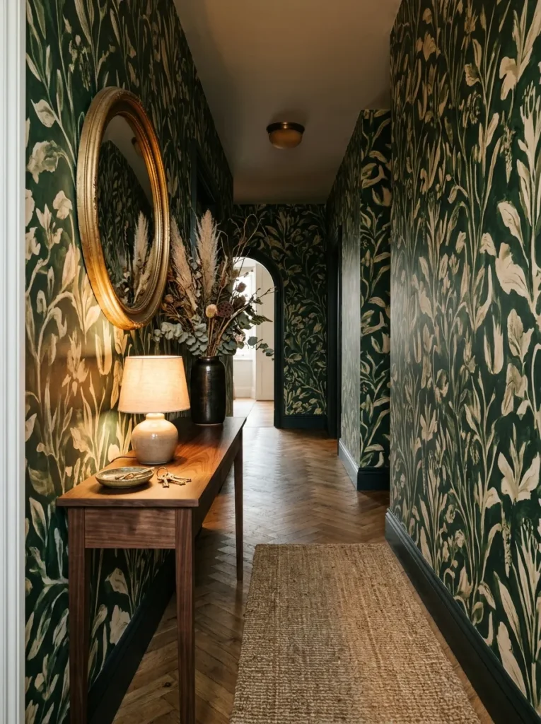
Vibe: Dramatic and welcoming — the entry hall that makes every arrival feel like an occasion.
Why it works: A dramatically wallpapered entry hall applies the design principle of entry impact as room quality predictor — the entry hall is the first room experienced by every person who enters the home, and its design quality sets the expectation for every subsequent room. A full-height botanical wallpaper in a large, painterly scale creates immediate visual complexity and warmth that the alternative (painted walls) cannot achieve in the same space because pattern provides the eye with sustained engagement — there is always more to see in a patterned surface than a plain one. The slim console table, convex mirror, and single lamp composition against the wallpapered wall creates the classic entry hall vignette that has defined luxury residential entry design across centuries of interior design tradition.
How to get it: Source hand-blocked or digitally printed large-scale wallpaper from independent wallpaper designers rather than mass-market retailers — the scale and painterly quality of the pattern is the specific element that reads as luxury, and mass-market botanical prints typically use too-small pattern scales and too-saturated color ranges that read as wallcovering rather than art. Install floor to ceiling without a dado rail or chair rail break — the uninterrupted full-height wallpaper coverage is what creates the enveloping, dramatic quality. Pair with a slim console table (maximum 35cm depth for hallway comfort) in a dark wood finish that relates to the wallpaper’s darkest tones.
| Product |
|---|
| Large-scale botanical wallpaper deep green |
| Slim dark walnut console table hall |
| Convex mirror aged gold frame |
| Ceramic table lamp warm base |
| Dried botanical arrangement dark ceramic |
Also view: 15 Adult Craft Night Ideas for a Fun Weekend
2. Living Room with Layered Rugs and Deep Upholstery
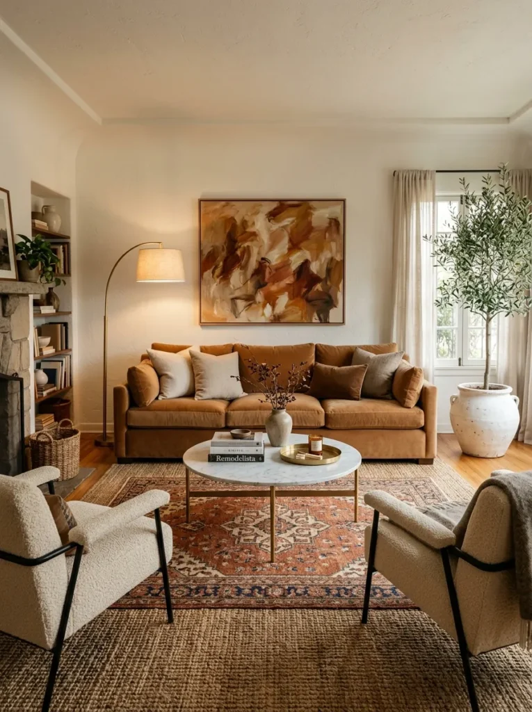
Vibe: Warm and generous — the living room that makes sitting down feel like a full-body decision to stay.
Why it works: A layered rug composition beneath deep, feather-filled upholstery applies the design principle of tactile layering as perceived luxury — the quality that most distinguishes genuinely luxurious rooms from well-furnished ones is the depth of textile layering at floor level and seating level. A hand-knotted wool rug layered over a natural fiber base rug creates a visual and tactile floor composition that reads as having been accumulated over time rather than purchased as a specification package, and the depth of pile beneath foot and the weight of feather-wrapped cushion beneath hand deliver sensory experiences that the body registers as luxury even when the mind has not consciously assessed the room. Mohair velvet specifically is the upholstery fabric with the highest luxury-signal-per-meter because its directional pile changes tone with viewing angle, creating a fabric that appears different at different times of day.
How to get it: Begin with the rug layering — a natural jute rug sized to the full seating arrangement footprint (typically 300x200cm for a standard living room), then a smaller hand-knotted wool rug centered under the coffee table at approximately 60% of the jute rug’s dimensions. Source hand-knotted rather than machine-knotted rugs — the hand-knotting quality is visible in the rug’s back face, where individual knots can be counted, and produces a pile depth and color variation that machine tufting cannot replicate. Specify feather wrap insert rather than polyester fill for all sofa and chair cushions — the slight irregularity of a feather-filled cushion surface is both more comfortable and more visually sophisticated than the perfect geometric form of a polyester alternative.
| Product |
|---|
| Hand-knotted wool rug terracotta rust cream |
| Natural jute base rug large format |
| Caramel mohair velvet sofa three-seat |
| Feather-wrap cushion insert set |
| Marble-top coffee table round |
3. Dining Room with Statement Chandelier
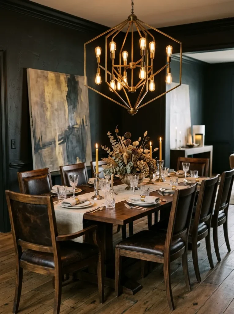
Vibe: Warm and formal — the dining room that makes any dinner feel like the meal you will remember.
Why it works: A statement chandelier hung low over a dining table applies the most fundamental dining room lighting principle — the chandelier should be hung at a height that creates a defined light pool over the table surface (typically 75–85cm above the table top) rather than at a height that provides general room illumination. This low hanging position creates an intimate, warm light environment at the table level that makes conversation feel enclosed and special, while the rest of the room recedes into relative shadow. The dramatic visual presence of a large sculptural chandelier at low height also makes the dining table the room’s clear organizational center — every other element (wall art, floor material, wall color) exists in relation to the chandelier-table composition rather than competing with it.
How to get it: Size the chandelier to approximately 60–70% of the table width — a chandelier too small for the table reads as an afterthought, while one too large crowds the table visually. Hang at 75–85cm above the table surface using a swag hook and chain rather than fixing the electrical box at ceiling height — the adjustable chain allows the hanging height to be set precisely without rewiring. Install a dimmer switch specifically for the chandelier circuit — the ability to dim to 20% for intimate dinners and increase to 60% for practical meal serving is the functional quality that makes a dining chandelier genuinely usable across the full range of dining occasions.
| Product |
|---|
| Aged brass sculptural chandelier large |
| Dark walnut dining table extending |
| Leather dining chair set dark walnut |
| Chandelier dimmer switch compatible |
| Antique crystal wine glass set |
4. Primary Bedroom with Floor-to-Ceiling Curtains
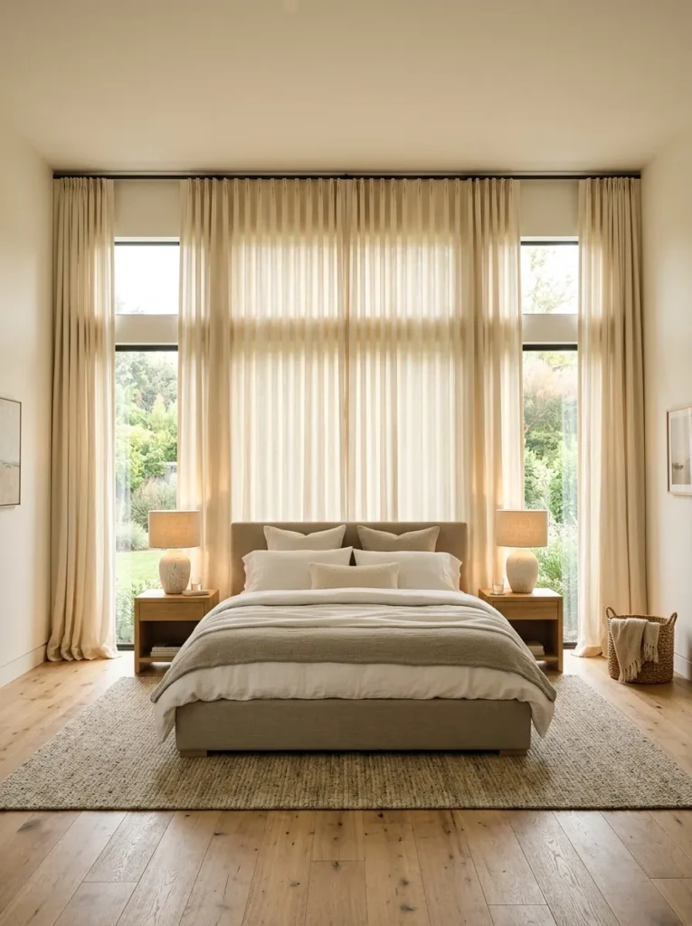
Vibe: Serene and expansive — the bedroom that makes the ceiling seem higher than it is and the morning seem quieter than it should be.
Why it works: Floor-to-ceiling curtains hung from ceiling-height rods and extending beyond the window width in both directions apply three simultaneous design principles: height illusion (curtains mounted at ceiling height draw the eye vertically and make the ceiling appear higher than its actual measurement), window enlargement (curtains extending beyond the window frame create the visual impression of a larger window when open, because the window appears to be the full width between the curtain panels), and light diffusion (cream silk-linen blend fabric converts direct morning sun into a warm, diffuse glow that fills the room with an infinitely more flattering light quality than uncurtained glass). These three effects combined produce a bedroom that feels larger, lighter, and more luxurious than its actual dimensions and orientation would suggest.
How to get it: Mount curtain rods at ceiling height (within 5cm of the ceiling) rather than at window frame height — this single positioning decision produces more visual impact than the curtain fabric choice. Specify rods that extend 30–45cm beyond the window frame on each side — the extended rod allows the curtain panels to stack completely clear of the glass when open, revealing the full window. Choose a fabric weight that falls cleanly rather than puffing — medium-weight linen, silk-linen blend, or weighted linen voile all fall vertically in the clean, elegant way that lightweight polyester sheer cannot replicate.
| Product |
|---|
| Ceiling-height curtain rod brass extendable |
| Silk-linen blend curtain panel cream pair |
| Curtain eyelet or pleat tape heading |
| Curtain holdback hook brass pair |
| Low upholstered platform bed greige linen |
5. Home Library with Floor-to-Ceiling Bookshelves
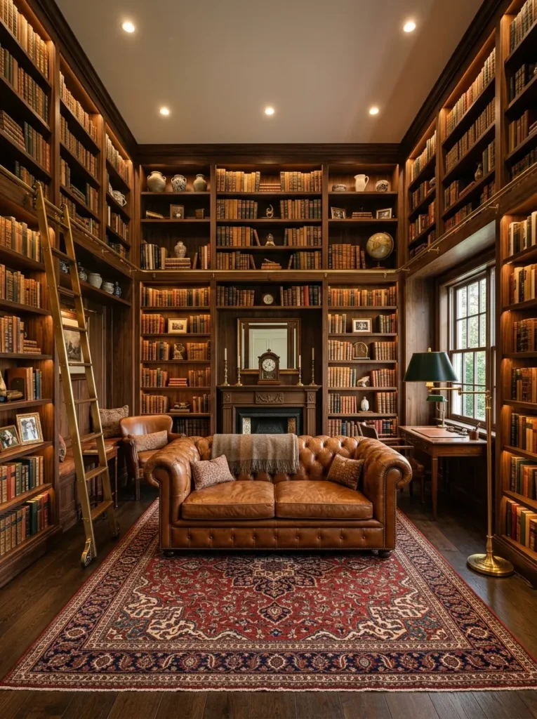
Vibe: Warm and scholarly — the room that makes reading feel like the most important thing you could possibly be doing.
Why it works: Floor-to-ceiling bookshelves on three walls of a library or study apply the design principle of enveloping material richness — books are the most materially diverse wall covering available, providing a continuously varied composition of color, texture, and dimensional interest that no wallpaper or paint can replicate because books change as they are added, removed, and rearranged over a lifetime of reading. The rolling brass library ladder is the functional detail that completes the library as a designed concept — it signals that the upper shelves are genuinely accessible and in active use rather than merely decorative, which is the specific quality that distinguishes a working library from a book display. The Chesterfield sofa in aged leather is the seating choice that most authentically references the English library tradition and provides the visual weight needed to anchor the center of a room dominated by tall shelving walls.
How to get it: Build floor-to-ceiling bookshelves using 18mm melamine or painted MDF carcasses — the shelf material matters less than the shelf depth (minimum 25cm for standard paperbacks and art books) and the shelf height variation (combining fixed shelves at standard book heights with taller shelf bays for oversized art and reference books creates the visual complexity that makes a bookshelf look like a library rather than a storage unit). Install the library ladder rail system before completing the top shelf — the rail must be fixed to a structural element above the shelving, and access to the wall above the shelves requires the shelf installation to be incomplete.
| Product |
|---|
| Floor-to-ceiling bookshelf system walnut |
| Library rolling ladder brass rail system |
| Cognac leather Chesterfield sofa |
| Persian rug deep red navy large |
| Brass floor lamp with green shade |
6. Kitchen with Unlacquered Brass Hardware and Stone Countertops
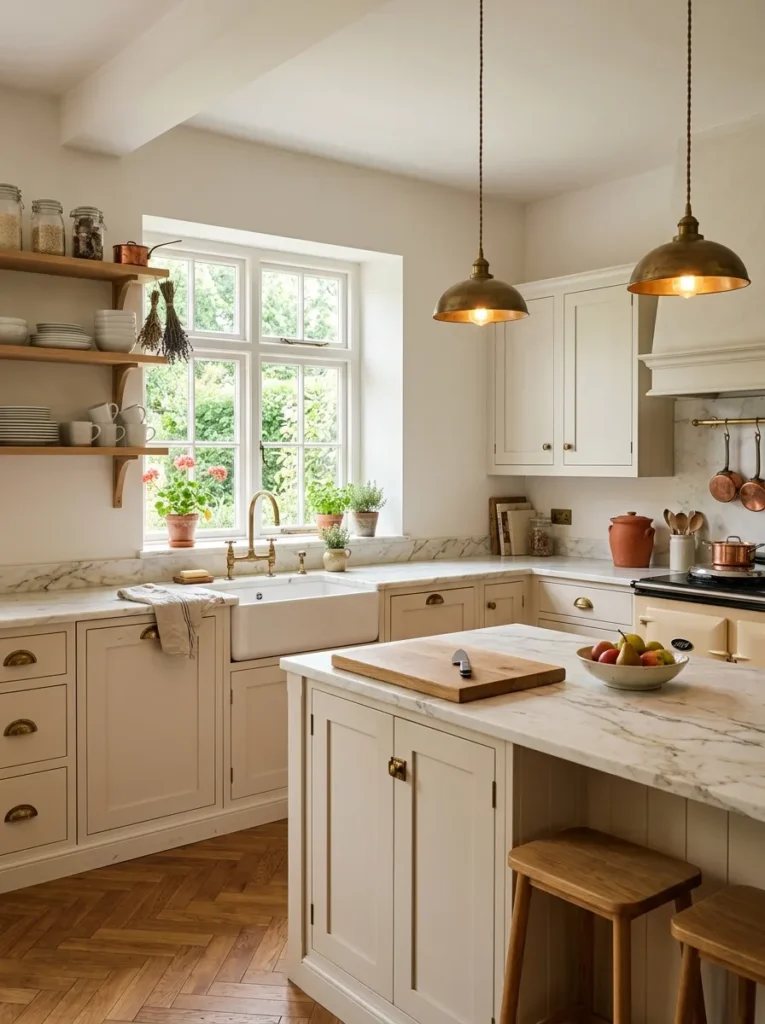
Vibe: Warm and considered — the kitchen that looks like it has been cooking in the same family for three generations.
Why it works: Unlacquered brass hardware on kitchen cabinetry applies the design principle of material aging as quality accumulation — lacquered brass maintains a uniform bright appearance that reads as artificial over time, while unlacquered brass develops a patina unique to the specific handling patterns, water contact, and environmental conditions of its particular location. The cup pulls and bar handles most frequently touched develop the richest patina first, while those used less frequently remain brighter — creating a natural record of the kitchen’s daily use that is simultaneously beautiful and deeply personal. Honed Calacatta marble countertops are the stone specification that best complements unlacquered brass because honed marble’s matte surface reflects light softly rather than brightly, allowing the warm glow of the brass to read against it without the mirror-surface competition of polished marble.
How to get it: Specify unlacquered brass explicitly when ordering hardware — many suppliers offer both lacquered and unlacquered versions of the same hardware, and the unlacquered version is sometimes listed as “living finish” or “natural brass.” Do not apply any protective coating to unlacquered brass hardware after installation — the development of patina is the aesthetic goal, and coating prevents it. Honed marble countertops require sealing with a penetrating stone sealer annually in a kitchen context — unsealed honed marble absorbs oil, wine, and acid from kitchen use and stains permanently.
| Product |
|---|
| Unlacquered brass cup pull set kitchen |
| Unlacquered brass bar handle set |
| Honed marble countertop slab |
| Belfast farmhouse sink white ceramic |
| Unlacquered brass kitchen mixer tap |
7. Bathroom with Marble Mosaic Floor and Freestanding Bath
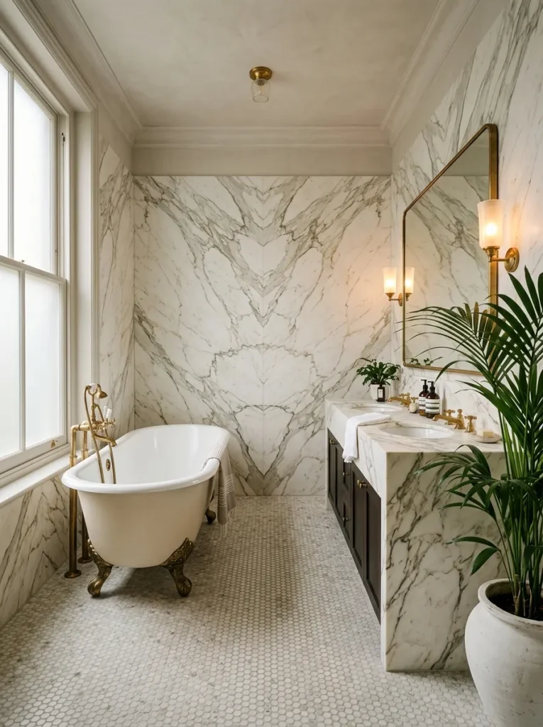
Vibe: Serene and opulent — the bathroom that makes you want to arrive home earlier.
Why it works: A marble penny mosaic floor beneath a freestanding roll-top bathtub applies the design principle of material layering at different scales — the small individual circles of the penny mosaic create fine-grained visual texture at floor level, while the large slab marble wall tiles provide bold, broad veining pattern at wall level, and the cast iron tub’s smooth, curved form provides a sculptural counterpoint to the geometric mosaic beneath it. The three scales of marble — fine mosaic, large slab, and the smooth enamel surface of the bath — create a material conversation across the room’s surfaces that is richer and more sophisticated than any single marble specification across all surfaces would achieve. Book-matched marble wall tiles, where adjacent tiles are mirror images of each other cut from the same slab, produce the most dramatic veining compositions available in marble specification.
How to get it: Source penny mosaic tile from a specialist stone supplier — genuine marble penny mosaic (not ceramic printed with a marble effect) has the tonal variation and surface depth that ceramic alternatives cannot replicate. Specify book-matched marble slabs for wall tiles by requesting matched slabs from the same quarry block — the supplier will show photographs of the matched slab pairs before cutting to confirm the book-match pattern. The floor-mounted bath filler requires a dedicated floor penetration through the marble mosaic for the supply pipes — this penetration must be planned before the mosaic is laid, as cutting through laid mosaic produces cracking.
| Product |
|---|
| Marble penny mosaic floor tile white gray |
| Roll-top cast iron bathtub white |
| Antique brass ball-and-claw bath feet set |
| Unlacquered brass floor-mounted bath filler |
| Large format marble slab wall tile |
8. Bedroom with Upholstered Walls and Silk Bedding
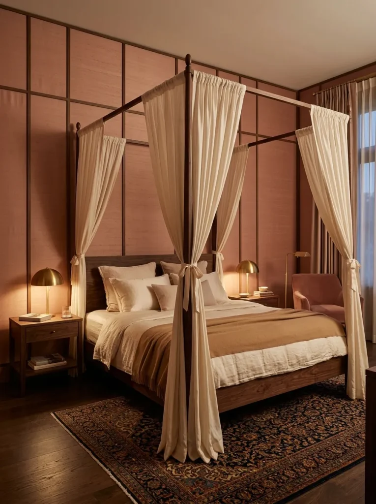
Vibe: Intimate and enveloping — the bedroom that makes the outside world genuinely recede.
Why it works: Upholstered walls — fabric stretched over batting and secured within painted timber batten frames — apply the design principle of acoustic and thermal softness as luxury experience. The tactile and acoustic qualities of upholstered walls are the specific luxury sensory experiences that cannot be photographed or communicated in a product description but are immediately and profoundly felt in the room: sound absorption (the bedroom becomes quieter than any other room in the house), warmth retention (the insulating quality of batting and fabric makes the room feel warmer at the same actual temperature), and the specific soft visual quality of fabric covering all wall surfaces rather than flat paint (which reflects sound and light differently from fabric in ways the human nervous system experiences as more or less stimulating). These combined effects make an upholstered bedroom the most genuinely restful domestic room available.
How to get it: Install a grid of 25x25mm painted timber battens on each wall surface, creating rectangular panels of the desired proportion — standard wall upholstery panel proportions are approximately 60cm wide and 90cm tall for most room heights. Staple a layer of 25mm polyester batting over each wall section between the battens, then pull silk or performance fabric taut over the batting and secure by stapling within the batten channel. Cover the batten faces with a trim molding to hide the staple edge — painted timber trim pressed against the fabric edge produces the clean panel border that distinguishes professional wall upholstery from a DIY application.
| Product |
|---|
| Dusty rose silk fabric upholstery yard |
| Polyester batting 25mm wall upholstery |
| Trim molding painted for batten edge |
| Dark walnut canopy bed frame |
| Cashmere throw blanket warm camel |
9. Home Office with Dark Lacquered Walls and Brass Details
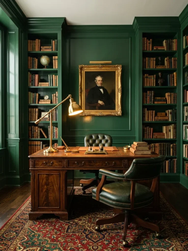
Vibe: Atmospheric and scholarly — the home office that makes every email feel like correspondence worth composing.
Why it works: Lacquered walls in a home office — specifically a deep, saturated color applied in a satin or semi-gloss finish that creates a subtle reflective quality different from both matte paint and high-gloss lacquer — applies the design principle of material finish as atmosphere generator. The satin lacquer finish on a deep forest green wall catches and reflects ambient and task light differently at different times of day and from different positions in the room, creating a living surface that is never exactly the same color under all conditions. This optical variability gives the lacquered room a visual depth that matte painted rooms cannot achieve, and the specific combination of deep green lacquer with brass desk accessories and warm wood furniture is the office aesthetic most consistently associated with genuine creative productivity in design culture — referencing the great private libraries and studies of European intellectual history.
How to get it: Lacquered wall finishes require a perfectly smooth substrate — any surface imperfection (jointing, nail holes, sanding marks) is amplified by a gloss or satin finish in a way that matte paint conceals. Prepare the walls with two coats of high-build plaster primer, sanding to 240 grit between coats, before applying the lacquer paint in minimum three coats with sanding to 400 grit between coats. Specify an oil-based satin paint (alkyd enamel) rather than water-based for the most authentic lacquer quality — oil-based satin self-levels more completely than water-based, eliminating brush marks that water-based satin retains even after sanding.
| Product |
|---|
| Deep forest green oil-based satin paint |
| Antique mahogany or dark wood desk |
| Dark green leather desk chair brass castors |
| Brass adjustable desk lamp |
| Persian rug deep red emerald 5×8 |
10. Living Room Fireplace with Marble Surround
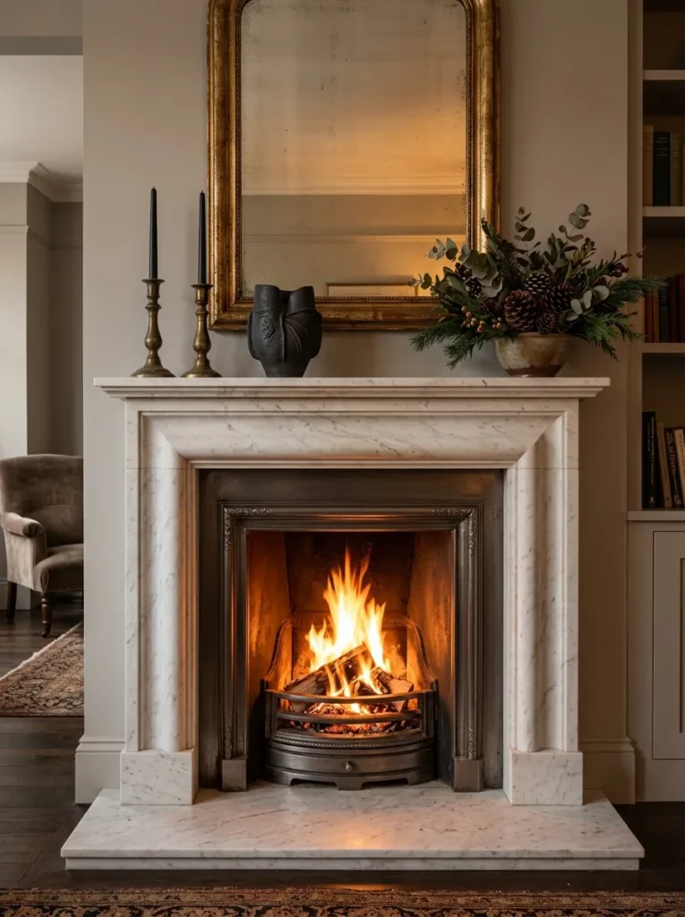
Vibe: Warm and classic — the fireplace that makes every room it is in feel like the most important room in the house.
Why it works: A marble fireplace surround is the single architectural element with the most consistent luxury-signal across every style of interior design from classical to contemporary — the material’s geological history (its formation over millions of years), its visual complexity (the veining that is different in every marble slab ever quarried), and its tactile quality (the cool smoothness that immediately communicates density and permanence) make it the residential material most universally associated with considered investment. The bolection molding profile — the traditional fireplace surround form where the molding projects forward from the chimney breast face — is the specific classical form that most elegantly resolves the architectural challenge of the fireplace opening, and its use in Carrara marble is the combination that has remained in continuous production in the finest residential interiors for over three centuries.
How to get it: Source a marble fireplace surround from a specialist marble supplier or antique dealer — antique marble surrounds from the 18th and 19th centuries are often available for comparable prices to new surrounds of equivalent quality and carry the additional value of genuine age and provenance. Have the fireplace opening professionally assessed for the correct insert size before purchasing a surround — the surround’s fire opening dimensions must match the existing chimney breast opening to avoid visible gaps or requiring structural modification. Style the mantel with restraint — three to five objects with generous negative space between them reads as luxury; a crowded mantel reads as domestic clutter regardless of each individual object’s quality.
| Product |
|---|
| Carrara marble fireplace surround bolection |
| Cast iron fire insert for open fireplace |
| Antiqued or aged mirror for above mantel |
| Aged brass candlestick set pair tall |
| Black taper candle set for mantel |
11. Dining Room with Lacquered Ceiling and Plaster Walls
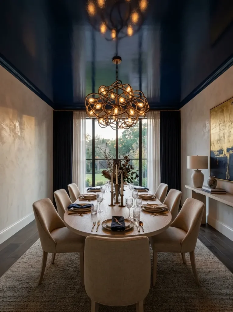
Vibe: Dramatic and unexpected — the dining room where the ceiling becomes the most interesting surface in the room.
Why it works: Lacquering the ceiling in a deep, saturated color while keeping the walls in a warm neutral applies the design principle of unexpected plane activation — rooms are conventionally designed with the walls as the primary decorative surface and the ceiling as a neutral plane, and inverting this hierarchy by making the ceiling the room’s most dramatic color creates a spatial surprise that makes the room memorable and distinctive. A deep navy ceiling in a dining room specifically creates the impression of dining under a night sky — the dark overhead plane reduces the perceived ceiling height in a way that makes the dining table feel more enclosed and intimate, which is precisely the spatial quality that makes a dining room feel genuinely convivial. The aged bronze chandelier against the navy ceiling is the material contrast that makes this composition work — warm bronze against deep blue is the color relationship most consistently associated with richness and depth in interior design.
How to get it: Apply Venetian plaster to the dining room walls using the traditional float-and-burnish technique — two base coats of Venetian plaster applied with a wide steel trowel in overlapping arcs, burnished with a polished steel trowel while the second coat is partially set, then waxed with a natural beeswax. Lacquer the ceiling in the chosen navy using an oil-based semi-gloss paint applied in two to three coats — the ceiling’s horizontal position requires careful paint viscosity management to prevent runs. Paint the ceiling before the Venetian plaster walls so that any ceiling paint splatter can be incorporated into the wall plaster application.
| Product |
|---|
| Venetian plaster warm stone white |
| Deep navy oil-based semi-gloss ceiling paint |
| Aged bronze sculptural chandelier |
| Bleached ash oval dining table |
| Linen upholstered dining chair set |
12. Living Room with Curated Art Gallery Wall
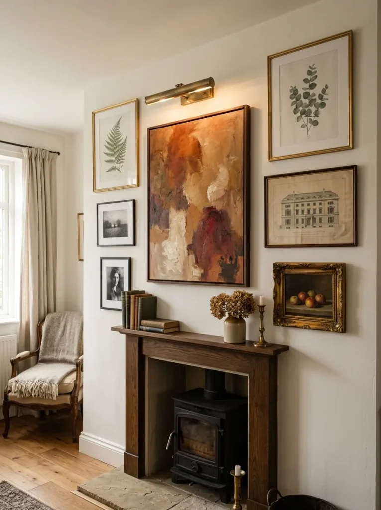
Vibe: Warm and considered — the wall that makes the room feel like it has been loved and lived in across different chapters.
Why it works: A curated gallery wall on a chimney breast applies the design principle of visual narrative through collected objects — a gallery wall of varied artwork in varied frame styles, hung in a composition where the relationships between works (size, subject, tone, era) are as considered as the individual works themselves, reads as a personal collection accumulated through genuine aesthetic engagement rather than a purchased decorating package. The critical curatorial decisions that distinguish a gallery wall that reads as luxurious from one that reads as busy are: consistent spacing between frames (5cm is the maximum gap that reads as intentional rather than random), a dominant anchor piece at eye height in the composition’s visual center, and enough variety in frame style and artwork type to suggest curation over a period of time rather than simultaneous purchase.
How to get it: Template the gallery wall composition on the floor before hanging any works — lay all frames on the floor in the planned composition, photograph the floor arrangement, and use the photograph as a reference for hanging. Begin hanging with the large anchor piece at eye height (center of painting at 155–165cm from floor) and work outward from there. Use a laser level for horizontal alignment rather than attempting to level by eye — the consistency of a horizontally level row within the composition is what distinguishes a professional installation from an amateur one.
| Product |
|---|
| Large abstract oil painting warm earth tones |
| Gilt picture frame set medium |
| Thin black picture frame set small |
| Antique ornate frame single |
| Picture light above-frame brass |
13. Bedroom with Textured Limewash Walls
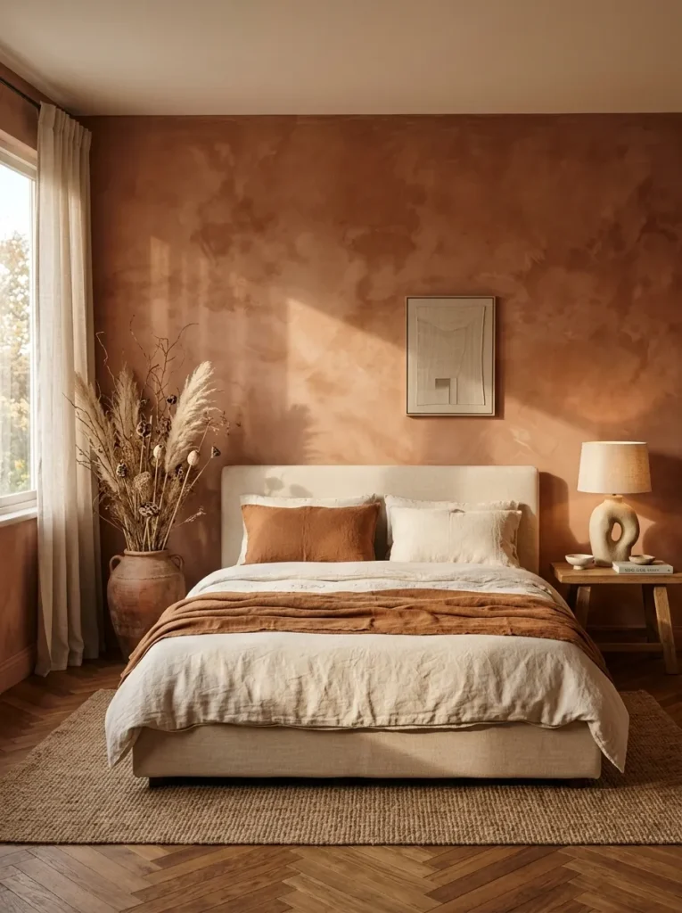
Vibe: Warm and organic — the bedroom that makes a weekday morning feel like it is happening in Tuscany.
Why it works: Limewash paint on bedroom walls applies the principle of material depth as visual luxury — limewash is a traditional lime-based paint whose transparent, layered application produces a tonal variation and depth that no modern acrylic paint can replicate, because each layer of limewash is translucent and the cumulative effect of multiple translucent layers creates a surface that appears to have internal depth rather than existing only at the wall surface. The specific quality of limewash that makes it the luxury wall treatment currently most in demand is its response to raking light — in afternoon sun or warm lamp light that grazes the wall surface at an angle, the brushwork and tonal variation become dramatically visible, giving the room a quality of illuminated depth that flat paint cannot produce.
How to get it: Apply genuine limewash (lime putty diluted to the appropriate consistency with water and tinted with natural earth oxide pigments) in three coats using a wide natural bristle brush in overlapping, cross-directional strokes — each coat applied before the previous is fully dry, so the coats blend partially at their edges. Vary the stroke direction and pressure between coats to create the tonal variation that is limewash’s defining quality. Seal with a thin coat of linseed oil in a bathroom or kitchen application, but leave unsealed in bedrooms — limewash in non-moisture environments does not require sealing and remains slightly breathable in its unsealed state, which benefits both the wall substrate and indoor air quality.
| Product |
|---|
| Limewash paint terracotta natural pigment |
| Wide natural bristle brush limewash |
| Cream linen duvet cover set |
| Rust linen throw blanket |
| Organic sculptural ceramic lamp |
14. Kitchen with Open Shelving and Collected Ceramic Display
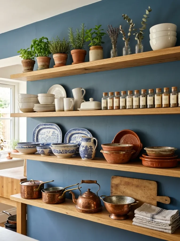
Vibe: Warm and collected — the kitchen shelves that make everyday cooking feel like participation in something beautiful.
Why it works: Open kitchen shelving with a curated ceramic collection applies the design principle of functional display — objects that are both used daily and beautiful deserve to be displayed rather than concealed, and a kitchen with visible ceramic collections, copper pots, and glass vessels communicates a relationship with cooking and materials that closed cabinetry conceals entirely. The deep dusty blue painted wall behind the open shelves is the specific design decision that elevates a functional shelf wall to a considered visual display — the dark wall behind light ceramic objects creates the contrast and depth that makes each object visible as an individual form rather than part of an undifferentiated collection.
How to get it: Assess the kitchen’s existing ceramic and cookware collection honestly before installing open shelves — open shelving reveals everything on it, and the discipline of editing to only display objects that are genuinely beautiful and regularly used is the prerequisite for open kitchen shelving that reads as curated rather than cluttered. Mount oak shelves at varied heights to accommodate different object heights — the variation in shelf spacing (30cm for cups and small bowls, 40cm for dinner plates and serving pieces, 50cm for large vessels and copper pots) creates the visual rhythm that flat, equally spaced shelving cannot produce.
| Product |
|---|
| Natural oak floating shelf set deep |
| Hand-thrown ceramic bowl set terracotta |
| Vintage blue and white serving platter |
| Antique copper pot collection |
| Glass jar set labeled for spices |
15. Terrace or Balcony with Outdoor Living Room Quality
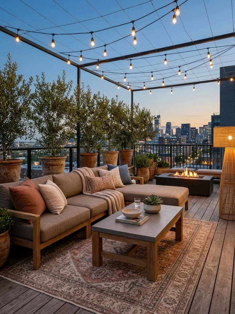
Vibe: Warm and expansive — the outdoor space that makes staying home feel better than going anywhere.
Why it works: An outdoor terrace designed with the same furniture depth, textile layering, and lighting consideration as an interior living room applies the principle of inside-outside quality continuity — the most luxurious outdoor spaces are those where the design language of the indoor rooms extends uninterrupted to the outdoor space, creating a seamless environmental experience rather than a contrast between a carefully designed interior and an improvised outdoor space. The specific quality indicators that distinguish a luxury outdoor living space from a patio with garden furniture are: seating depth (outdoor sofas with 90cm+ seat depth versus standard 70cm contract-furniture depth), weather-resistant textiles with indoor-quality visual weight, a proper outdoor rug that defines the seating zone as a room within the outdoor space, and a warm-toned lighting system that provides the same quality of evening illumination as indoor lighting.
How to get it: Specify all outdoor furniture in solution-dyed acrylic fabric (Sunbrella or equivalent) in warm, neutral tones — solution-dyed acrylic is the only outdoor upholstery fabric that maintains its color and resists mold growth through multiple seasons of full outdoor exposure. Choose seating with seat depths of 90–100cm rather than the standard 70–75cm of contract-grade outdoor furniture — the additional 20–25cm of seat depth is the specific physical quality that makes outdoor seating feel genuinely as comfortable as indoor seating. Install a programmable warm-white string light system on a timer so the outdoor space is illuminated automatically at dusk.
| Product |
|---|
| Deep outdoor sofa solution-dyed acrylic |
| Teak and concrete outdoor coffee table |
| Outdoor rug weatherproof Persian style |
| Outdoor rattan floor lamp warm shade |
| Olive tree large terracotta pot pair |
How to Start Your Luxury Interior Decor Transformation
Start with the lighting. Before purchasing any furniture, selecting any new material, or committing to any renovation, assess and improve the lighting in the room you most want to elevate. Replace all cool-white bulbs with 2700K warm white LEDs, add a floor lamp or table lamp to any room that currently relies solely on a ceiling fixture, and install a dimmer switch where possible. This modification — achievable for $30–$80 — produces the most immediate perceptible improvement to the room’s quality because light quality is the atmospheric foundation from which every other design quality is perceived. A beautifully furnished room in cold, flat light reads as ordinary. The same room in warm, layered light reads as designed. Every design decision made after the lighting is corrected will be more accurate because it will be assessed in the room’s intended light rather than its default light.
The most common mistake people make when pursuing luxury interior decor is spending on the visible surface while neglecting the underlying quality — purchasing an expensive sofa fabric without specifying feather-wrap cushion inserts, choosing marble tile without specifying honed rather than polished finish, or selecting a chandelier without installing the dimmer switch that makes it usable across its full atmospheric range. Genuine luxury is produced at the junction between the visible and the tactile, the visual and the experiential, and the decisions that determine these qualities — cushion fill, stone finish, light control, fabric weight — are frequently less expensive than the headline purchase they accompany but more impactful on the daily experience of the room.
Three items under $50 that make an immediate impact: A set of 2700K warm white LED bulbs ($8–$15) that transforms any room’s light quality before any other modification; a single feather-wrap cushion insert in the largest size that fits an existing sofa cushion cover ($18–$35) that introduces the tactile quality most associated with genuinely luxurious seating; and a natural linen throw in warm cream or oatmeal ($25–$45) that introduces the natural fiber quality that reads as material consideration in any room it occupies, draped over a sofa arm or folded at the foot of a bed.
Realistic expectations: A single-room luxury lighting upgrade — bulb replacement, dimmer installation, and one added lamp — takes one afternoon and costs $50–$150. A mid-level room transformation — quality rug, new throw pillows with feather inserts, statement mirror, and quality textiles — typically costs $400–$900 and takes one weekend of sourcing and installation. A full luxury room renovation — new upholstery, custom drapery, quality flooring, and considered lighting design — ranges from $3,000–$15,000 for a standard living room or bedroom depending on material specification and room size. The principle that applies across every budget level is concentration — spending 80% of the available budget on the two or three elements that most determine a room’s quality (rug, upholstery, lighting) and using the remaining 20% for accessories and styling produces better results than distributing the budget evenly across every element category.
Frequently Asked Questions About Luxury Interior Decor
What makes interior decor genuinely luxurious rather than merely expensive?
The defining quality of genuinely luxurious interior decor is the evidence of considered intention — spaces where every design decision, from the height of the curtain rod to the finish of the hardware, reflects a specific thought about how the room should feel rather than a default specification or a convenience purchase. This quality is independent of cost — a room with correctly proportioned, warm-lit, materially honest design reads as more luxurious than a room furnished with expensive objects in the wrong proportions under the wrong light. The specific indicators of genuine luxury that are available at any budget level are: correct furniture scale relative to the room (furniture neither too large nor too small for the space), warm light quality (2700K sources at appropriate heights), natural fiber textiles (linen, cotton, wool rather than synthetic equivalents), edited accessory placement (fewer objects with more space between them), and material authenticity (surfaces that are visibly what they are rather than imitations of other materials).
How do I choose a luxury color palette for my home?
Luxury color palettes share three characteristics regardless of their specific hues: tonal warmth (even dark, saturated colors in luxury interiors carry a warm undertone — deep forest green rather than cool blue-green, warm charcoal rather than cool gray, aged brass rather than chrome), restraint in color count (most genuinely luxurious interiors use three or fewer distinct colors across a room — the variety comes from material texture and tone rather than color multiplicity), and relationship to natural materials (colors that exist in nature — stone, clay, timber, aged metal, dried botanical — rather than purely synthetic colors are those most consistently associated with luxury aesthetics). The safest luxury color approach is to begin with one natural material — a stone, a timber, a fiber — and derive the room’s entire color palette from the tonal range visible within that single material.
Is it worth investing in custom or bespoke furniture for a luxury interior?
Custom furniture provides genuine advantages over off-the-shelf alternatives in three specific scenarios: when the room has non-standard dimensions that standard furniture sizes cannot address properly (a sofa that is 10cm too long for its wall position reads as wrong regardless of its quality); when a specific fabric or finish combination is required that no manufacturer stocks as a standard option; and when the furniture piece is the room’s primary focal point where its specific character as an object (its leg profile, its cushion shape, its arm detail) significantly contributes to the room’s design identity. In all other scenarios, off-the-shelf furniture from quality manufacturers — with upgraded fabric specifications, feather-wrap inserts, and proper leg hardware — delivers comparable quality to custom at a fraction of the cost and timeline. The budget saved on non-custom pieces is better directed toward the room’s rug, lighting, and window treatment — the three elements that most determine a room’s overall quality perception.
How do I style a room to look luxurious without over-decorating?
The styling principle that most reliably produces a luxurious rather than cluttered result is the rule of three plus negative space — group objects in odd-number compositions of three or five with generous visible surface between each group and between all groups and the edge of the surface they occupy. A luxury sideboard is styled with three groups: a tall element (lamp or vase), a medium element (ceramic vessel, stack of books), and a low element (small object, tray). Between and around these three elements, the surface of the sideboard is visible — the negative space is as important as the objects. The negative space is what signals confidence in the individual quality of each object — that each piece is interesting enough to stand in open space rather than requiring the company of other objects to justify its presence.
What is the best way to mix antique and contemporary elements in a luxury interior?
The most successful antique-contemporary mix in luxury interiors follows the principle of material dialogue over style matching — antique objects and contemporary furniture relate through shared material language (both in warm wood tones, or both carrying brass or bronze hardware) rather than through shared design period. An antique Persian rug beneath a contemporary low-profile sofa works because both are high-quality natural fiber objects in warm tonal registers — the rug’s age and the sofa’s modernity create a deliberate time tension that is more interesting than either would produce in an all-contemporary or all-period room. The specific antique categories that integrate most successfully into contemporary luxury interiors are: Persian and antique kilim rugs (relate to any contemporary upholstery through their warm wool palette), antique ceramic vessels and objects (relate to contemporary ceramics through material continuity), antique mirrors in ornate frames (provide the vintage gravitas that contemporary mirrors in minimal frames cannot achieve), and antique brass and bronze hardware (develop the patina that new hardware cannot replicate).
Ready to Create Your Dream Luxury Interior?
These 15 ideas cover the complete range of what luxury interior decor can achieve across every room — from the dramatic wallpapered entry hall that sets the quality expectation for the entire home, to the limewash bedroom walls that make a weekday morning feel like it is happening somewhere genuinely beautiful. Every luxury interior transformation begins with the smallest possible commitment to quality over quantity — changing one light bulb to warm white, adding one natural fiber throw, replacing one piece of decorative hardware with an unlacquered brass alternative — and building from those first decisions outward with the same principle consistently applied. Right now, walk through the room you most want to transform and identify the single element that most undermines its quality — the overhead cool-white light, the synthetic throw pillows, the cluttered surface — and address that single element this week before planning anything more ambitious. The improvement you see from that first quality decision is the creative momentum that makes every subsequent decision feel not just achievable but genuinely important. Save the ideas that match your home’s architecture, your material preferences, and the quality of life you want every room to support — and begin from that first warm light bulb.