15 Stylish Kitchen Ideas with Bold Functional Design
Stylish kitchen ideas with bold functional design combine strong visual decision-making — dramatic material choices, architectural color, considered lighting — with the organizational and operational intelligence that makes a kitchen genuinely easy to cook in, clean, and maintain daily. This article gives you exactly 15 ideas spanning cabinetry, worktops, lighting, storage, layout, appliances, and small-kitchen solutions so every kitchen size, budget, and cooking style finds a bold, functional approach that works.
A kitchen that is only beautiful fails every Tuesday morning. A kitchen that is only functional fails every dinner party. The ideas in this list are specifically chosen because they deliver on both — bold enough to make the room feel designed, practical enough to make the work easier. Here are 15 ideas worth saving — and building.
Why Stylish Kitchen Ideas with Bold Functional Design Work So Well
The kitchen has undergone the most significant design evolution of any domestic room in the past thirty years — transitioning from a service room to a social room, from a workspace to the home’s primary gathering space, and from the most utilitarian room in the house to the one most frequently cited as the highest-value investment in residential renovation. The American Kitchen Cabinet Alliance reported in 2023 that kitchen renovation delivers the highest return on investment of any home improvement project in the United States, and the UK’s Nationwide Building Society’s data consistently shows that a well-specified kitchen adds 5–15% to a property’s sale value. These economic facts reflect a deeper cultural shift: the kitchen is now the room where design decisions matter most commercially, socially, and experientially.
The core materials that define a stylish and functional contemporary kitchen include: slab-door cabinetry in painted MDF (the most durable, dimensionally stable, and design-versatile cabinet substrate), porcelain or quartz worktops (both offering the durability and low-maintenance properties that marble and timber cannot match in working environments), undermount sinks in stainless steel or composite granite (which are the most hygienic and cleanable option available), integrated appliances behind matching cabinet doors (which maintain the visual calm that characterizes a well-designed kitchen), and statement lighting — both task (recessed LED or under-cabinet strip) and ambient/decorative (pendant clusters over islands, architectural wall sconces). The color palette has expanded dramatically from the decade of white kitchen dominance: deep greens, warm navies, terracotta, warm charcoal, and two-tone combinations (an island in a contrasting color to the perimeter cabinetry) are all well-established as sophisticated choices rather than risk-taking ones.
The convergence of bold design and genuine function is the defining characteristic of the contemporary kitchen design moment — the two are no longer in tension. Matte black faucets that were exclusively decorative choices a decade ago are now produced to the same technical specification as standard chrome; deep green cabinetry in specialist furniture paint is no more difficult to clean than white; unlacquered brass hardware that develops a patina is deliberately chosen rather than failed — function follows form and form follows function simultaneously. This convergence is documented in the output of every major kitchen design publication, from Architectural Digest’s annual kitchen roundup to the biennial KBB industry report, and is the design context within which all 15 ideas in this list were selected.
Small kitchens — under 100 square feet, which describes the majority of urban apartment kitchens — benefit particularly from bold functional design because strong design decisions (a dramatic paint color, a statement pendant, a distinctive worktop material) generate more visual impact per square foot in a small space than in a large one. A 60-square-foot galley kitchen with deep forest green cabinetry, brass hardware, and a continuous marble-effect porcelain worktop reads as more designed than a 200-square-foot kitchen with white cabinetry and no material specificity. The honest constraint for small kitchens: layout is the most critical decision, and no amount of material quality or design boldness compensates for a layout that creates traffic conflicts or inadequate work surface.
Style at a Glance
| Element | Functional Core | Bold Design Edge |
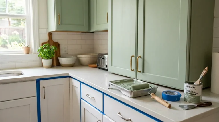
|---|---|---|
| Philosophy | The kitchen works for how you actually cook | The room earns visual authority |
| Materials | Porcelain, quartz, stainless, MDF cabinet | Fluted glass, unlacquered brass, fluted oak |
| Color Palette | Warm white, warm gray, natural timber | Forest green, warm navy, terracotta, warm charcoal |
1. Deep Forest Green Cabinetry with Unlacquered Brass Hardware
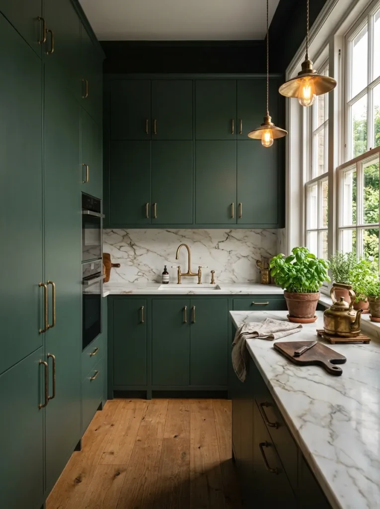
Vibe: The kitchen feels deeply considered — the green rich enough to be called a decision rather than a color.
Why it works: Deep forest green cabinetry with unlacquered brass hardware applies the design principle of analogous material warmth — both forest green (which shares the yellow-green undertone of aged brass) and unlacquered brass (which develops a warm patina referencing natural mineral tone) belong to the same warm, earthy material family. This shared undertone makes the combination cohesive rather than contrasted and prevents the kitchen from reading as high-contrast or theatrical. The white marble-effect worktop provides the necessary visual relief — without a light-toned worktop, a full-green kitchen reads as heavy regardless of the material quality. Unlacquered brass is the specifically correct hardware choice over lacquered or polished brass — the patina that develops on unlacquered surfaces reads as authentic aged material rather than decorative finish.
How to get it: Specify cabinetry painted in Farrow & Ball Studio Green No. 93 or Little Greene Obsidian Green for the most architecturally resolved forest green tone. Use a furniture-specific eggshell or satin finish rather than matte — matte green cabinetry in a cooking environment shows fingerprints and grease marks more readily than a satin that can be wiped clean without removing the paint film. Source unlacquered brass bar pulls in 160mm or 224mm length for drawer and door hardware — specify C-to-C (center-to-center) dimension before ordering.
Quick Win: Replacing standard satin chrome cabinet hardware with unlacquered brass bar pulls ($4–8 each from online hardware suppliers) on existing white or gray cabinets creates the warm-metal-against-cabinet-tone effect for under $100 in total hardware cost — the fastest material upgrade available for an existing kitchen.
Shop The Look
| Product |
|---|
| Unlacquered brass bar pull 160mm cabinet |
| Forest green kitchen cabinet paint eggshell |
| Marble effect porcelain worktop slab |
| Unlacquered brass kitchen mixer faucet |
| Terracotta herb pot small kitchen |
Also view: 13 Elegant Master Bedroom Ideas for Ultimate Comfort
2. Integrated Appliances Behind Matching Cabinet Doors for Visual Calm
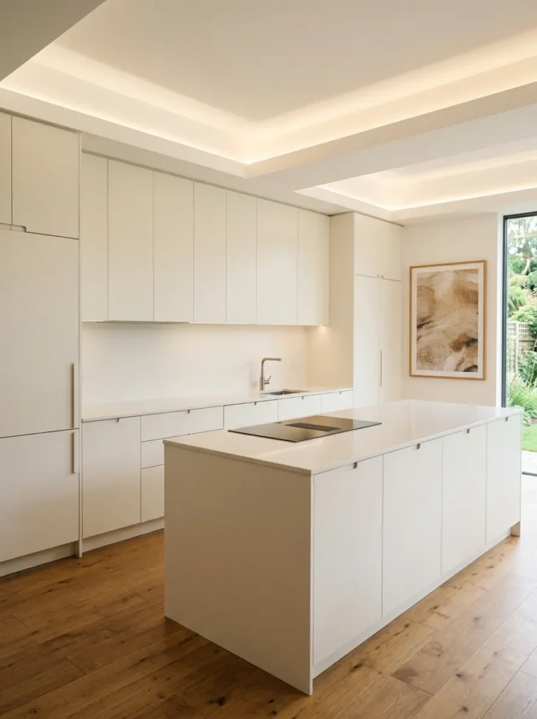
Vibe: The kitchen feels settled and still — the calm that arrives when nothing competes for visual attention.
Why it works: Integrating all appliances behind matching cabinet door fronts applies the interior design principle of visual unity through concealment — every visible appliance face in a standard kitchen (the stainless refrigerator, the black dishwasher control panel, the chrome oven handles) introduces a competing visual element that fragments the kitchen’s composition. A fully integrated kitchen eliminates all of these visual interruptions, allowing the cabinetry to be experienced as a unified architectural surface. This is the defining visual characteristic of the most prestigious contemporary kitchen designs — both in residential and hospitality contexts — and it is achievable at all budget levels from IKEA-integrated to bespoke fitted.
How to get it: Specify a refrigerator designed to accept furniture door panels (IKEA AXSTAD or similar overlay panels for IKEA refrigerators; dedicated furniture-front refrigerators from Liebherr, Miele, and Gaggenau for higher-budget specifications). Specify a fully integrated dishwasher (panel-ready models accept a standard cabinet door front and have a top-mounted or push-to-open control mechanism). Specify fan-assisted oven units that fit within standard 60cm cabinet openings and accept matching oven housing doors. The critical dimensional coordination point is ensuring all integrated appliance door faces sit in the same plane as adjacent cabinet doors — a door that protrudes 5mm beyond the cabinet face reads as misaligned regardless of the panel finish.
Shop The Look
| Product |
|---|
| Panel-ready integrated refrigerator 60cm |
| Integrated dishwasher panel-ready 60cm |
| Cabinet furniture door panel overlay kit |
| Finger-pull recess insert cabinet door |
| Large format art print kitchen end wall |
Also view: 12 Home Depot Christmas Decorations for Small Spaces
3. Statement Island in Contrasting Color with Waterfall Worktop
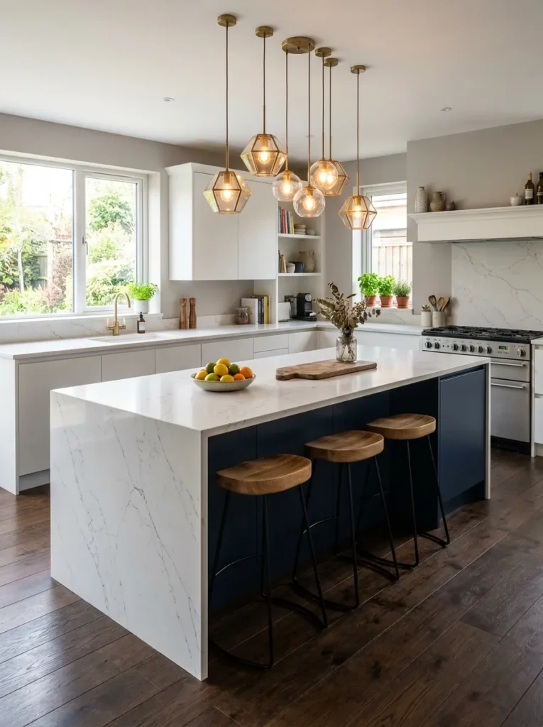
Vibe: The island feels like the room’s anchor — the navy pulling every other element in the kitchen into relation with it.
Why it works: A contrasting-color kitchen island with a waterfall worktop applies the design principle of compositional focal point through color and material — the island’s departure from the perimeter cabinet color immediately establishes it as the kitchen’s primary design feature, directing visual attention to the functional center of the room. The waterfall worktop (a continuous stone or quartz surface that runs over the island top and falls vertically to the floor on one or both ends) amplifies this focal quality by making the material — not the color — the compositional statement. White quartz against navy blue cabinetry creates the most resolved version of this combination because the high contrast makes the waterfall’s continuous material quality maximally legible.
How to get it: Specify the island cabinetry in Benjamin Moore Van Deusen Blue HC-156 or Farrow & Ball Hague Blue No. 30 — both are warm-toned navies that read as rich and considered rather than flat and corporate. The waterfall worktop requires a mitered stone joint at the top corner (where the horizontal worktop surface meets the vertical waterfall face) — this joint is cut at 45 degrees and joined with a matching stone adhesive for an invisible seam. Specify the worktop material in a book-matched format if using a veined stone or porcelain — the vein pattern continuing uninterrupted across the miter creates the premium material effect.
Shop The Look
| Product |
|---|
| Deep navy kitchen cabinet paint satin |
| White quartz worktop slab waterfall |
| Miter stone adhesive kit worktop |
| Pendant light cluster set kitchen island |
| Oak bar stool seat height 65cm set |
4. Open Shelving in Smoked Oak for Styled but Functional Storage
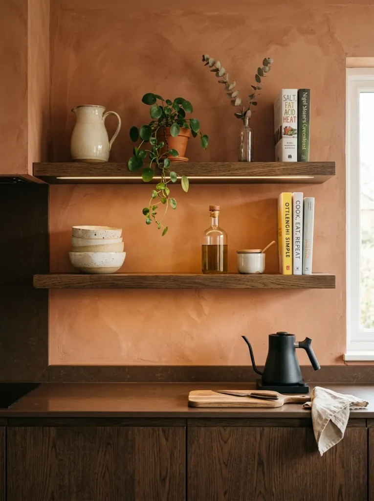
Vibe: The shelf wall feels genuinely inhabited — the difference between a kitchen that shows and a kitchen that lives.
Why it works: Open shelving in smoked oak replacing upper cabinets on a single wall applies the kitchen design principle of selective concealment — not all kitchen storage needs to be closed, and the items that are stored openly (ceramic vessels, cookbooks, beautiful bottles, small plants) actively contribute to the room’s visual warmth in a way that closed cabinets cannot. Smoked oak specifically is the most sophisticated open shelf material available at reasonable cost — the smoking process darkens the wood’s natural grain unevenly, producing a warm charcoal-brown tone with the natural grain remaining clearly legible. Against a terracotta plaster wall (or any warm-toned paint color), smoked oak reads as material-rich and considered rather than simply “shelf.”
How to get it: Source smoked oak shelf boards (available from specialist timber suppliers in the UK and Europe; in North America, cerused or ebonized oak produces a similar effect) in 30cm depth and cut to the wall width. Mount on heavy-duty floating shelf brackets rated for the full shelf load — open shelves in active kitchens bear the weight of heavy ceramics and glass, and bracket specification should be based on the total anticipated load at 1.5 times the expected weight for a safety factor. Install LED strip lighting to the underside of each shelf for task lighting that serves the worktop below.
Shop The Look
| Product |
|---|
| Smoked oak floating shelf board 30cm deep |
| Heavy duty floating shelf bracket set |
| Under-shelf LED strip warm white |
| Ceramic mixing bowl set stacked kitchen |
| Terracotta wall paint plaster effect |
5. Fluted Glass Upper Cabinet Doors for Material Interest
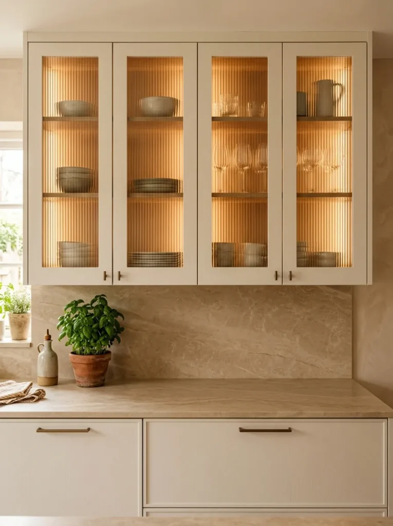
Vibe: The upper cabinets feel warm and mysterious simultaneously — the fluted glass revealing form without content, texture without clarity.
Why it works: Fluted glass upper cabinet doors apply the design principle of material texture at the transparent plane — standard clear glass cabinet doors create a window into the cabinet interior that demands everything inside be display-quality. Fluted (reeded) glass diffuses the view into the cabinet, revealing the general form and color of stored items without their individual detail, which simultaneously makes the cabinets visually interesting (the diffused outlines create movement and warmth) and tolerant of real-world storage (the diffusion forgives the inevitable imperfection of a working kitchen’s stored contents). Internally illuminated fluted glass cabinets are particularly effective — the light source within the cabinet diffracts through the glass reeds, creating a warm ambient glow that contributes significantly to the kitchen’s evening atmosphere.
How to get it: Specify fluted glass inserts for upper cabinet door frames from a glass supplier — standard fluted or reeded glass is available in various reed widths (8–12mm reeds are the most legible at kitchen scale) and thicknesses (4mm is standard for cabinet doors). Rout a 10mm rebate around the interior perimeter of each door frame to accept the glass panel, retaining with a quadrant bead molding pinned into the rebate. Install a warm LED strip inside each illuminated cabinet bay, concealed behind the top shelf front rail.
Shop The Look
| Product |
|---|
| Fluted reeded glass panel cabinet door insert |
| Cabinet door frame timber white painted |
| Interior cabinet LED strip warm white |
| Glass panel retaining quadrant bead molding |
| Warm stone worktop quartz natural |
6. Dramatic Ceiling-Height Splashback in Porcelain Slab
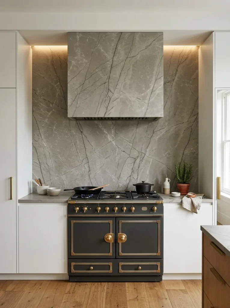
Vibe: The cooking wall feels monumental — a single surface treated as architecture rather than as cladding.
Why it works: A floor-to-ceiling porcelain slab splashback applies the architectural design principle of material continuity at vertical scale — extending a single material from the worktop surface to the ceiling height eliminates every horizontal joint and material boundary that standard tile installations create, producing a visual field that reads as a single composed surface rather than a tiled wall. This treatment makes the cooking wall the kitchen’s architectural statement, positioning the range cooker as a composition element within the material field rather than as an appliance in front of a tiled wall. Book-matched installation (two panels installed as mirrored images meeting at a central vertical joint) amplifies the monumental quality by creating a symmetrical vein composition centered on the range.
How to get it: Specify large-format porcelain slabs (1200×2400mm or 1200×3000mm for a floor-to-ceiling continuous run) in a book-matched format — order panels sequentially from the same pallet or lot to ensure vein pattern continuity. Install with a specialist large-format tile adhesive applied with a notched trowel to achieve full bed coverage across the slab back (partial bed coverage causes stress fractures in large-format slabs). Clad the extraction hood in the same material, mitered at the hood’s corners for a continuous wrapped surface.
Shop The Look
| Product |
|---|
| Large format porcelain slab 1200x2400mm |
| Large format tile adhesive full bed specialist |
| Range cooker 90cm dual fuel natural gas |
| Porcelain tile cutter diamond blade wet |
| Kitchen extraction hood 90cm chimney |
7. Matte Black Faucet and Sink Hardware for Graphic Contrast
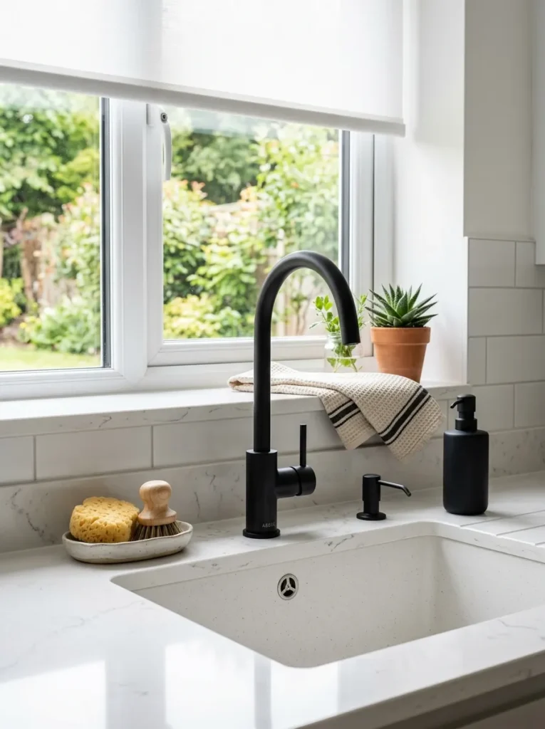
Vibe: The sink area feels graphic and intentional — the matte black a punctuation mark in a light kitchen.
Why it works: Matte black faucet and sink hardware in a predominantly light kitchen applies the design principle of graphic accent through material tone — a single, consistent black element (faucet, soap dispenser, potentially a knife block or utensil holder in the same matte black) creates a visual anchor in a pale kitchen that reads as a deliberate design decision rather than an incidental object. Matte black specifically (rather than gloss black, brushed steel, or chrome) is the correct specification because the non-reflective surface prevents the faucet from competing with the kitchen’s primary light source — a matte surface reads as a defined color rather than a reflective object, maintaining the graphic quality of the black element without the visual complexity of reflections.
How to get it: Source a matte black kitchen mixer faucet from a mid-range plumbing fixture supplier (Abode, Quooker, and Grohe all produce matte black kitchen mixers at accessible price points). Specify a white or cream composite granite undermount sink (Blanco, Franke, and Villeroy & Boch offer composite sinks that complement the matte black without the visual conflict that stainless creates). Match the soap dispenser in the same matte black finish — a mismatched dispenser finish undermines the graphic intentionality of the sink hardware.
Shop The Look
| Product |
|---|
| Matte black kitchen mixer faucet |
| White composite granite undermount sink |
| Matte black soap dispenser kitchen |
| White quartz worktop kitchen standard |
| Simple white roller blind kitchen window |
8. Terracotta and Warm White Two-Tone Kitchen for Mediterranean Warmth
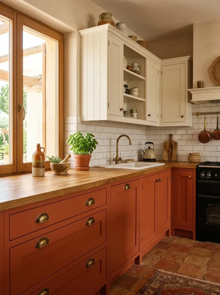
Vibe: The kitchen feels sun-warmed — a room that references the Mediterranean without borrowing its imagery.
Why it works: A terracotta and warm white two-tone kitchen applies the color design principle of warm analogous harmony — terracotta (red-orange earth tone) and warm white (white with a warm yellow undertone) share the same warm chromatic family, creating a kitchen that reads as cohesive and enveloping rather than contrasted. Two-tone cabinetry (darker color below, lighter above) also applies the spatial design principle of visual grounding — heavier-toned lower cabinets ground the kitchen visually, making the room feel settled and stable rather than top-heavy. Oak worktops rather than stone reinforce the warm, organic register of the terracotta palette — the grain and warmth of timber contributes to the Mediterranean material reference alongside the terracotta cabinet color.
How to get it: Specify lower cabinetry in Farrow & Ball Berber Pink No. 14 (which reads as terracotta in natural light), Little Greene Tomato, or Benjamin Moore Pueblo 2089-30. Specify upper cabinetry in the same warm white as the ceiling — Dulux Timeless, Farrow & Ball All White No. 2002, or Benjamin Moore White Dove OC-17 for a seamless upper wall-to-cabinet transition. Use aged brass cup pulls throughout both upper and lower cabinetry for hardware continuity — mixing hardware finishes across a two-tone kitchen splits the composition visually.
Shop The Look
| Product |
|---|
| Terracotta kitchen cabinet paint matte warm |
| Warm white kitchen paint upper cabinets |
| Solid oak kitchen worktop 40mm |
| Aged brass cup pull cabinet hardware |
| White metro tile kitchen splashback set |
9. Under-Cabinet LED Strip Lighting for Task and Ambient Illumination
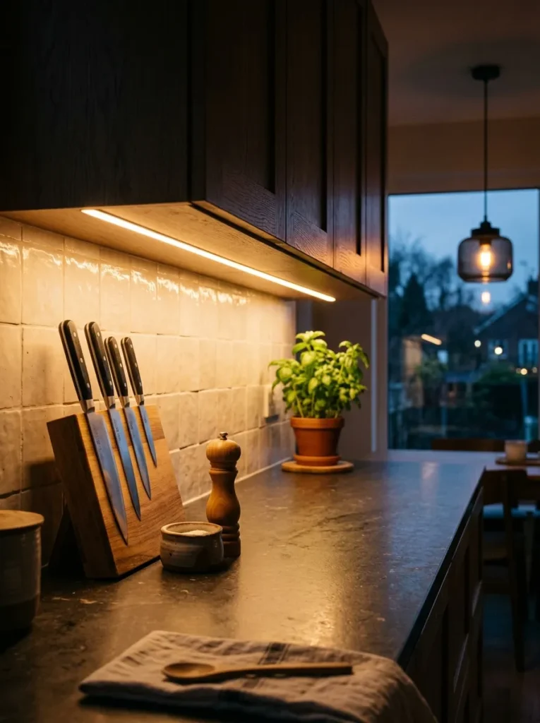
Vibe: The kitchen at dusk feels warm and functional simultaneously — the task light doing its job while the room becomes something more atmospheric.
Why it works: Under-cabinet LED strip lighting applies the hospitality lighting principle of multi-source layered illumination — task lighting at counter level, ambient lighting from ceiling pendants or recessed fixtures, and decorative accent lighting from island or bar pendants create a kitchen that can shift from a bright working environment to a warm atmospheric space by adjusting which light circuits are active. Under-cabinet LEDs specifically solve the kitchen’s primary task lighting problem: standard overhead ceiling lighting creates shadows on the worktop surface from the cook’s own body — the cook stands between the light source and the work surface, casting a shadow precisely where precision cutting and preparation require the most light. Under-cabinet LEDs eliminate this shadow completely by positioning the light source between the cook’s eyes and the work surface.
How to get it: Install warm-white LED strip lights (2700K, minimum CRI 90 for accurate food color rendering) in an aluminium channel with a frosted diffuser fitted beneath the front rail of every upper cabinet. Route the cable from strip to strip through the cabinet interiors (drill a 10mm cable pass hole in the cabinet’s inner side panel, concealed by the cabinet door when closed) and connect all strips to a single circuit on a dimmer switch. The dimmer switch allows the same strip lights to serve as bright task illumination when cooking and warm ambient lighting when dining.
Quick Win: A 5-metre roll of 2700K warm white LED strip tape with an aluminium channel and frosted diffuser ($35–55) installed under the upper cabinets in a single afternoon is the single lighting upgrade that most consistently transforms both the kitchen’s task functionality and its evening atmosphere.
Shop The Look
| Product |
|---|
| Warm white LED strip tape 2700K CRI90 |
| Aluminium LED channel frosted diffuser |
| LED strip dimmer switch inline |
| Cabinet cable pass grommet set |
| Warm white LED power supply transformer |
10. Handleless Push-to-Open Cabinetry for a Seamless Modern Profile
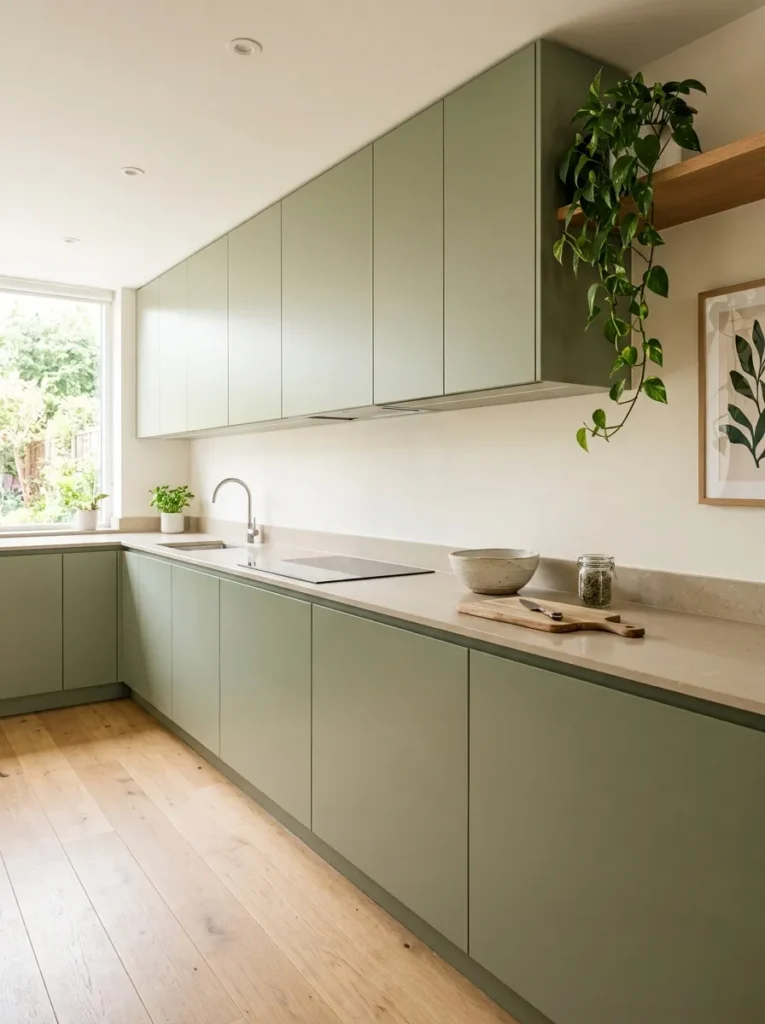
Vibe: The kitchen reads as seamless and calm — the absence of hardware making the room feel resolved rather than equipped.
Why it works: Handleless push-to-open cabinetry applies the design principle of uninterrupted surface — when every cabinet face is free of hardware, the kitchen’s cabinetry reads as a single continuous composition rather than a series of individual units, each interrupted by a handle. This visual continuity is the defining characteristic of the most refined contemporary kitchen designs in both residential and commercial contexts. The push-to-open mechanism (either a magnetic press-and-release system or a mechanical rebound system integrated into the hinge) maintains full drawer and door functionality without any visible hardware element — making the cabinetry face the sole visual subject. Sage green in a satin finish is the optimal color for a handleless kitchen because the slight sheen of satin highlights the precise edge lines of the slab doors — the only surface detail available on a handle-free cabinet.
How to get it: Specify Blum TIPMATIC or equivalent rebound system integrated into standard soft-close hinges for door applications, and Hettich Sensys or equivalent push-to-open slides for drawer applications. These mechanisms are standard fitments in fitted kitchen cabinetry and add approximately $8–15 per door or drawer over standard hardware. The cabinet reveal (the visible gap at the door edge) must be precise to make the push-to-open mechanism visible as a design detail rather than a tolerance error — specify 2mm reveals on all four sides of every door.
Shop The Look
| Product |
|---|
| Push-to-open hinge rebound system Blum |
| Push-to-open drawer slide set |
| Sage green kitchen paint satin finish |
| Light stone porcelain worktop 20mm |
| Trailing plant shelf end panel |
11. Scalloped or Arched Cabinet Toe Kick for Architectural Detail
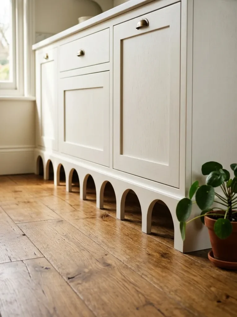
Vibe: The toe kick detail feels designed at every scale — the kind of detail that architects notice and clients remember.
Why it works: A scalloped or arched toe kick profile applies the interior design principle of architectural detail at the smallest scale — the toe kick (the recessed base panel beneath base cabinets) is typically the most generic and least designed element of any kitchen, presenting as a flat painted panel. Routing a continuous scalloped arch profile into the toe kick panel creates a rhythmic architectural detail that is visible from across the room at low viewing angles (when sitting at a kitchen table or island) and on close approach, adding surface interest without competing with any other design element. The scallop/arch reference is also historically resonant — the arched profile appears in everything from Gothic architectural arcades to mid-century modern furniture, giving the detail a design pedigree that makes it read as referenced rather than arbitrary.
How to get it: Cut the scalloped profile in a continuous MDF panel using a jigsaw with a thin-kerf blade, following a template made from a piece of cardboard with the arch dimensions marked and cut out. The arch width should be proportioned to the toe kick height (standard toe kicks are 100mm tall — arches of 80mm height and 120–150mm width produce the best proportion). Sand all cut edges to 180 grit and fill with MDF primer before painting in the cabinet color. The curved cut edge of MDF requires a minimum of two coats of primer and one coat of paint for a smooth finish.
Shop The Look
| Product |
|---|
| MDF panel sheet 9mm thin toe kick |
| Jigsaw thin kerf blade set curved |
| MDF primer sealer undercoat |
| White satin kitchen paint touch-up |
| Arch template cardboard craft set |
12. Concrete-Effect Worktop for Industrial Modern Kitchens
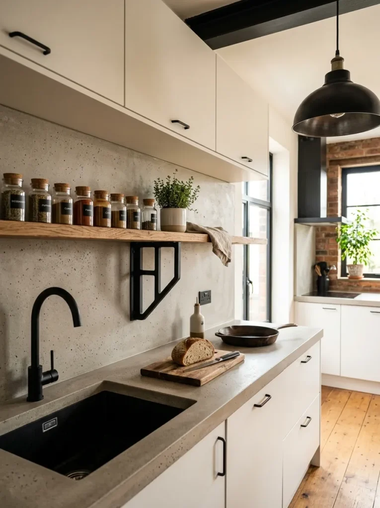
Vibe: The kitchen feels raw and refined simultaneously — the concrete reference warm and domestic rather than cold and commercial.
Why it works: A concrete-effect porcelain worktop applies the design principle of material ambiguity — a surface that references industrial concrete while providing the practical properties of engineered porcelain (heat-resistant, stain-resistant, zero-maintenance) delivers both an aesthetic bold enough to be a design statement and performance properties that poured concrete cannot match in a domestic kitchen. Contemporary porcelain printing technology produces concrete-effect surfaces with genuine aggregate texture variation and warm gray tonal range that at working proximity read as convincingly as poured concrete while being incomparably more practical. The full-height splashback continuation (the same porcelain material run from worktop to underside of upper cabinet, typically 600–650mm) eliminates the standard worktop-to-wall junction and creates a complete material volume at the kitchen’s working zone.
How to get it: Specify Atlas Concorde or Mirage’s concrete-effect porcelain in large format (800×800mm or larger) for the worktop and splashback, ensuring both surfaces are from the same product run to guarantee tonal consistency. The worktop specification should be 20mm thick for adequate structural depth; the splashback can be 10mm or 12mm. Install the worktop and splashback as a single material commission — the junction between the horizontal and vertical planes is a mitered or coved joint that must be continuous for the full-height effect to work.
Shop The Look
| Product |
|---|
| Concrete effect porcelain tile large format |
| 20mm porcelain worktop slab concrete look |
| Industrial metal shelf bracket black set |
| Cast iron skillet kitchen essential |
| Glass spice jar set kitchen shelf |
13. Warm Timber Island Base with Painted Perimeter for Visual Texture
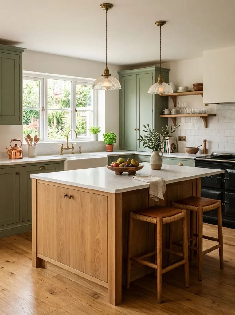
Vibe: The kitchen feels material-rich and warm — the natural oak doing what painted cabinetry cannot, adding a living quality to the room’s most central piece.
Why it works: A natural timber island base contrasting with painted perimeter cabinetry applies the design principle of material contrast within a consistent color family — natural oak (warm yellow-brown) and sage green (warm yellow-green) share the same warm-yellow undertone, making the combination feel cohesive despite the significant difference between a natural material and a painted surface. This specific pairing has become the most commercially successful kitchen design combination in the UK market since approximately 2020, referenced in virtually every kitchen design publication and showroom. The island’s natural material quality makes it the compositional center of the kitchen in material as well as spatial terms.
How to get it: Specify island cabinet doors in natural white oak veneer on an MDF substrate (solid oak doors are significantly more expensive and prone to movement — oak-veneered MDF provides identical appearance with superior dimensional stability). Apply a UV-resistant matte lacquer to the oak veneer to protect against the oil, moisture, and food contact that an island worktop base inevitably receives. Specify perimeter cabinetry in a sage paint that shares the warm undertone of the oak — test the paint color against the specific oak veneer sample in the kitchen’s actual light before committing.
Shop The Look
| Product |
|---|
| Oak veneer kitchen door slab 18mm |
| UV lacquer matte cabinet wood protection |
| Sage green perimeter cabinet paint |
| White stone worktop island 40mm |
| Copper kettle kitchen classic |
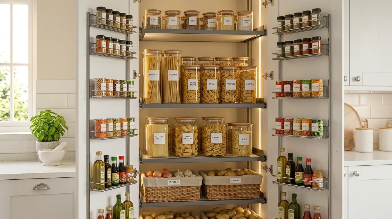
14. Tall Larder and Pantry Pull-Out Storage for Maximum Organization
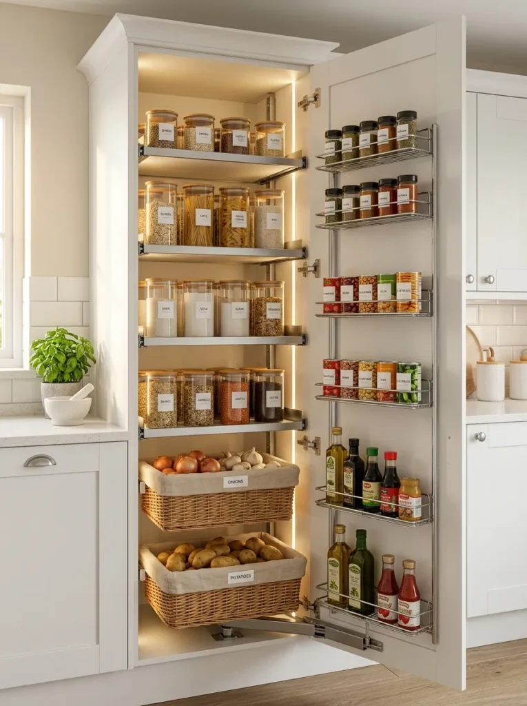
Vibe: The larder interior feels entirely solved — the satisfaction of a storage system that has a place for everything and everything in its place.
Why it works: A full-height larder cabinet with pull-out interior fittings applies the storage design principle of full-depth accessibility — standard shelved larder cabinets are 60cm deep and typically allow only the front 30cm of depth to be actively used, with the back 30cm becoming dead storage that accumulates forgotten items. Pull-out shelf mechanisms bring the full cabinet depth forward to the user, making every centimeter of the larder actively accessible. A well-specified larder pull-out system (door shelving for small items, pull-out wire baskets for produce, and full-width pull-out shelves at mid-height for boxed goods) accommodates the complete pantry inventory of a working family kitchen in a single 60cm wide cabinet, eliminating the distributed and disorganized food storage that undermines kitchen functionality.
How to get it: Source a full-height larder pull-out fitting from Häfele, Rev-A-Shelf, or Kesseböhmer — these are the primary suppliers of high-quality pull-out larder systems. Specify a system with three functional zones: door-mounted tiered shelf (for jars, spices, and small containers), mid-height pull-out shelves (for boxed and canned goods), and base pull-out baskets (for root vegetables and bulk items). Install internal LED strip lighting to the larder cabinet’s top rail — a larder without internal lighting prevents full inventory visibility at the back of any shelf.
Shop The Look
| Product |
|---|
| Full height larder pull-out fitting kit |
| Internal cabinet LED strip with sensor |
| Glass food storage canister set labeled |
| Pull-out wire basket set larder |
| Door-mounted spice rack shelf fitting |
15. Small Kitchen Transformation with Bold Color and Mirror Splashback
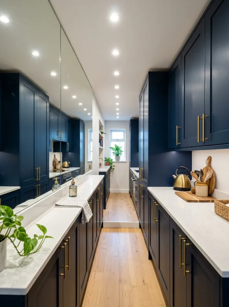
Vibe: The small kitchen feels bold and spacious simultaneously — the mirror doing what no extension or renovation could, doubling the apparent width.
Why it works: A mirror splashback in a small galley kitchen applies the spatial design principle of reflective expansion at the working wall — a mirror running the full length and height of the splashback zone reflects the opposite cabinet run, the task lighting, and the cook’s activity, creating the perception of a kitchen twice the galley’s actual width. This is the most impactful single spatial improvement available in a narrow kitchen because it requires no structural work and no change to the kitchen’s layout or cabinetry. Deep navy cabinetry in a small kitchen applies the counter-intuitive design principle that dark colors in small rooms are not inherently space-reducing — a bold, saturated color in a small space reads as confident and designed rather than compressed, whereas a light color in the same space reads as neutral and modest rather than spacious.
How to get it: Source a mirror cut to the exact dimensions of the splashback zone from a glazier — specify 6mm glass (standard mirror glass at 4mm flexes slightly under thermal variation and can distort reflections in a cooking environment). Apply the mirror to the wall using mirror adhesive and mirror clips at each corner and mid-point. The mirror’s lower edge should sit on the worktop surface with a 2mm silicone bead sealing the joint. Install recessed LED downlights at a density of 2 per meter run of the kitchen length for task illumination that the mirror reflects and amplifies throughout the galley.
Shop The Look
| Product |
|---|
| Mirror glass cut to size 6mm splashback |
| Mirror adhesive heavy duty wall |
| Mirror safety clip set corner |
| Deep navy cabinet paint satin |
| Recessed LED downlight warm white set |
How to Start Your Bold Kitchen Transformation
The single best first move before specifying any new cabinetry, worktop, or appliance is resolving the kitchen’s lighting plan. Every other design decision — the cabinet color, the worktop material, the hardware finish — will look fundamentally different under the kitchen’s actual lighting conditions than it will in a showroom, on a screen, or in a photograph. A kitchen planned under cool fluorescent lighting and delivered into a warm pendant and downlight environment will read completely differently from the design intent. Commission a lighting designer or spend the time to resolve the circuit plan, the color temperature (2700K for warm, 3000K for neutral-warm — avoid 4000K in a domestic kitchen), and the dimmer switch configuration before any other specification is finalized.
The most common mistake in kitchen renovation is spending the available budget evenly across all elements rather than concentrating it at the highest-impact moments. The visual quality of a kitchen is determined primarily by three elements in descending order of impact: the cabinetry (the largest surface area, visible throughout the room), the worktop (the horizontal surface that receives the most direct attention during use), and the hardware and faucet (the smallest area but the highest-detail element experienced closest). Spending 60% of the available budget on cabinetry and worktop, 15% on hardware and plumbing fixtures, and 25% on lighting and appliances produces a significantly more resolved result than distributing budget equally — the cabinetry and worktop are the room, and the hardware is the detail that makes the room look expensive.
Three specific items under $50 that immediately improve any kitchen’s design quality: a set of unlacquered brass or matte black bar pulls ($4–8 each, replacing existing chrome or white plastic handles across all cabinets for a total of $40–80 for a standard kitchen); a roll of warm white LED strip tape with an aluminium channel ($35–55 for a 5-metre roll, installed under upper cabinets for task lighting and evening atmosphere in a single afternoon); and a ceramic utensil holder in a material-specific finish (white ceramic, terracotta, or matte black, $15–25) that replaces a plastic or stainless utensil container and contributes to the kitchen’s material palette on the worktop surface.
A surface refresh — new hardware, new lighting, and a paint update on existing cabinetry — is achievable in one weekend for $200–600 and produces a dramatically different visual result without replacing a single cabinet carcass. A mid-range kitchen renovation with new door fronts, worktop replacement, new sink and faucet, and lighting installation runs $3,000–8,000. A full kitchen replacement including new carcasses, integrated appliances, bespoke island, and specialist worktop material represents a $15,000–40,000 investment in most UK and US markets. The hardware and lighting improvements are achievable this weekend; the worktop and cabinetry investments follow a sequence determined by budget and renovation scope.
Frequently Asked Questions About Stylish Kitchen Ideas
What is the most impactful single change I can make to an existing kitchen?
The single most impactful change to an existing kitchen is replacing the cabinet hardware — handles, knobs, and pulls — with a considered specification in a contemporary finish. This change affects every door and drawer in the kitchen simultaneously, costs between $80 and $250 for a full kitchen, takes a single afternoon to complete, and produces a visual result that most observers attribute to a full kitchen renovation rather than a hardware swap. The hardware to choose: unlacquered brass bar pulls for a warm contemporary kitchen, matte black bar pulls for a graphic modern kitchen, or brushed nickel bar pulls for a clean transitional kitchen. Avoid satin chrome (dates quickly), polished chrome (shows every fingerprint), and white plastic (the most generic and lowest-quality option available).
What worktop material is the best combination of looks and practicality?
Quartz engineered stone offers the best combination of aesthetic quality and practical performance for a domestic kitchen. It is non-porous (no sealing required, bacteria cannot penetrate the surface), heat-resistant to approximately 150°C (above this, a trivet should be used), impact-resistant, and available in an extensive range of colors and surface patterns including highly convincing marble, concrete, and stone effects. Its only significant limitation is UV sensitivity — quartz in direct strong sunlight may discolor over years, making it less appropriate for a kitchen with large south-facing windows. For kitchens with significant direct sun exposure, large-format porcelain is the preferred alternative — it shares quartz’s practical advantages while being completely UV stable.
How do you make a small kitchen feel larger without structural work?
Four design interventions make a small kitchen feel larger without any structural change: a mirror splashback (which reflects the kitchen back on itself, doubling the apparent width as described in Idea 15); removing upper cabinet doors and replacing with open shelving (which eliminates the visual weight of closed cabinet boxes at eye level and opens the kitchen’s vertical dimension); a continuous worktop material that extends to the wall and to the splashback zone without joints or changes of material (which eliminates the visual fragmentation of multiple materials and makes the kitchen read as a single surface); and reducing the number of visible objects on worktops to the minimum necessary (which reduces visual clutter and allows the kitchen’s design decisions to read clearly rather than being obscured by accumulated items).
What kitchen cabinet color is most timeless?
The most consistently timeless kitchen cabinet colors are those in the warm neutral range — warm white (not cool bright white, which ages poorly), warm greige (gray with a warm beige undertone), and warm off-white with a slightly yellow or green tinge. Farrow & Ball’s Mole’s Breath, Elephant’s Breath, and Shaded White; Benjamin Moore’s White Dove and Pale Oak; and Little Greene’s Slaked Lime all have proven longevity. Deep colors — particularly forest green, warm navy, and warm charcoal — have demonstrated stronger longevity than expected, appearing consistently across twenty years of high-end kitchen design rather than as trend-driven choices. The colors that age most poorly are those tied to specific trend periods: the terracotta of the 1990s (though the current terracotta iteration is more sophisticated), the pale gray of the 2010s (already dating), and the highly saturated primary blues and greens of individual design moments.
How important is kitchen lighting and what should I prioritize?
Kitchen lighting is the most important and most consistently under-specified element of kitchen design — a well-designed, well-specified kitchen with poor lighting looks worse than a budget kitchen with excellent lighting. The prioritization order for kitchen lighting is: task lighting first (recessed LED downlights or under-cabinet LED strips providing adequate illumination at the worktop surface — minimum 300 lux at worktop level, ideally 500 lux); ambient lighting second (a general room illumination source that is separate from the task lighting and dimmable for evening use); and decorative or accent lighting third (pendants over the island, interior cabinet lighting for open shelving or glass-front cabinets). All kitchen lighting should be on at least two separate dimmer circuits — task lighting and ambient lighting on independent circuits allow the kitchen to shift from a bright working environment to a warm social environment without changing the room’s physical furniture arrangement.
Ready to Build Your Dream Stylish Kitchen?
These 15 ideas move through every dimension of what makes a kitchen both bold enough to feel designed and functional enough to work for how you actually cook — from the material specificity of deep forest green cabinetry with unlacquered brass, to the spatial intelligence of mirror splashbacks and larder pull-outs, to the lighting precision of under-cabinet LED strips and kitchen-height recessed downlights, to the architectural ambition of floor-to-ceiling porcelain splashbacks and scalloped toe kick details. Starting with the hardware and the under-cabinet lighting — two improvements that cost under $150 combined and take a single weekend to install — is not a partial approach to the kitchen you want. It is the correct first act, because it proves the material direction, tests the color temperature, and delivers an immediately visible improvement that makes the next investment decision easier and more confident. Order the hardware and the LED strip today, and the kitchen transformation has already begun at its two highest-return moments. Pin the cabinetry color and worktop ideas that match your cooking environment and your design intention, and return to the built-in larder and island specification when the lighting and hardware have confirmed the palette that the whole room will follow.