15 Stylish Green Living Room Designs for Every Home
A green living room is a decorating approach that uses green as the primary color — whether in wall paint, upholstery, textiles, cabinetry, or a combination of these — to create a living room that is simultaneously warm, sophisticated, and connected to the natural world in a way that no other color achieves in residential interiors. This article gives you 15 genuinely creative, styled green living room designs that span the full spectrum of green’s tonal range and design register — from the palest sage to the deepest forest — making the most versatile and most forgiving color in the interior design palette work for every home style, every room size, and every available budget.
Most green living rooms default to the obvious — a generic sage accent wall, a forest green sofa in an otherwise untouched room, a mint that reads as either hospital or nursery depending on the light. The living rooms in this list make more considered choices: they use green with compositional intelligence, pairing it with materials and tones that amplify its specific warmth, and applying it at scales and in formats that make it read as a genuine design decision rather than a color trend followed at a distance. Here are 15 ideas worth saving — and decorating with.
Why Green Living Room Designs Work So Well
Green’s dominance in contemporary residential interior design is not a passing trend but the most recent expression of a design tradition that stretches back to William Morris’s botanical wallpapers of the 1870s, the Arts and Crafts movement’s reverence for the natural world, and the long history of green as the color most associated with the domestic garden brought inside. What distinguishes the contemporary green interior from its predecessors is the sophistication of the specific greens now in use — the dusty, complex, slightly greyed greens of Farrow & Ball’s Mizzle and Calke Green, the deep, saturated greens of Sherwin-Williams’ Jasper and Pewter Green, the warm, olive-inflected greens of Benjamin Moore’s Tate Olive and Avocado — which are all significantly more nuanced and more livable than the flat, bright, or acidic greens that characterized earlier periods of green’s decorating popularity.
The materials that most naturally and most powerfully coordinate with green are those that share its organic, earth-derived quality. Natural linen in warm ivory and oatmeal tones is the textile that most effectively complements any green in the dusty-to-forest range because its neutral warmth prevents the green from reading as cool or clinical. Warm timber — oak, walnut, teak, and rattan — provides the material counterpoint that grounds any green palette in the warmth that prevents it from feeling cold. Natural stone — travertine, limestone, and marble — provides the mineral-cool counterpoint that gives deep greens their most sophisticated companions. Aged brass and burnished gold are the metal finishes that most consistently elevate any green interior from pleasant to editorial, because the warm gold provides a color complement to green’s blue-green tones that reads as decoratively decisive rather than neutrally safe.
The biophilic design research that has accumulated over the past two decades provides a scientific basis for what designers have known intuitively for centuries: green interiors produce measurable reductions in stress and blood pressure, improvements in mood and creativity, and increases in the sense of spatial generosity compared to equivalent rooms in other color palettes. This is not merely an aesthetic preference but a physiological response to the evolutionary association between green environments and the safe, resource-rich habitats that the human nervous system interprets as favorable living conditions. A green living room is, at its most fundamental, a room that the human body reads as good to be in.
Small living rooms benefit specifically from green because green — particularly in its mid-depth range, from sage through to soft forest — creates spatial depth on walls in a way that flat neutrals cannot. Green walls advance toward the viewer in warm light and recede from the viewer in cool light, creating a dynamic wall surface that makes the room appear to change dimension across the day — a quality that makes small rooms feel more spatially interesting and more spatially generous than the same small room in white or grey.
Style at a Glance
| Element | Detail |
|---|---|
| Philosophy | Green is not a color trend in the living room — it is the natural world’s most successful domestic design decision, applied with the sophistication of the specific green chosen |
| Key Companion Materials | Natural linen, warm timber, aged brass, travertine, rattan, boucle, velvet, marble |
| Color Palette | Pale sage, dusty sage, warm olive, deep forest, emerald, dark myrtle, warm hunter, black-green |
15 Stylish Green Living Room Designs
1. All-Over Deep Forest Green for a Moody Maximalist Living Room
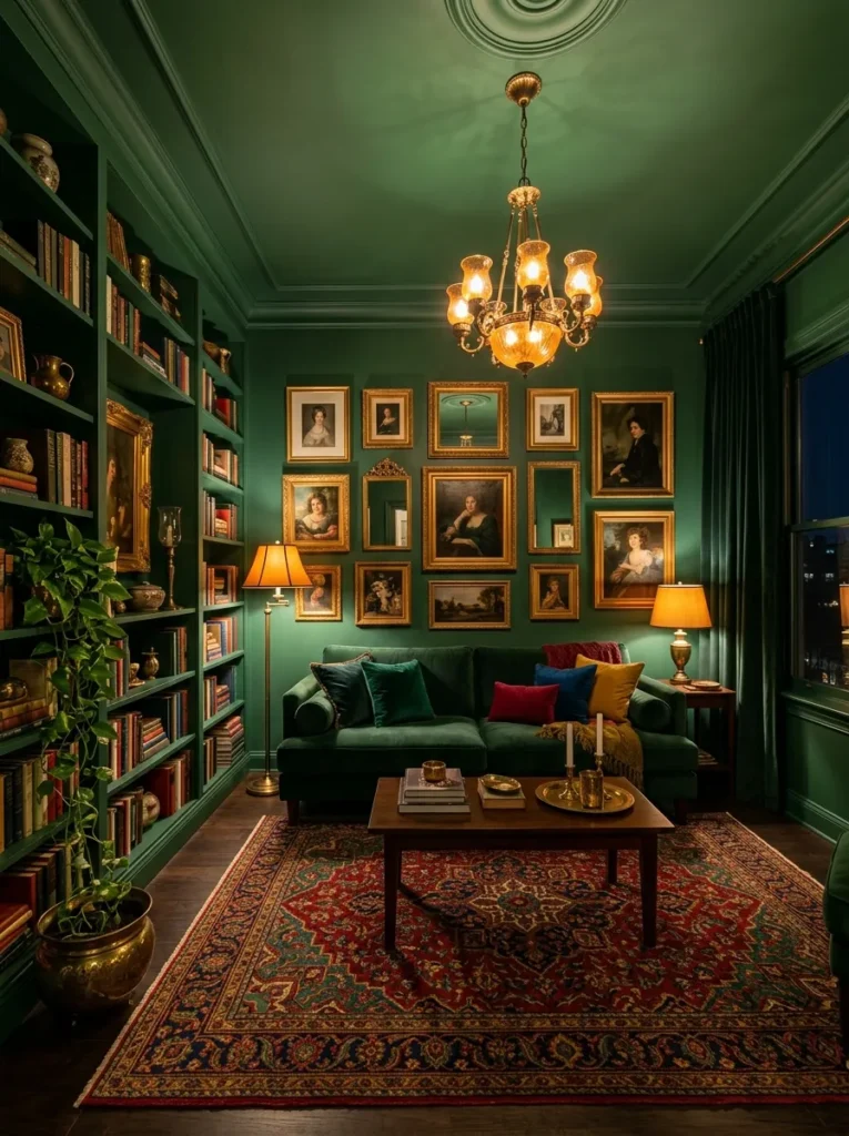
Vibe: Moody and maximalist — the living room that makes evening feel like the best part of the day.
Why it works: The all-over deep forest green living room — walls, ceiling, and built-in shelving all in the same deep saturated green — is the green living room design that most powerfully creates the sense of enveloping, immersive spatial identity. Painting the ceiling the same color as the walls removes the most visually disruptive element of most painted rooms (the stark white ceiling that visually floats above the colored walls as though it belongs to a different room) and creates instead a continuous color environment that reads as genuinely designed and genuinely considered. The all-over green specifically works in a deep forest tone because the depth of the color creates enough variation in its appearance across differently lit surfaces — the ceiling reads lighter than the walls, the walls read darker in shadowed corners — to prevent the room from feeling monotonous despite the single-color application. A pale green applied all-over would read as flat; a deep green applied all-over creates the dimensional quality that makes the room feel like a deliberately created environment rather than a painted box.
How to get it: Apply the same deep forest green to walls, ceiling, and any built-in joinery in a single color — Farrow & Ball’s Calke Green No. 80, Sherwin-Williams’ Jasper SW 6216, or Benjamin Moore’s Forest Green 2047-10 are all appropriately deep and complex for this application. The ceiling application requires a flat or matte paint (less sheen on the ceiling reduces glare from overhead light sources), while the walls can be in eggshell for durability and the bookshelves in satin for wipeable surface quality. Introduce warmth through amber-toned lighting exclusively — cool or white light in a deep green room reads as cold and institutional.
Quick Win: Painting the ceiling the same deep green as the walls — without changing any other element of a green room — immediately transforms the room’s atmospheric quality from a colored room to an immersive environment, at no additional material cost beyond the extra paint required for the ceiling area.
Shop the Look
| Product |
|---|
| Deep forest green interior paint matte |
| Velvet sofa deep green |
| Brass chandelier warm light |
| Persian rug jewel tones |
| Gold picture frame set |
Also view: 13 Cozy Bedroom Decor Ideas That Feel Dreamy
2. Sage Green Walls with Natural Linen and Warm Oak
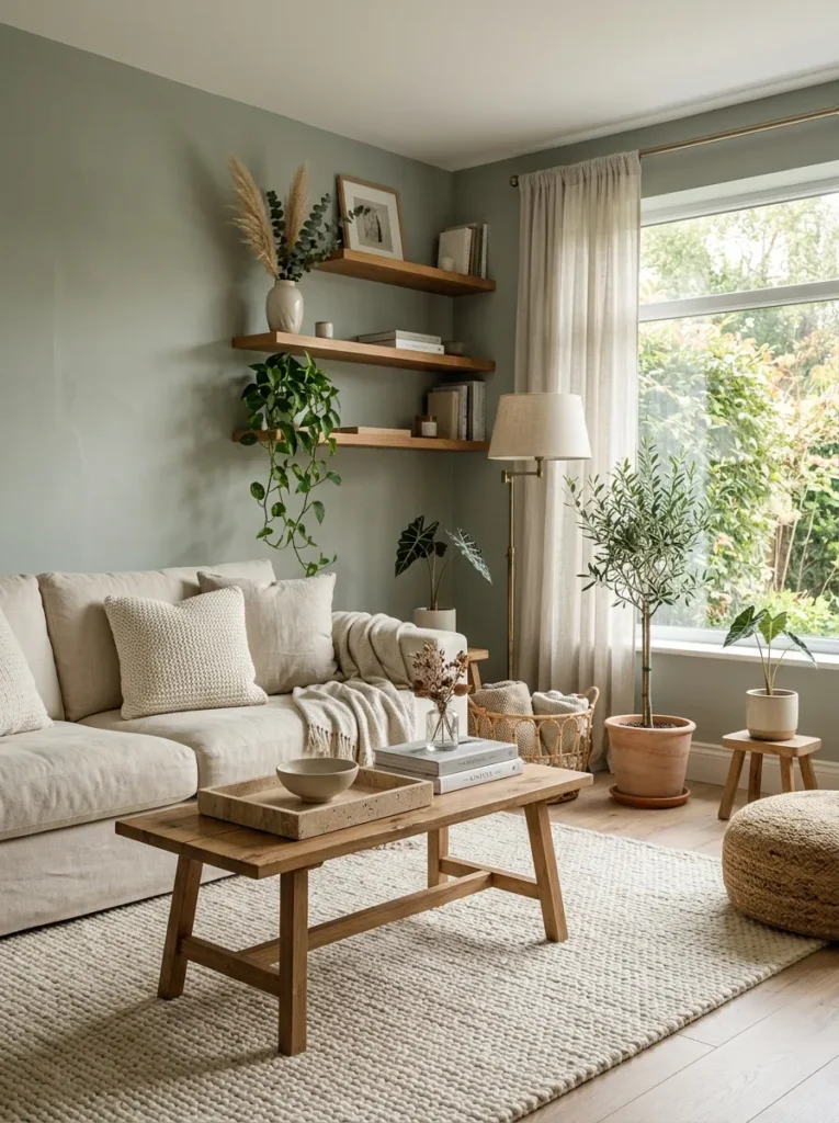
Vibe: Calm and organic — the living room that makes you breathe more slowly from the moment you walk in.
Why it works: Dusty sage green paired with natural linen and warm oak is the green living room combination that most effectively achieves the contemporary Scandinavian organic aesthetic — the warm-greyed sage is neither so saturated that it reads as a color statement nor so pale that it reads as a neutral, occupying the precise tonal position that reads as designed and intentional without being assertive. The natural linen sofa in warm ivory is the textile choice that most gracefully complements any sage or dusty green palette because the warm ivory of natural linen contains the same warm yellow-green undertone that unifies it with sage green across the color temperature spectrum — they read as from the same natural palette rather than from contrasting tonal families. The oak and travertine accessories compound this natural material coherence: the warm honey of oak coordinates with the warm undertone of the sage wall, and the slightly warm-grey of travertine provides the material cool counterpoint that prevents the palette from reading as uniformly warm and one-dimensional.
How to get it: Farrow & Ball’s Mizzle No. 266 is the benchmark dusty sage that most interior designers reference for this specific quality — it shifts from warm sage in morning light to grey-sage in afternoon light to blue-sage in evening light, providing the temporal variation that makes a painted room feel dynamic rather than static. Dulux’s Tranquil Retreat and Benjamin Moore’s Saybrook Sage HC-114 are both accessible alternatives in the same tonal register.
Shop the Look
| Product |
|---|
| Dusty sage green paint eggshell |
| Natural linen sofa ivory |
| Oak floating shelf set |
| Travertine decorative tray |
| Cream natural wool rug large |
Also view: 15 Stylish Kids Closet Storage Ideas for Small Spaces
3. Emerald Green Velvet Sofa Against a Neutral Wall
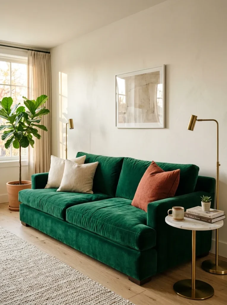
Vibe: Warm and confident — the sofa that makes every other element in the room seem to have been chosen specifically to accompany it.
Why it works: A single emerald green velvet sofa against a neutral wall is the green living room design with the highest design impact per investment, because it delivers the room’s entire green statement in a single furniture purchase without requiring any wall painting, architectural change, or compositional commitment beyond the sofa’s own placement. The emerald green velvet sofa works specifically because velvet is the fabric whose surface behavior most amplifies the visual quality of a saturated color — the pile direction creates zones of slightly different color intensity as light moves across the surface, making the green appear both richer and more dimensional than the same green in a flat fabric. The emerald specifically — as opposed to sage, forest, or olive — is the correct green for a neutral-wall sofa because its saturation provides sufficient visual weight to serve as the room’s primary focal point without requiring any other green element to support it.
How to get it: Size the emerald velvet sofa at minimum 2.2 meters for a standard living room — a smaller sofa in a saturated color loses its visual weight and reads as an accent piece rather than a room anchor. The cushion arrangement should include one terracotta or warm rust cushion alongside the neutral linen — this color-complement accent (green and terracotta are near-complementary) is the styling detail that elevates a green sofa from simply bold to decoratively sophisticated. Performance velvet (Crypton or similar treatment) is the practical choice for a sofa that will see regular use — it maintains the visual quality of standard velvet while resisting the crushing and marking that makes standard velvet impractical for daily use.
Shop the Look
| Product |
|---|
| Emerald green velvet sofa large |
| Slim brass floor lamp pair |
| Marble side table round |
| Natural linen cushion cover set |
| Terracotta cushion cover accent |
4. Dark Olive Green Living Room with Warm Timber and Leather
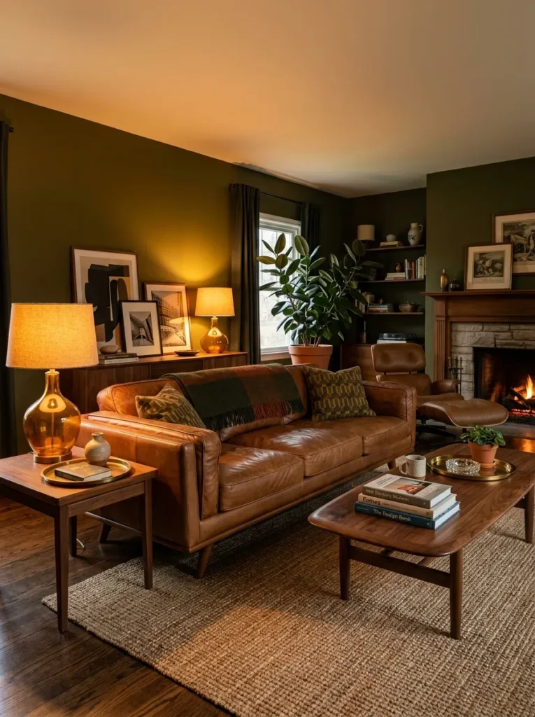
Vibe: Warm and masculine — the living room that reads like the study of someone who has been to every interesting place and brought something home from each of them.
Why it works: Dark olive green — the green with the strongest yellow and brown undertones, sitting closest to khaki on the color spectrum — is the green that most naturally pairs with warm masculine materials (leather, walnut, sisal, amber glass) because its own warm undertones connect it to the warm tonal family of cognac, caramel, and dark walnut rather than to the cooler tonal families that other greens occupy. This warm connection between the olive green wall and the warm leather and timber surfaces of the furniture creates the specific material coherence that makes the room read as deliberately composed rather than assembled from independent purchasing decisions. Olive green also has the specific quality of reading simultaneously as dark and warm — a combination that is rare among wall colors and specifically desirable in a living room that needs to feel both sophisticated and hospitable.
How to get it: Farrow & Ball’s Tench No. 291, Sherwin-Williams’ Oregano SW 6179, and Benjamin Moore’s Tate Olive 2150-20 all occupy the correct position in the dark olive spectrum. The leather sofa should be in a cognac or warm tan rather than a dark brown or black — the warm orange-brown of cognac leather provides the maximum contrast with the olive green while remaining within the same warm tonal family. Sisal or jute rugs in natural tones are the correct floor covering for this palette — a wool rug in any color would be too soft and residential for the leathery, material-rich quality that the dark olive room requires.
Shop the Look
| Product |
|---|
| Dark olive green paint |
| Cognac leather sofa |
| Walnut coffee table round |
| Sisal rug natural large |
| Amber glass table lamp |
5. Green and Pink Living Room in a Botanical Maximalist Style
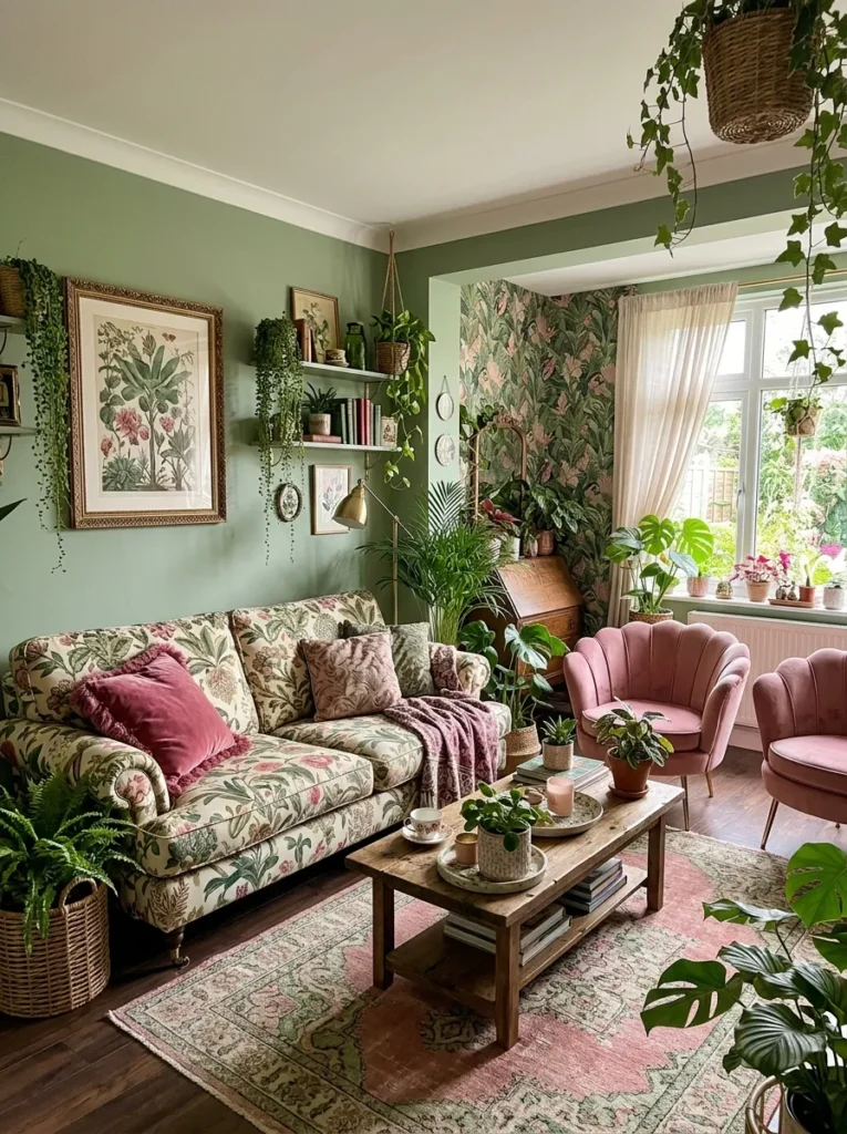
Vibe: Lush and botanical — the living room that makes every other room feel slightly under-planted.
Why it works: The green and pink botanical maximalist living room is the design combination that most completely embraces green’s historical association with the garden brought indoors — the specific pairing of green and pink references the most common combination in the natural flower world (green foliage and pink blossom) and the long decorating tradition of botanical print textiles that have expressed this combination since the chintz fabrics of the 18th century. Green and pink are specifically harmonious rather than merely complementary because they share the same warmth — a warm sage green and a warm dusty pink both contain yellow-red undertones that connect them to the same organic warm palette. The abundance of real indoor plants is the element that completes the botanical reading of the room — the green paint and botanical print textiles suggest the garden, while the actual living plants make the suggestion literal.
How to get it: The botanical print sofa fabric is the room’s organizing object — source it first and build the palette from its specific greens and pinks rather than selecting the sofa to complement a pre-chosen wall color. Botanical print upholstery fabrics are available from specialist fabric suppliers (Schumacher, Kravet, and Colefax and Fowler all produce extensive botanical print collections) and can be specified to upholster any standard sofa frame. The pink accent chairs should be in a dusty or muted pink rather than a bright or saturated pink — the dusty pink coordinates with the sage green wall through their shared warm undertone, while a bright pink would create a color clash rather than a color complement.
Shop the Look
| Product |
|---|
| Sage green paint eggshell |
| Pink velvet armchair dusty |
| Botanical print cushion set |
| Large indoor plant palm |
| Botanical framed print large |
6. Green Kitchen-Adjacent Living Room with Open-Plan Integration
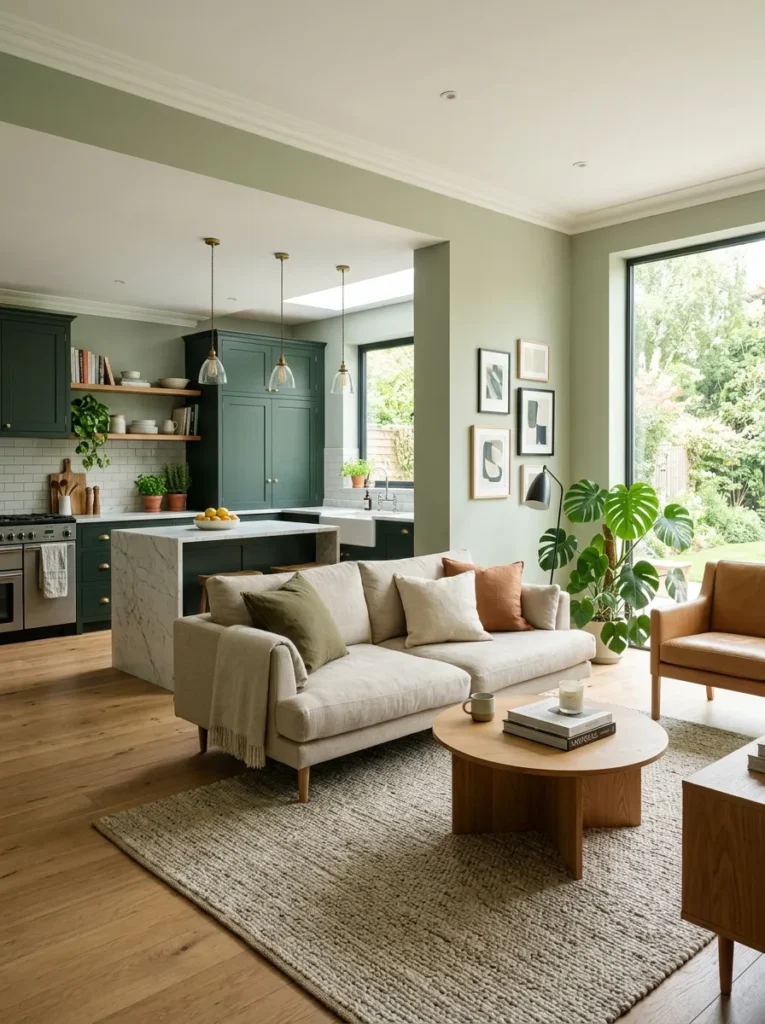
Vibe: Cohesive and considered — the open-plan interior that feels like it was designed by someone who understood that two rooms sharing a wall is an opportunity rather than a constraint.
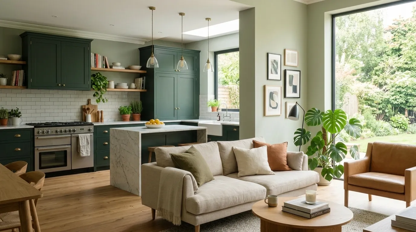
Why it works: The tonal green progression from kitchen to living room — deep sage cabinetry in the kitchen, lighter sage walls in the adjacent living room — is the open-plan design approach that most elegantly creates visual separation between zones without the physical separation of walls. The eye reads the darker and lighter versions of the same green as belonging to the same compositional system, creating a sense of designed coherence across the full open-plan space. The green specifically performs this tonal progression more effectively than most other colors because green’s natural range from dark forest to pale mint contains a full spectrum of tonal variation while remaining within a single recognizable color family — the progression from deep sage kitchen to lighter sage living room reads as a deliberate spatial gradient rather than a color mismatch.
How to get it: Specify the kitchen cabinetry color and the living room wall color from the same paint brand’s color range, choosing two colors that share the same hue family but differ by approximately 2–3 lightness values on the paint brand’s scale — this ensures the tonal progression reads as deliberate gradation rather than accidental inconsistency. The shared floor material (timber, concrete, or stone continuous across kitchen and living zones) reinforces the visual connection between zones that the tonal green progression establishes at wall level.
Shop the Look
| Product |
|---|
| Deep sage kitchen cabinet paint |
| Lighter sage living room paint |
| Marble kitchen island top |
| Natural linen sofa living zone |
| Large area rug living area |
7. Sage Green Paneled Walls with White Trim and Brass Details
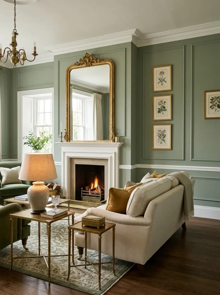
Vibe: Warm and traditional — the living room that makes Georgian architecture feel like the most modern design decision available.
Why it works: Sage green paneled walls with white painted trim and brass details is the living room design combination that most effectively creates the perception of architectural quality and historical depth in a standard residential room. The applied panel molding creates the same shadow-relief detail as genuine period architectural paneling — the shadow line between the sage green panel field and the white painted molding reads as dimensional architectural detail rather than applied decoration — at a fraction of the cost of genuine period renovation. The sage green within the panel field is specifically the correct color choice for this application because it is the historically authentic color range for 18th-century European domestic paneling (Gustavian interiors, Georgian drawing rooms, and French boiserie all used greens in precisely this tonal range for their wall paneling) and because its warmth prevents the paneled room from reading as cold and formal.
How to get it: Apply panel molding using 30mm × 12mm MDF strips applied directly to the wall surface to create the panel profile, painted in a white semi-gloss that creates the crisp trim-to-panel contrast. Paint the panel field (the wall surface within the molding frame) in the sage green and the molding strips and chair rail in the same white used for the ceiling and baseboard — this creates the three-color scheme (sage panel, white molding, white trim) that reads as architecturally authentic. Source genuine brass furniture — occasional tables, lamp bases, picture frames — in solid or plate brass rather than gold-toned chrome or plastic, which read as imitation at close range.
Shop the Look
| Product |
|---|
| Sage green panel field paint |
| White semi gloss trim paint |
| MDF strip molding profile |
| Brass occasional table set |
| Gilt picture frame large |
8. Muted Sage Green Living Room with Terracotta and Natural Fiber
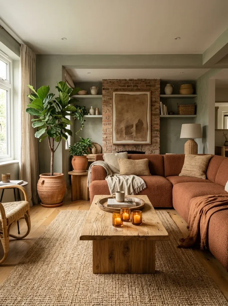
Vibe: Earthy and organic — the living room where the colors feel like they were taken from the landscape rather than chosen from a paint chart.
Why it works: Muted sage green with terracotta is the green living room combination that most completely expresses the biophilic design principle — the pairing of these two colors references the specific color contrast of the natural garden landscape at its most earthy: green foliage against terracotta soil, the sage of dried herbs against the warm clay of a Mediterranean hillside. The specific tone of both colors is critical: a brighter or more saturated green with a brighter or more saturated terracotta would read as color-block contemporary; the muted, slightly greyed sage with the warm, dusty terracotta reads as earthy and organic because both colors share the same quality of slight desaturation that connects them to the natural world rather than to the design-forward world of saturated color. The natural fiber materials (jute rug, sisal texture, raw timber) complete the earthy palette by introducing materials that are literally from the ground.
How to get it: Farrow & Ball’s Mizzle No. 266 and Pigeon No. 25 are both in the correct muted sage register for this palette. The terracotta sofa should be in a wool or natural fabric rather than synthetic — a wool terracotta sofa has the specific matte, slightly textured surface quality that coordinates with the earthy palette, while a synthetic fabric’s sheen introduces a manufactured quality that conflicts with the organic character of the materials. Add jute or sisal rugs rather than wool or synthetic pile — the natural fiber rug’s visible weave structure reinforces the earthy material palette at floor level.
Shop the Look
| Product |
|---|
| Muted sage grey-green paint |
| Terracotta wool sofa |
| Jute rug large natural |
| Terracotta ceramic plant pot |
| Raw timber coffee table |
9. Dark Green Accent Wall Behind the Sofa with Gallery Art
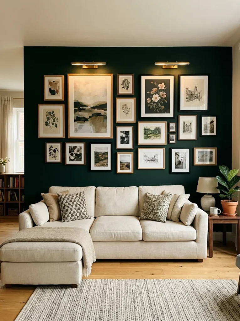
Vibe: Warm and gallery-like — the accent wall that makes the living room feel like a curated private collection rather than a decorated house.
Why it works: A dark forest green accent wall functions as the highest-quality gallery background available in residential design — it creates the same warm, receding visual field that top art galleries use in their darkest rooms to make artwork appear to glow from the wall surface. The deep green is specifically superior to both white and black for this gallery application: white creates too much contrast with the artwork frames, reading as bright and institutional; black creates so much contrast that the frames disappear into the wall; deep forest green provides sufficient contrast to make the artworks read clearly while adding warmth that makes the gallery wall feel intimate and residential rather than institutional. The cream linen sofa positioned against the dark green wall provides the most dramatic sofa-to-wall contrast available in a natural palette, making the sofa appear luminously light against the deep wall behind it.
How to get it: Farrow & Ball’s Down Pipe No. 26 is the definitive very-deep green-grey that reads as dark enough for this application in warm light; for a purer deep green, Calke Green No. 80 or Sherwin-Williams’ Pewter Green SW 6208 both work at the darker end of their respective green ranges. Install picture lights (plug-in brass picture lights are the most cost-effective option at $40–80 each) above the two or three largest pieces in the gallery arrangement — the warm amber light of picture lights against a dark green wall creates the most beautiful residential gallery lighting achievable outside a purpose-built art installation.
Shop the Look
| Product |
|---|
| Deep forest green paint |
| Natural timber picture frame set |
| Black picture frame set |
| Plug in brass picture light |
| Cream linen sofa |
10. Pale Green and White Living Room for Small Spaces
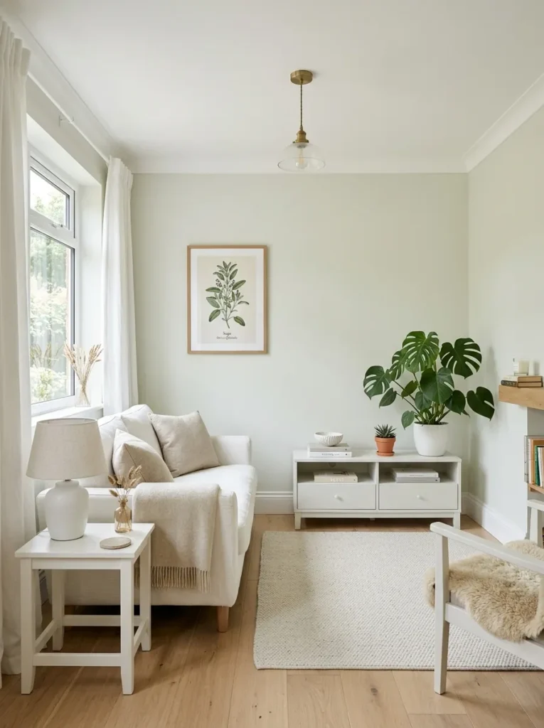
Vibe: Airy and considered — the small living room that manages to feel both intimate and spacious at the same time, which is the most difficult thing a small room can do.
Why it works: Pale green — green so light that it reads as a white with a green memory rather than as a definite color — is the wall color that provides the maximum spatial benefit in a small living room while simultaneously delivering the psychological warmth that green provides. Pure white walls read as blank and unresolved; pale green walls read as intentional and warmly toned, creating the sense that a design decision has been made without introducing the visual weight that would make the small room feel smaller. The pale green also performs the specific optical function of advancing the walls gently toward the viewer in warm light — the slight forward movement of the pale green wall creates a more intimate, contained sense of space than the infinitely receding quality of pure white, which is paradoxically what makes a small room feel comfortable rather than merely small.
How to get it: Farrow & Ball’s Mists of Time No. 266, their Pale Powder No. 204, or Benjamin Moore’s Honeydew 2146-60 are all appropriately pale for this application — greens that read as almost-white in bright natural light but as clearly green in softer or directional light. The white furniture and white linen curtains against the pale green wall are the styling decisions that maintain the room’s light-maximizing palette — any furniture in a deeper color would introduce visual weight that the small room cannot absorb without appearing more cramped.
Shop the Look
| Product |
|---|
| Pale sage almost white paint |
| White painted small sofa |
| White linen curtain pair |
| Natural oak side table |
| Single large plant white pot |
11. Jewel-Toned Green Living Room with Maximalist Layering
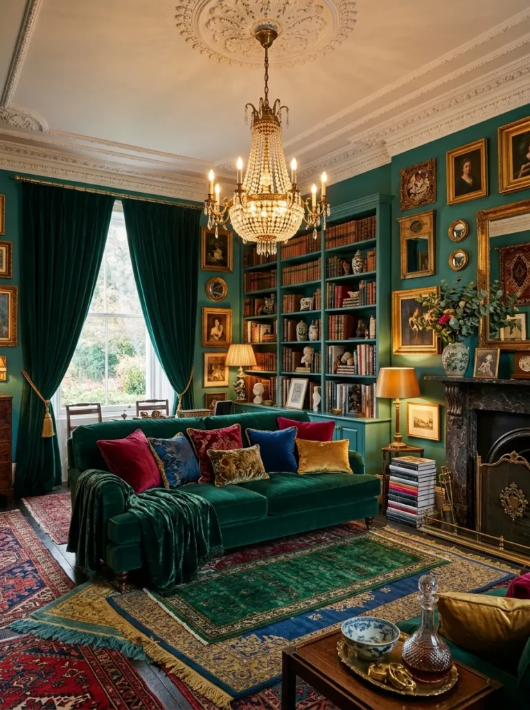
Vibe: Luxuriously abundant — the maximalist living room where every evening in it feels like being inside the world’s best novel.
Why it works: The jewel-toned green maximalist living room is the green design that most completely embraces green’s historical association with luxury and opulence — the deep emerald and teal greens of Victorian and Edwardian drawing rooms, where the jewel tones of emerald green, sapphire blue, and ruby red were the domestic expressions of luxury in an era before synthetic dyes made vivid color democratically available. The maximalist layering approach — multiple rugs, multiple upholstery layers, stacked books, ornate accessories — is appropriate for jewel-toned green specifically because the depth and richness of the jewel green colors provide sufficient visual coherence to hold the layered complexity together. In a paler or more neutral palette, the same quantity of layering would read as cluttered; in jewel green, the layering reads as opulent because the strong colors provide the compositional gravity that organizes the complexity.
How to get it: Anchor the maximalist green living room with a single dominant green — choose either emerald (blue-green) or teal (green-blue) as the primary color and use the secondary green as an accent — introducing both in equal quantities creates visual competition rather than hierarchy. The ornate brass chandelier is the single most important object in this design: its scale, warmth, and decorative quality provide the organizing focal point from which the rest of the room’s abundance radiates.
Shop the Look
| Product |
|---|
| Teal green wall paint |
| Emerald velvet sofa |
| Floor length velvet curtain deep green |
| Ornate brass chandelier large |
| Layered jewel-toned rug set |
12. Soft Sage Green Nursery-Adjacent Living Room
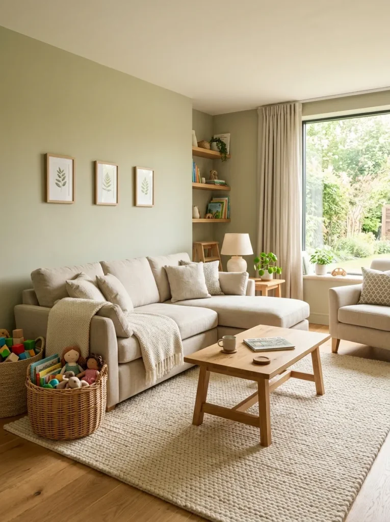
Vibe: Warm and family-inclusive — the living room that works for the children without apologizing for it, and that looks genuinely good anyway.
Why it works: Soft sage green is the wall color that most effectively solves the family living room design problem — the need for a room that is simultaneously adult-designed and child-friendly, that looks considered rather than child-proofed, and that can absorb the visual noise of toys, books, and general family abundance without looking overwhelmed. Sage green’s specific quality in this application is its calming, nature-referencing warmth: research on children’s response to color consistently identifies green tones as among the most calming and most cognitively supportive colors for children’s environments, which means that a sage green family living room is serving the child’s needs as effectively as it is serving the adult aesthetic. The performance linen sofa in oatmeal is the practical material choice that maintains the organic aesthetic while handling the cleaning demands of family use.
How to get it: Specify washable paint in the sage green (Benjamin Moore’s Aura in Matte finish is washable and wipeable while maintaining a quality matte appearance) — the washable specification is essential for a family living room where crayon marks, dirty hand prints, and the general contact of children with walls is daily reality. Performance linen or Crypton-treated upholstery in oatmeal or warm ivory provides the aesthetic quality of linen with the stain-resistance and wipeable surface that family upholstery specifically requires.
Shop the Look
| Product |
|---|
| Soft sage green washable paint |
| Performance linen sofa oatmeal |
| Large soft cream wool rug |
| Natural woven toy storage basket |
| Botanical print at low height |
13. Green Living Room with Indoor Garden Wall Feature
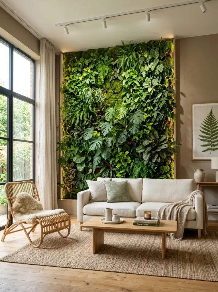
Vibe: Lush and architectural — the living room that makes you feel like you are sitting in the most beautiful greenhouse you have ever been in.
Why it works: The living plant wall as the primary green element in a living room is the green design that most fully realizes the biophilic design ideal — not simulated natural connection through color or botanical print but genuine living plant material at architectural scale. A floor-to-ceiling living plant wall behind the sofa creates the most powerful possible green focal feature in a living room because it is simultaneously architectural (filling the full height of the primary wall), botanical (the variety of textures, colors, and forms of mixed tropical planting creates visual richness that no paint color can replicate), and genuinely living (the wall changes over time as plants grow, establishing the room as a genuinely dynamic rather than static environment).
How to get it: Specify a proprietary living wall system (Mobilane, ANS Living Walls, or Botanical Wall Design all produce residential-scale systems with integrated irrigation) for the most maintenance-efficient installation — proprietary systems include integrated drip irrigation that reduces the daily maintenance requirement to a monthly inspection rather than daily watering. The supplemental grow lighting installed behind the plant wall is the critical technical requirement that makes an interior plant wall viable without natural light — LED grow strips at the correct spectrum (full-spectrum at 4000–6500K) provide the light intensity that tropical plants require even in positions far from a window.
Shop the Look
| Product |
|---|
| Living wall system residential |
| LED grow light strip full spectrum |
| Cream performance fabric sofa |
| Natural timber coffee table |
| Rattan accent chair |
14. Vintage Green Living Room with Antique and Collected Pieces
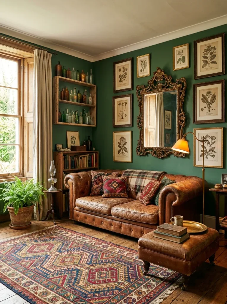
Vibe: Warm and eclectic — the living room that looks like the autobiography of someone with extraordinarily good taste and a reliable instinct for the beautiful object.
Why it works: Forest green walls with vintage and antique furniture is the green living room combination that most powerfully creates the sense of accumulated, personal design intelligence — the specific combination of a deep green wall, aged leather, a kilim rug, gilt frames, and vintage glass has the visual quality of a room that has been collecting itself over years rather than being purchased in a single decorating session. Forest green is specifically appropriate as the backdrop for an eclectic vintage collection because its depth provides the visual gravity that holds diverse objects in a coherent spatial composition — a lighter or more neutral wall color would read as a background for the objects, while the deep forest green reads as a participant in the composition, contributing its own material weight to the room’s visual balance.
How to get it: The Chesterfield sofa in aged cognac leather is the specific piece that most completely establishes the vintage green room’s aesthetic register — a new leather Chesterfield aged to a used quality (or a genuine antique sourced from a dealer or estate sale) provides the starting point from which all other collecting decisions are oriented. The Turkish kilim rug is the second organizing element — source from a genuine specialist importer or dealer rather than a reproduction, as genuine kilims have a depth and variety of color that reproduction versions consistently fail to replicate.
Shop the Look
| Product |
|---|
| Forest green interior paint |
| Leather chesterfield sofa cognac |
| Turkish kilim rug antique |
| Antique gilded mirror |
| Vintage glass bottle collection |
15. Monochromatic Green Living Room in Three Tones
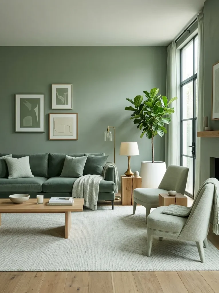
Vibe: Sophisticated and cohesive — the living room that proves that the most advanced color use is the restraint to use only one.
Why it works: The monochromatic green living room in three tones is the green design approach that demonstrates the most sophisticated command of color theory — using a single hue at three distinct tonal levels (medium on the walls, deeper on the primary seating, lighter on the secondary seating) creates a room that achieves visual richness and spatial complexity through tonal variation within a single color family rather than through the introduction of multiple colors. This approach is specifically successful in green because green’s natural tonal range — from near-white pale sage through medium sage to deep forest — encompasses such a complete spectrum of visual value that a three-tone green composition achieves the same visual richness as a multi-color composition while maintaining a level of color coherence that multi-color rooms cannot achieve.
How to get it: The three-tone system requires that all three greens share the same hue temperature — all three must be in the same warm-sage, cool-sage, or olive direction, as mixing warm and cool greens in a monochromatic composition creates visual conflict rather than tonal harmony. Select the middle tone first (the wall color), then choose the deeper version for the primary sofa upholstery and the lighter version for the secondary chair upholstery, all from the same paint brand’s or fabric supplier’s color family to guarantee hue consistency across the three tones. Introduce natural timber as the only non-green element — the warm honey of oak provides the temperature counterpoint that prevents the monochromatic green room from reading as monotonous rather than sophisticated.
Shop the Look
| Product |
|---|
| Medium sage green paint walls |
| Deep dusty green velvet sofa |
| Light sage performance fabric chair |
| Pale sage wool throw |
| Natural oak side table |
How to Start Your Green Living Room Transformation
Your single first move is to establish the correct green temperature for your specific living room before purchasing paint, fabric, or furniture in any green tone. Green occupies the widest hue range of any color on the spectrum — from the warm, yellow-inflected olive greens through the balanced sage and forest greens to the cool, blue-inflected emerald and teal greens — and the wrong green temperature for a specific room’s light quality and existing material palette can produce a result that reads as either cold and clinical or muddy and brown rather than the warm, sophisticated quality that a correctly chosen green delivers. The single most reliable way to establish the correct green temperature is to collect four to six paint sample cards in varied greens (including warm-toned and cool-toned versions of your target tone) and observe them in your specific room at three different times of day — morning, afternoon, and evening artificial light. The green that reads most warmly and most correctly at all three times is the correct one for your room.
The most common green living room mistake is choosing a green that is too saturated or too bright for the room’s existing material quality — particularly in rooms with standard white trim, standard light fittings, and standard neutral furniture, where a highly saturated green wall creates a color shock rather than a sophisticated backdrop. The green that reads as most sophisticated in editorial photography and Instagram imagery is almost always a complex, slightly desaturated, slightly greyed green — a green that looks less like a color choice and more like a material quality, because it contains enough grey and enough complementary warmth to prevent it from reading as a single-note statement. The greens that Farrow & Ball have made their reputation with — Mizzle, Calke Green, Pigeon, Cromarty — are all examples of this complex, desaturated quality; they are not interesting in a paint tin but deeply beautiful on a room’s walls.
Three specific investments under $100 that create immediate green living room impact: (1) A large textured throw in a dusty sage or deep forest green ($45–85 from any quality homewares retailer) draped over a neutral sofa introduces the room’s primary green element at a commitment level that can be changed as the palette develops, while immediately demonstrating how the chosen green tone reads in the room’s specific light. (2) A pair of aged brass picture frames ($15–30 each) replaced on existing framed artworks immediately introduces the warm metallic accent that elevates any green palette from pleasant to editorial, as the aged brass complement to green’s blue-green tones is the single most reliably beautiful metal pairing available for any green room. (3) A botanical print in the specific green tones you are considering for the room ($20–50 printed and framed) placed on the intended accent wall demonstrates how the color will read at wall scale before any paint is purchased, allowing the color decision to be made with reference to the actual room rather than the paint sample card alone.
Realistically, a complete single-room green living room transformation — new wall paint, a velvet or linen sofa in the appropriate green or its complement, a quality rug, a statement lighting piece, and the complete accessory and cushion palette — costs $2,500–6,000 at mid-range quality for a standard living room. A focused three-element green transformation — a single accent wall in deep forest green behind an existing sofa, two slim brass floor lamps, and a gallery arrangement of framed botanical prints — costs $200–500 and produces a room that reads as designed and intentional without the commitment or cost of a complete room renovation. Most people begin with the paint — a single accent wall or the full room in the chosen green — spend a season with the color to observe how it performs in the room’s specific light at different times of year, and then invest in the furniture, textile, and accessory upgrades that the established green palette suggests and supports.
Frequently Asked Questions About Green Living Room Design
What shade of green works best for a living room?
The shade of green that works best for a living room depends primarily on the room’s natural light quality and orientation. North-facing rooms (those that receive reflected rather than direct natural light) benefit most from warm-toned greens — olives, warm sages, and yellow-green inflected tones — because these warm undertones compensate for the cool, flat quality of reflected natural light. South-facing rooms (those that receive direct sunlight for significant portions of the day) can handle cooler, more complex greens — deep forests, teal-inflected sages, emeralds — because the warm direct sunlight warms the cool green tones to an appropriate temperature. East-facing rooms benefit from warm or medium sages that read warmly in the morning light that they receive. West-facing rooms are the most versatile for green because the warm quality of afternoon light makes almost any green tone read beautifully in the evening hours when living rooms are most occupied.
How do I use green in a small living room without making it feel smaller?
Green in a small living room works best when applied at full saturation on all walls including the ceiling — the all-over color application eliminates the white ceiling that visually shortens a room’s apparent height and creates instead a color envelope that reads as spatially generous rather than spatially contained. Pale greens — greens so light that they read as tinted whites — provide the maximum spatial benefit in a small living room, creating interest and depth without the visual weight that darker greens introduce. In a small room, the most effective use of green is as the primary wall and ceiling color in a pale to medium tone, with furniture in neutral tones (cream, ivory, oatmeal) that do not compete with the green for visual dominance. Avoid combining green walls with green upholstery in a small room — the double application of green creates visual saturation that makes the room read as smaller than it is.
What colors pair best with green in a living room?
The colors that pair best with green in a living room are determined by whether the green has warm or cool undertones. Warm greens (olive, sage, warm forest) pair best with warm companions: terracotta, warm rust, cognac, warm ivory, warm timber, and aged brass. Cool greens (emerald, teal, blue-sage) pair best with cool or contrasting companions: cream, warm pink (as a color complement), navy (as a tonal companion), and polished or brushed brass (which bridges warm and cool through its own warm tone). Terracotta and dusty pink are the two colors that pair well with virtually any green tone because they share the complementary relationship that exists between the warm red-orange family and the green family across the color wheel, and they do so in a muted, earthy register that reads as sophisticated rather than garish.
Can green work with other strong colors in a living room?
Yes — green’s specific ability to serve as a background color while simultaneously contributing its own visual weight makes it one of the most versatile colors for multi-color living rooms. The most successful strong color combinations with green are: green and pink (the botanical combination that references the garden world’s most universal color pairing), green and terracotta (the earthy palette that references the Mediterranean landscape), green and navy (the jewel-toned combination that reads as maximalist and opulent), and green and warm rust or cognac (the masculine palette that reads as collected and sophisticated). The key to all strong color combinations with green is to maintain tonal coherence — the companion colors should share the same warmth or coolness as the chosen green, which prevents the combination from creating color clash rather than color composition.
How do I choose between a green sofa and green walls in my living room?
The decision between a green sofa and green walls depends on the level of commitment you want to make and the ease of change you need to maintain. Green walls are the more permanent commitment (repainting is more disruptive than replacing a sofa) but the less expensive one (paint costs significantly less than quality upholstered furniture). A green sofa is the more temporary commitment (it can be moved, sold, or recovered) but the more expensive one per unit. In rooms where the wall color is already established in a neutral that you want to maintain, a green sofa delivers the room’s green statement without requiring a paint decision. In rooms where a complete redesign is intended, starting with the wall color and then choosing the sofa to complement the wall green produces a more cohesive result than starting with the sofa and trying to find a compatible wall green. In either approach, the principle is the same: establish the primary green element first and orient all subsequent decisions around it.
Ready to Create Your Green Living Room?
These 15 designs span the full range of what a green living room can be — from an all-over deep forest immersion that makes every evening feel atmospheric and from a pale sage that makes a small room breathe, to an emerald velvet sofa that makes a neutral room sing and a monochromatic three-tone composition that demonstrates the most sophisticated green mastery available without introducing a second color — so whether you are making your first tentative commitment to green with a single throw pillow or planning a complete room transformation with new walls, new upholstery, and new architectural detail, there is a genuinely achievable, genuinely beautiful green living room design here for your specific space, your specific light, and your specific appetite for color. The transformation begins with the paint sample — with the commitment to observe four or five different greens in your specific room at three times of day and trust the one that reads most beautifully across all three — and continues with the material decisions that amplify the chosen green’s specific warmth and complexity. Today’s specific action: purchase paint sample pots in four greens spanning the warm-to-cool spectrum — one warm olive, one warm sage, one balanced forest, one cool emerald — brush them each in a 300mm × 300mm square on the wall you most want to transform, and observe them over 48 hours in your room’s natural and artificial light. The green that you keep returning to, that reads most warmly and most correctly in the specific quality of light your living room receives, is the one worth committing to. Save the designs that matched your living room’s specific architectural conditions and your household’s specific lifestyle — those are the green rooms that will feel genuinely right when they are finished, and genuinely yours in the years that follow.