14 Neutral Living Room Designs with Timeless Style
A neutral living room is a living space designed around a palette of warm whites, soft creams, warm greys, oat, greige, and natural material tones — not as a default or a compromise but as a deliberate design choice that creates the specific quality of calm, warmth, and visual coherence that saturated color palettes cannot achieve and that remains genuinely beautiful across changing design trends and changing life circumstances. This article gives you 14 neutral living room design ideas across furniture arrangement, material layering, lighting, accent color, textile composition, wall treatment, and small-space adaptation so your neutral living room achieves the warm sophistication that distinguishes genuinely considered neutral design from a room that simply has no color.
A neutral living room done well is not a colorless room. It is a room where the color story is told through material rather than pigment — the warm honey of white oak, the silver-grey of natural linen, the cream of unglazed stoneware, the dusty sage of dried eucalyptus, the warm amber of beeswax candlelight. These are colors that exist within the neutral register while providing the visual richness and warmth that make a room genuinely pleasant to be in for hours. The difference between a neutral room that reads as cold and institutional and one that reads as warm and sophisticated is almost entirely a function of material quality and light temperature rather than paint color. Here are 14 ideas worth saving — and designing.
Why Neutral Living Room Design Achieves Timeless Style
Neutral living room design achieves timeless style through a specific design principle that distinguishes it from trend-driven color choices: neutral palettes derive their visual interest from material texture, tonal variation, and light interaction rather than from color contrast, which means the palette’s beauty is not dependent on the cultural moment that makes a specific color fashionable. The deep forest green accent wall that reads as contemporary in 2025 may read as dated in 2032; the warm white linen sofa on a natural jute rug with white oak furniture and warm ambient lighting reads as sophisticated in any decade because its beauty is material rather than cultural.
The design traditions that have most consistently produced timeless neutral interiors span cultures and centuries — the Japanese wabi-sabi interior that finds beauty in the natural variation of unpainted clay walls, unfinished wood, and aged linen; the Gustavian Swedish interior that uses warm white paint and natural materials to create the specific Nordic quality of light-filled winter warmth; the British country house interior that layers aged linen, worn wool, faded antique textile, and warm wood in a neutral palette that develops richer character over decades of use. All of these traditions share the recognition that the most durable interior beauty is the beauty of genuine natural materials responding to light, age, and use.
The material palette of the timeless neutral living room is specific and important. Warm white (a white with yellow-red undertone rather than blue or purple — Benjamin Moore White Dove OC-17, Sherwin-Williams Alabaster SW 7012) is the correct wall tone. Natural linen, organic cotton, and wool in cream, oat, and warm greige are the correct upholstery and textile materials. White oak and walnut are the correct furniture timber species — white oak for its open grain and warm honey tone, walnut for its deep chocolate warmth. Unlacquered brass is the correct metallic accent — its warm gold tone deepens with age rather than fading. Natural stone — travertine, marble, limestone — provides the cool mineral counterpoint that prevents the palette from reading as uniformly warm and heavy.
The cultural moment for neutral living room design has never been stronger. The convergence of the quiet luxury aesthetic, the warm minimalism movement, and the growing awareness that trend-chasing interior design is both environmentally wasteful and financially inefficient has created a genuine cultural appetite for interiors designed to last — to age beautifully, to accommodate changing accessories and artwork without requiring complete replacement, and to create the specific quality of ease that only a genuinely well-designed room provides.
Style at a Glance
| Element | Detail |
|---|---|
| Philosophy | Material richness over color contrast — beauty derived from texture, tone, and light rather than pigment |
| Key Materials | Natural linen, white oak, walnut, unlacquered brass, travertine, jute, wool, organic cotton |
| Key Colors | Warm white, soft cream, oat, warm greige, dusty sage, natural stone grey, warm charcoal |
14 Neutral Living Room Designs with Timeless Style
1. Warm White Linen Sofa with Layered Natural Textiles
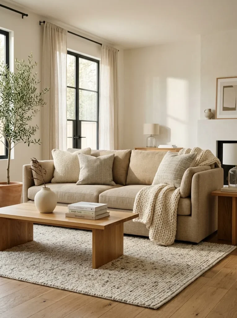
Vibe: The room is serene — a warm white linen sofa with layered natural textiles creates the tonal neutral living room at its most resolved, where the beauty comes entirely from the quality of the materials and the subtlety of their tonal variation within a single warm neutral family.
Why it works: The warm white linen sofa is the neutral living room’s central material statement — it provides the room’s primary horizontal mass in a tone that reflects warm light beautifully and coordinates with every subsequent material addition. The textile layering system (hand-knotted wool rug beneath, varied linen pillows on, chunky wool throw draped) creates the visual complexity of a considered room from materials that are all within the same warm neutral family. The key to this look’s success is that all materials share the same warm undertone — cream, oat, warm greige, and ivory all have yellow-red bases rather than cool-blue ones, which creates tonal cohesion that makes the room read as designed rather than accidentally assembled.
How to get it: Source the sofa in 100% natural linen or linen-blend upholstery in warm oat or natural cream — the fabric’s grain and slight slub texture is visible and contributes to the room’s material richness. Layer a hand-knotted or hand-loomed wool rug ($200–$600 for an 8×10-foot quality option) in a warm ivory and grey tone that maintains the neutral palette while adding floor-level warmth. Add three pillows in varied linen textures (a woven linen, a textured nubby linen, and a smooth linen) in tones that step between cream and warm greige. Drape a chunky knit or hand-loomed wool throw over one sofa arm in a casual arrangement that communicates genuine inhabitation.
Quick Win: Replacing existing sofa cushion covers with natural linen alternatives in warm oat or cream ($18–$35 per cover from specialty linen retailers) immediately shifts a room toward the warm neutral palette without any furniture purchase.
Shop The Look
- Natural linen sofa oat upholstered modern
- Hand knotted wool rug ivory warm grey 8×10
- Linen throw pillow cover set cream greige
- Chunky knit wool throw natural cream
- Natural wood coffee table minimal
Also view: 13 Cozy Bedroom Decor Ideas That Feel Dreamy
2. White Oak Furniture Collection for Warm Material Cohesion
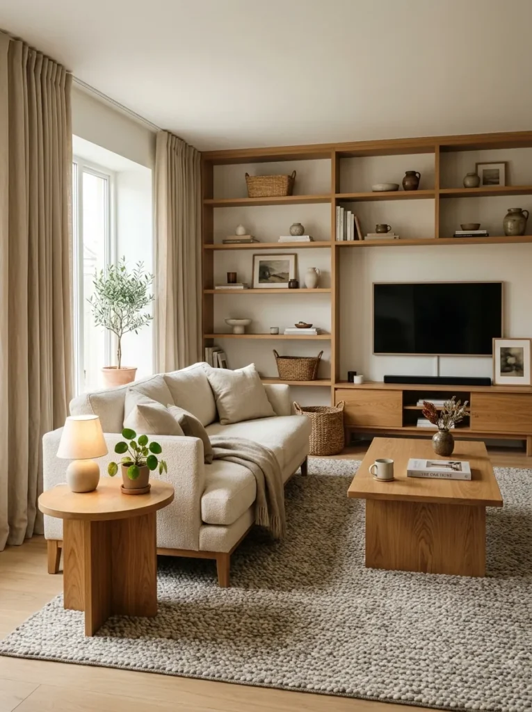
Vibe: The room is cohesive — a living room where all primary furniture is in white oak creates a material unity that reads as designed from the room’s structural level outward, where the consistent warm wood tone provides the palette’s primary color statement and everything else serves it.
Why it works: Material cohesion across the primary furniture pieces of a room — all in the same timber species or at least the same tonal family — creates the specific design quality that furniture showrooms attempt to replicate but rarely achieve, because the showroom’s vignette assembles matching pieces while genuine material cohesion comes from understanding that white oak’s specific grain, tone, and light response is consistent across pieces from different makers at different price points. White oak is specifically effective for this approach because its open grain and warm honey-amber tone work beautifully across all furniture scales — the same material on a coffee table, a side table, and an open shelf creates a room-unifying material language that connects all the furniture pieces into a single composition.
How to get it: Prioritize white oak or white-oak-veneer furniture across the living room’s primary horizontal surfaces — coffee table, side table, media console or TV cabinet. The pieces do not need to be from the same manufacturer or period — a vintage white oak coffee table paired with a contemporary white oak side table creates more visual interest than matching sets while maintaining the material cohesion. Pair with warm white walls and natural linen or wool upholstery that allows the white oak’s warmth to remain the primary tonal statement.
Shop The Look
- White oak coffee table solid modern
- White oak side table minimal
- White oak open shelving unit wall
- White oak TV console minimal
- Natural linen sofa coordinate oak
Also view: 15 Stylish Kids Closet Storage Ideas for Small Spaces
3. Travertine and Natural Stone Accent for Mineral Warmth
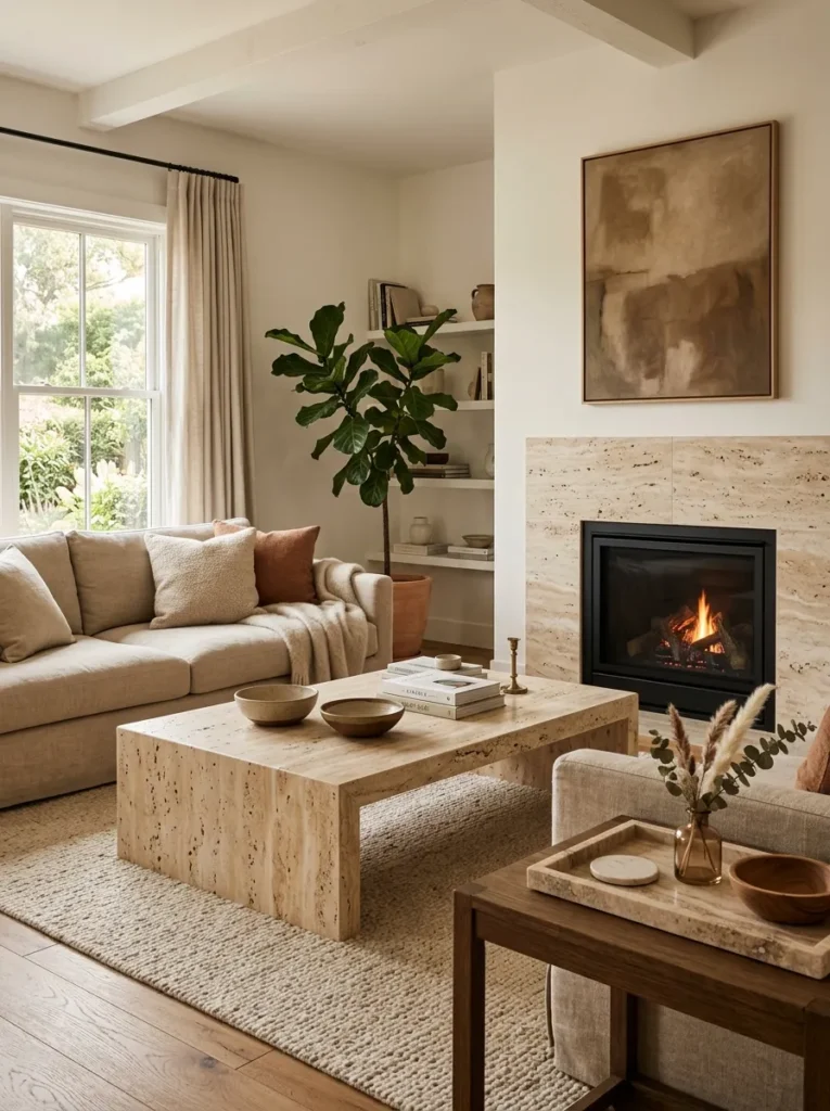
Vibe: The room is luxurious — travertine and natural stone within a neutral living room provide the material depth and cool mineral contrast that elevates the palette from warm-neutral-comfortable to warm-neutral-sophisticated, where the stone’s geological presence gives the room a quality of permanence.
Why it works: Natural stone in a neutral living room provides the single most effective material contrast available within the warm neutral palette — the stone’s cool mineral surface, its geological veining, and its physical weight create contrast with the warm softness of linen and wool without introducing any color that would break the neutral register. Travertine specifically (its warm cream-to-tan base tone, its characteristic surface pitting, and its slightly warmer temperature compared to white marble) reads as the most organic and least formal of the natural stone options, making it appropriate for the casual, livable neutral living room rather than only for formal or high-design contexts. The stone’s durability also contributes to the timeless quality of the design — a travertine coffee table improves with age and use in a way that glass, lacquered wood, or laminate cannot approach.
How to get it: A travertine coffee table is the highest-impact single stone addition to a neutral living room — available from stone furniture specialists at $400–$1,200 for standard sizes. A travertine tray ($30–$80 for a styled display surface on a side table or coffee table) introduces the material at minimal investment. For fireplace surrounds, travertine tile ($4–$8 per square foot, installed over an existing surround) provides the most cost-effective large-area stone addition.
Shop The Look
- Travertine coffee table natural stone
- Travertine tray display surface
- Natural stone tile fireplace surround
- Travertine vase small display
- Stone sealer penetrating food safe
4. Warm Greige Walls with Natural Material Furniture
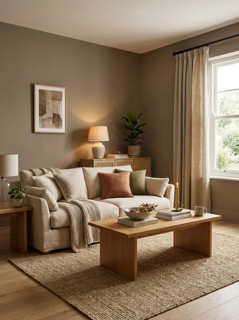
Vibe: The room is cocooning — warm greige walls that surround a neutral furniture grouping create the specific quality of envelopment that cold-white rooms never achieve, where the warm-toned walls make every material within the room appear more luminous and more warm by simultaneous contrast.
Why it works: Warm greige (a brown-grey blend with yellow-red undertone) is the most consistently successful neutral wall color for living rooms because it occupies the zone between warm white and warm beige where the room feels enveloped without feeling dark, and where the wall’s warmth amplifies the warmth of natural material furniture rather than competing with it. The simultaneous contrast effect — a cream linen sofa reads as warmer and more luminous against a greige wall than against a white wall because the greige wall’s cool-relative-to-cream temperature makes the sofa’s warmth more apparent — is the specific optical mechanism that makes greige-walled rooms feel more materially rich than white-walled rooms even when the furnishings are identical.
How to get it: The most reliable warm greige paint tones for living rooms include Benjamin Moore Revere Pewter HC-172 (a classic that has remained relevant across multiple design decades), Sherwin-Williams Accessible Beige SW 7036, and Farrow & Ball Elephant’s Breath No. 229. Test in the specific room across a full day’s light cycle before committing — warm greige tones shift significantly between morning cool light and afternoon warm light, and the specific undertone must coordinate with the room’s natural light direction and the warm tone of existing furnishings.
Shop The Look
- Warm greige interior paint sample set
- Natural linen sofa oat coordinate walls
- Jute area rug natural 8×10
- Linen curtain panel warm oat
- White oak furniture coordinate walls
5. Neutral Gallery Wall with Warm Toned Art and Natural Frames
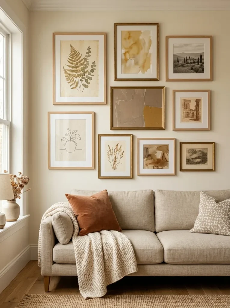
Vibe: The gallery is curated — a neutral living room gallery wall where every frame and every artwork is chosen within a single warm-tonal family creates the visual complexity of a sophisticated art collection while maintaining the palette coherence that makes the room read as genuinely designed rather than assembled from unrelated elements.
Why it works: Gallery walls in neutral living rooms succeed when the art curation itself observes the room’s tonal palette — not by requiring all art to be monochromatic, but by selecting works whose dominant tones belong to the warm neutral family. Botanical illustrations (with their warm greens, cream grounds, and natural subject matter), abstract watercolor washes in ochre and warm cream, black and white photography printed warm (sepia-adjacent rather than cool-blue-grey), and warm-toned prints all contribute to a gallery wall that reads as a single warm-tonal composition rather than a collection of colored interruptions to the neutral palette. Natural wood and warm aged gold frames (both within the same warm metal-and-wood family) provide the frame material consistency that completes the cohesion.
How to get it: Curate art content specifically for warm tonal quality — botanical illustration prints (available for free download from the Biodiversity Heritage Library at biodiversitylibrary.org), abstract watercolor prints in ochre and cream (widely available from Etsy artists at $15–$50 per print), and warm-toned black and white photography. Frame in natural wood (unfinished pine or oak frame) and warm aged gold frames — avoid matte black frames in this context, as they introduce a cool-dark element that breaks the warm-neutral gallery wall’s tonal cohesion.
Shop The Look
- Natural wood gallery frame set varied
- Aged gold picture frame set
- Botanical print art warm neutral tones
- Abstract watercolor print ochre cream
- Gallery wall planning template kit
6. Floor-to-Ceiling Linen Curtains for Architectural Warmth
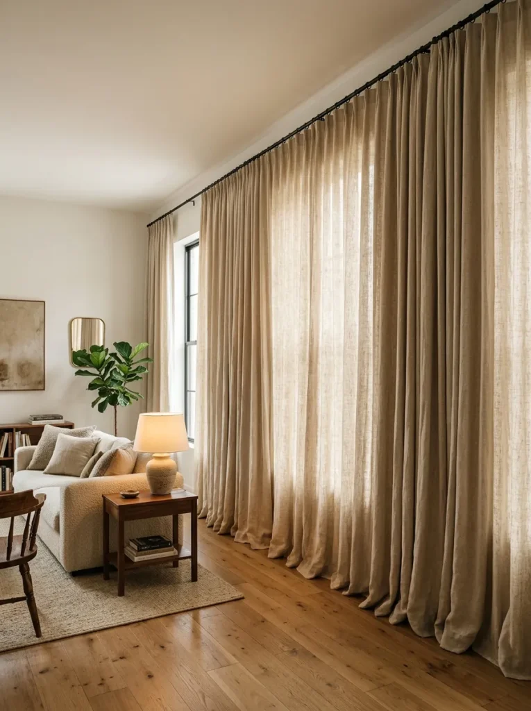
Vibe: The room is architectural — floor-to-ceiling linen curtains hung at ceiling height and wide of the window frame transform the window treatment from a functional covering into an architectural room element, where the abundant warm linen creates the impression of a significantly taller and more generously proportioned room.
Why it works: The single most impactful neutral living room intervention available without paint or furniture purchase is the correct installation of floor-to-ceiling curtains — specifically, hanging the rod at ceiling height (or within 2 inches of the ceiling molding) and extending the rod 12–18 inches beyond the window frame on each side. This installation makes the window appear significantly wider than it is, makes the ceiling appear significantly higher than it is, and fills the wall plane with warm linen textile rather than showing the window as a small frame within a large blank wall. Natural linen in warm cream or oat is the correct neutral fabric — its natural slub texture catches and diffuses light in a way that synthetic sheers cannot, and its warm undertone adds warmth to the room’s light quality throughout the day.
How to get it: Install the curtain rod within 2 inches of the ceiling or at ceiling height — this is the most important installation decision and the one most commonly done incorrectly. Extend the rod 12–18 inches beyond the window frame on each side. Purchase linen panels in 1.5–2 times the rod’s width in total fabric quantity for generous, soft gathering. Allow panels to pool 1–3 inches on the floor for maximum warmth and drama. Source from Belgian or French linen suppliers (Cultiver, Rough Linen, or specialist linen curtain suppliers) for the highest material quality.
Shop The Look
- Natural linen curtain panel floor ceiling oat
- Ceiling height curtain rod brass extended
- Curtain ring clip set brass warm
- Linen curtain panel fullness extra wide
- Curtain rod finial set warm brass
7. Layered Rug Approach for Tonal Floor Depth
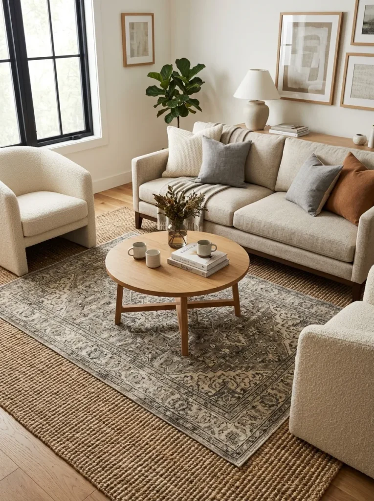
Vibe: The floor is layered — a sisal base rug with a vintage wool overlay creates the floor-level warmth and tonal complexity that no single rug can achieve, where the base layer provides grounding and the overlay layer provides pattern and material richness within the neutral palette.
Why it works: The layered rug approach solves the neutral living room’s most persistent floor challenge: a single neutral rug either reads as too plain (a large expanse of uniform natural sisal or jute) or too pattern-dominant (a vintage rug large enough to anchor the furniture grouping). The layered approach uses the large sisal or jute base rug as the floor-anchoring neutral ground and the smaller vintage or textural wool rug as the pattern and material richness element — each performing its specific role without requiring the other’s compromise. The result has significantly more visual depth and material interest than either rug alone while maintaining complete tonal coherence within the warm neutral palette.
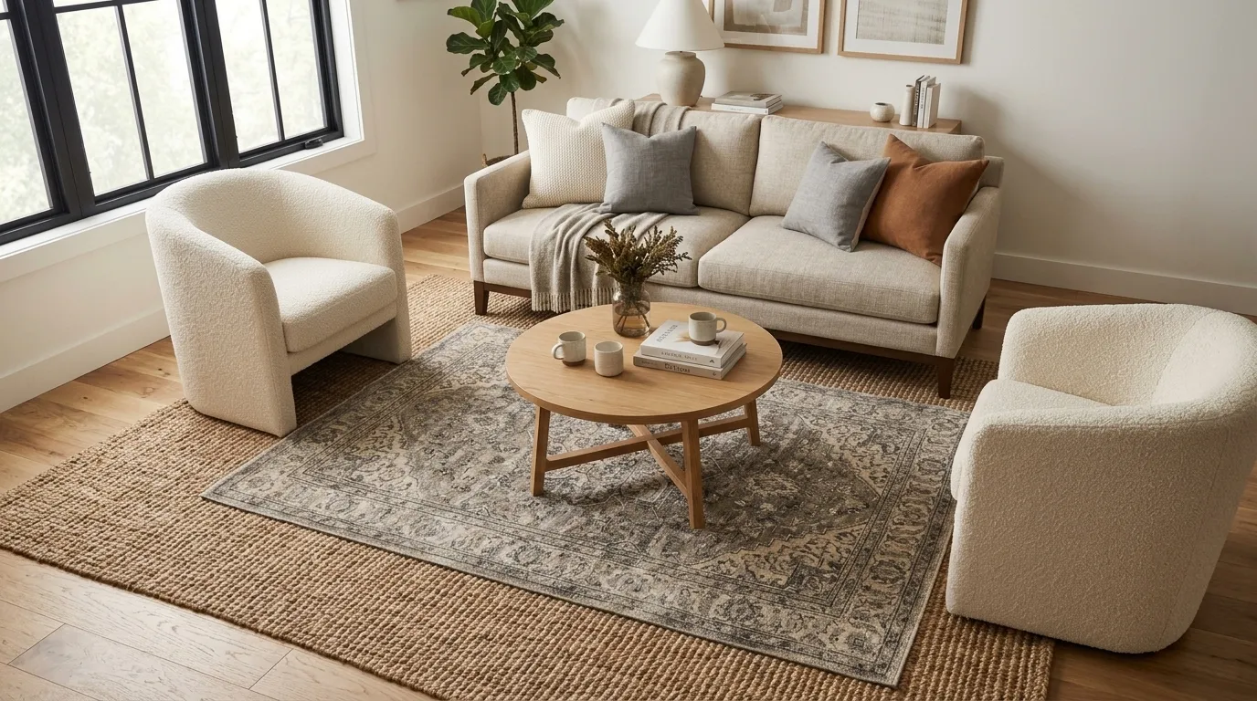
How to get it: Size the base jute or sisal rug at 9×12 feet for a standard living room furniture grouping (all furniture front legs on the rug). Layer a 5×8-foot or 6×9-foot vintage-style or hand-knotted wool rug centered on the base rug, ensuring 18–24 inches of base rug visible on all sides. The overlay rug should be in warm grey and cream tones for maximum neutral cohesion. Use a rug gripper mesh between layers — jute’s natural texture typically holds the overlay rug in position without additional adhesion, but the gripper eliminates any movement risk.
Shop The Look
- Natural jute area rug 9×12 base layer
- Vintage style wool rug 5×8 overlay
- Rug gripper mesh between layers
- Rug pad felt non-slip base
- Hand knotted wool rug warm neutral
8. Unlacquered Brass Accents Throughout for Warm Metallic Depth
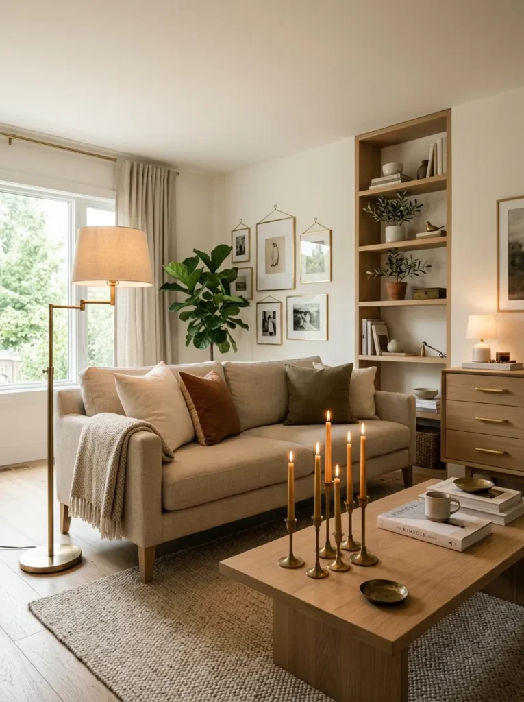
Vibe: The room is sophisticated — unlacquered brass appearing consistently throughout a neutral living room as candlesticks, lamp, hardware, and small objects creates the warm metallic thread that gives the neutral palette its most refined and most genuinely warm material accent.
Why it works: Unlacquered brass is the correct metallic accent for the neutral living room for three specific reasons. First, its warm gold tone belongs to the same warm-undertone color family as the room’s linen, wood, and stone — it reads as part of the material palette rather than as a contrasting accent color injection. Second, it develops a natural patina in ambient air over months and years — the brass deepens and varies in tone as it ages, becoming more beautiful rather than requiring maintenance to restore an initial appearance. Third, it reads as genuinely material rather than decoratively metallic — unlacquered brass has a weight and substance that chrome, bright gold plate, and satin nickel lack. Using brass consistently throughout the room (every metallic element in the same unlacquered brass finish) creates the material cohesion that mixed metals cannot achieve.
How to get it: Replace all metallic elements in the living room — light fixtures, lamp bases, candlesticks, hardware, picture hooks, and decorative objects — with unlacquered or raw brass equivalents. Unlacquered brass products are available from specialty hardware retailers, antique markets, and design-focused home stores. Allow the brass to develop its natural patina without cleaning — the living patina of genuinely used brass is its most beautiful quality and should not be restored to the initial bright appearance.
Shop The Look
- Unlacquered brass candlestick set varied
- Brass floor lamp warm patina arc
- Small brass decorative object set
- Brass drawer pull set sideboard
- Unlacquered brass picture hook set
9. Boucle Accent Chair as the Room’s Textural Statement
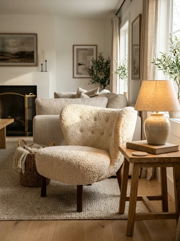
Vibe: The chair is luxurious — a boucle armchair’s looped pile surface creates the most texturally complex element in a neutral living room, where the dimensional fabric catches light differently at every angle and provides a tactile richness that makes the chair genuinely inviting rather than merely decorative.
Why it works: Boucle is the neutral living room’s most effective single-piece textural upgrade because its looped pile structure creates three-dimensional surface variation that is visible across the room — the light catches the top of each loop and the shadow falls in the loop’s interior, creating a continuous micro-pattern of light and shadow across the chair’s entire surface that changes as the light source moves throughout the day. This visual complexity exists entirely within the neutral palette (cream and warm greige boucle reads as warm neutral from any distance) while providing the visual richness that a flat-surfaced material cannot. A single boucle accent chair in an otherwise flat-upholstery neutral living room creates the textural hierarchy that makes the room’s material composition read as sophisticated.
How to get it: Boucle armchairs in performance-grade boucle (which provides the visual quality of traditional wool boucle with improved stain resistance for living room use) are available from CB2, Article, Crate & Barrel, and specialty upholstery retailers at $400–$900. The chair’s leg material matters for the neutral composition — warm wood legs (walnut or white oak) or unlacquered brass legs maintain the warm neutral material palette; chrome or matte black legs introduce cool material tension that may or may not be appropriate depending on the room’s direction.
Shop The Look
- Boucle armchair cream performance fabric
- Boucle accent chair warm greige modern
- Natural wood side table small beside
- Ceramic table lamp warm shade
- Boucle chair cushion additional
10. Warm Minimalist Neutral Living Room with Negative Space
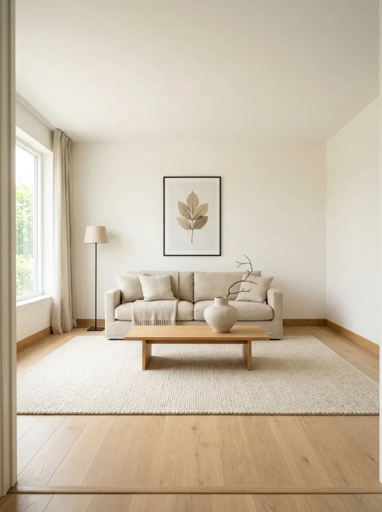
Vibe: The room is peaceful — a warm minimalist neutral living room with deliberate negative space around every furniture piece and clear floor in every corner creates the quality of ease and openness that only rooms designed for breathing room rather than maximum furniture occupation can achieve.
Why it works: Negative space in a neutral living room is not emptiness — it is the active design element that gives each chosen furniture piece its full visual presence. A sofa in a room with clear floor space on all sides reads differently from the same sofa surrounded by additional furniture — the clear space around it amplifies its form and material quality in a way that crowding prevents. The warm minimalist neutral living room specifically benefits from negative space because the absence of visual clutter allows the quality of the room’s materials (the linen, the oak, the wool, the ceramic) to read at close range and at distance, which is the condition under which natural materials are most beautiful.
How to get it: Begin with subtraction — remove everything from the living room and return only the pieces that pass two tests: they are genuinely beautiful in their material quality, and they contribute to the room’s warmth and function. The minimum viable warm minimalist neutral living room: one sofa, one coffee table, one side table, one lamp, one rug, and one wall piece. Everything additional must earn its place against these criteria. Maintain 36 inches of clear floor on both sides of the sofa and clear floor visible in all four corners.
Shop The Look
- Single natural linen sofa minimal
- Large natural wool rug cream minimal
- White oak coffee table single object
- Large ceramic vase single display
- Simple floor lamp warm shade
11. Sage and Warm White Neutral with Botanical Accents
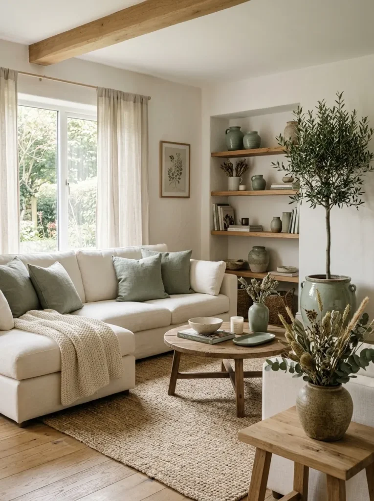
Vibe: The room is botanical — dusty sage introduced throughout a warm white neutral living room through textiles, ceramics, and living plants creates the most naturalistic expansion of the neutral palette available, where the sage reads as the colour of dried herbs and eucalyptus rather than as an accent color interruption.
Why it works: Dusty sage — a muted, grey-based green with warm yellow undertone — is the neutral palette’s most compatible secondary tone because it exists within the same organic, desaturated color family as the room’s warm whites, naturals, and greiges. It is the color of dried lavender stems, preserved eucalyptus, sage herb, and dried rosemary — all natural botanicals whose muted, dusty quality positions them as textural naturals rather than saturated accent colors. Introducing dusty sage through multiple routes simultaneously (textile, ceramic, living plant, dried botanical) creates the layered material approach that makes a secondary tone read as integrated into the palette rather than applied over it.
How to get it: Introduce dusty sage through three distinct material categories for the most integrated effect: textile (sage linen throw pillow covers in 100% linen, $25–$45 each), ceramic (sage or muted green-glazed ceramic vases at $20–$80 each), and botanical (a large live olive tree or fiddle-leaf fig in a sage-glazed or natural terracotta pot, $60–$150, paired with dried eucalyptus or dried lavender stems in a stoneware vessel). The sage tone in each material category will be slightly different — the sage linen will read slightly warmer, the ceramic glaze slightly cooler — and this tonal variation within the sage family creates the depth of a genuinely integrated secondary tone.
Shop The Look
- Dusty sage linen pillow cover set
- Sage ceramic vase modern
- Large olive tree indoor live
- Sage glazed ceramic pot floor
- Dried eucalyptus bunch grey-green
12. Neutral Living Room with Warm Charcoal Fireplace Wall
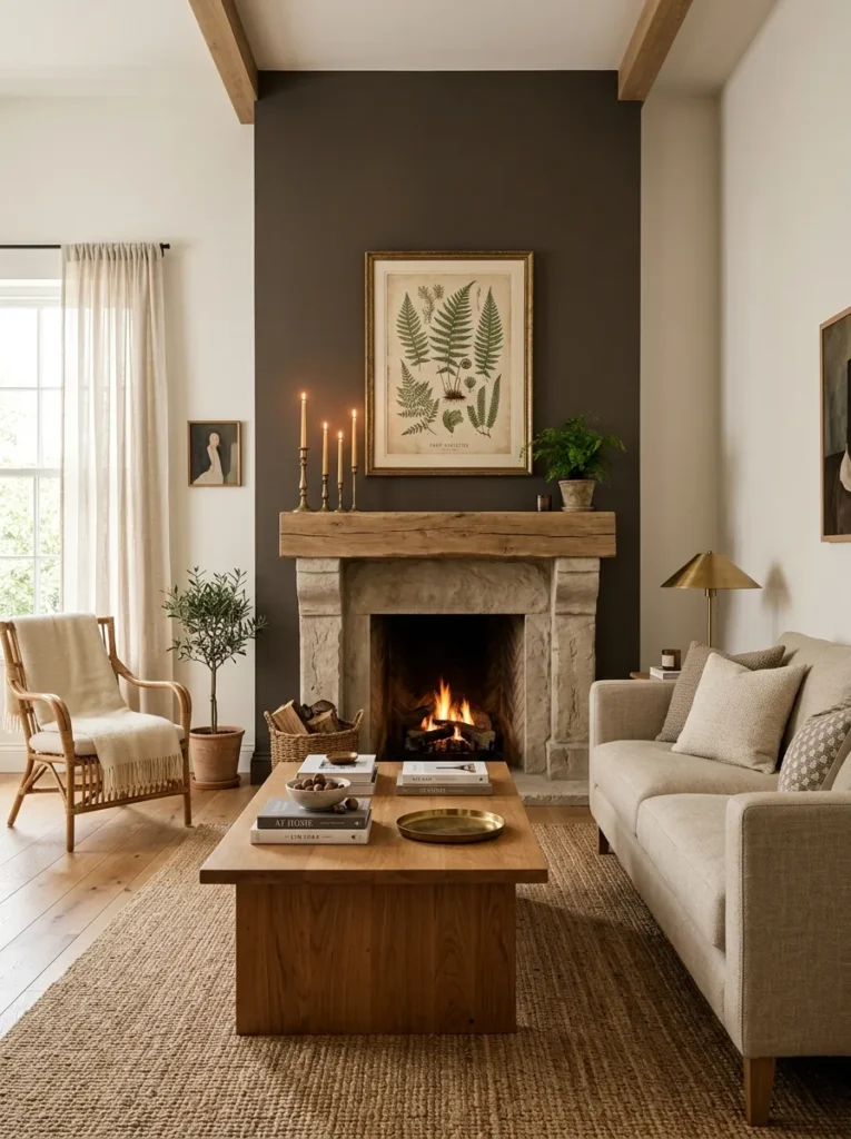
Vibe: The room is grounded — a single warm charcoal fireplace wall in an otherwise warm white neutral living room creates the tonal anchor that gives the palette depth and architectural weight, where the single dark element makes every warm neutral material in front of it appear more luminous and more warm by simultaneous contrast.
Why it works: A single warm charcoal accent wall in an otherwise neutral room works through the design principle of tonal anchoring — the darkest tone in the room’s palette, concentrated at one architectural element, provides the visual depth that prevents the neutral palette from reading as uniformly light and therefore flat. The fireplace wall is specifically the correct location for this dark element because the fireplace itself is already the room’s primary focal point and the dark wall reinforces its architectural importance. The critical distinction is undertone: a warm charcoal (brown-grey with warm undertone, Farrow & Ball Mole’s Breath or Benjamin Moore Kendall Charcoal) maintains the room’s warm neutral palette; a cool charcoal (blue-grey) introduces cool tension that breaks the warm material cohesion.
How to get it: Paint the fireplace wall in a warm charcoal with specifically warm (brown) undertone — test extensively before committing, as charcoal tones shift dramatically between natural and artificial light. Leave the remaining three walls in the room’s warm white. The fireplace wall paint should be in flat or matte finish — any sheen amplifies the dramatic quality of a dark wall in a way that can feel overwhelming in a living room. Keep the mantel styling warm-material-simple: brass candlesticks, one botanical print, perhaps a small ceramic object — the dark wall does the visual work and the mantel styling should not compete.
Shop The Look
- Warm charcoal interior paint matte
- Brass candlestick mantel set varied
- Botanical print neutral tones framed
- Natural linen sofa coordinate charcoal
- Ceramic mantel object minimal
13. Neutral Living Room with Vintage and Antique Finds
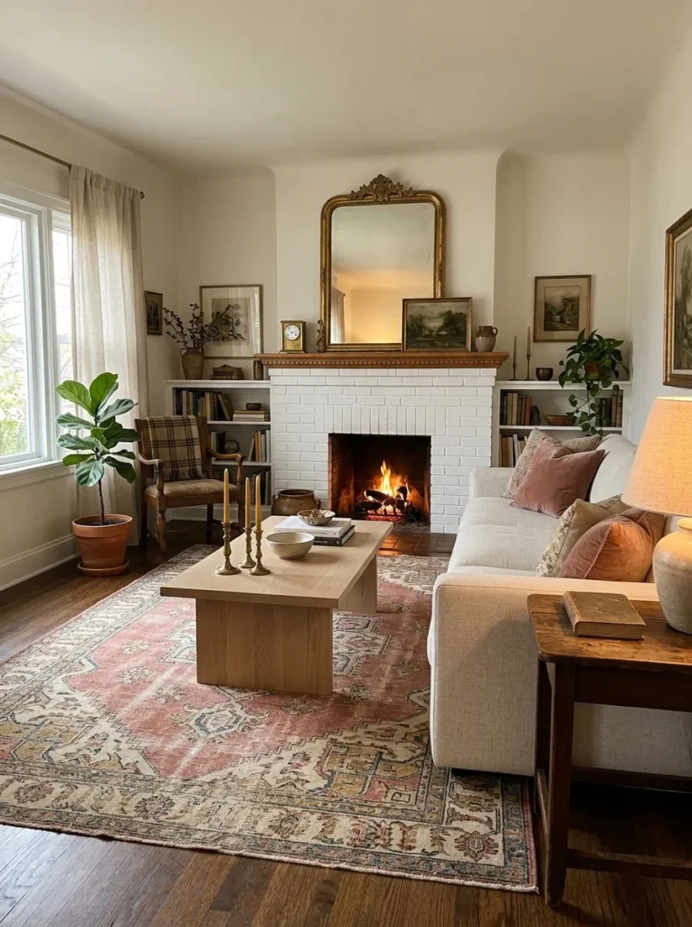
Vibe: The room is collected — a neutral living room that integrates vintage and antique pieces among contemporary furniture creates the specific quality of a room assembled with genuine taste over time, where no single shopping event or matching set produced the room’s composition.
Why it works: Vintage and antique pieces within a neutral living room provide the material quality that new production cannot replicate — the patina of a genuinely old brass candlestick, the faded, softened tones of a vintage Persian rug, the warm grey of aged oak in an antique side table — and they do so specifically within the neutral palette where their aged tones are most at home. A faded vintage Persian rug in dusty rose and cream is specifically a neutral palette element — its colors have softened and muted through decades of use to the same warm neutral register as new natural materials, while its pattern provides the floor-level visual complexity that a solid natural rug cannot. The combination of these aged materials with contemporary neutral furniture creates the most sophisticated version of the neutral living room.
How to get it: Source vintage and antique pieces through local antique markets, estate sales, online vintage marketplaces (Chairish, 1stDibs, Ruby Lane), and thrift stores. The most effective neutral living room vintage additions: a faded Persian or Oriental rug ($100–$800 depending on size and quality), antique brass candlesticks or objects ($15–$80 each), an antique side table in aged wood ($100–$400), and a vintage mirror in a warm-toned frame ($50–$300 at antique markets). These pieces provide the material richness and sense of accumulated time that gives a neutral room its most sophisticated and most timeless character.
Shop The Look
- Vintage Persian rug faded neutral tones
- Antique brass candlestick pair
- Aged wood antique side table
- Vintage gilt frame mirror medium
- Vintage linen textile throw
14. Neutral Living Room Styled for All Four Seasons
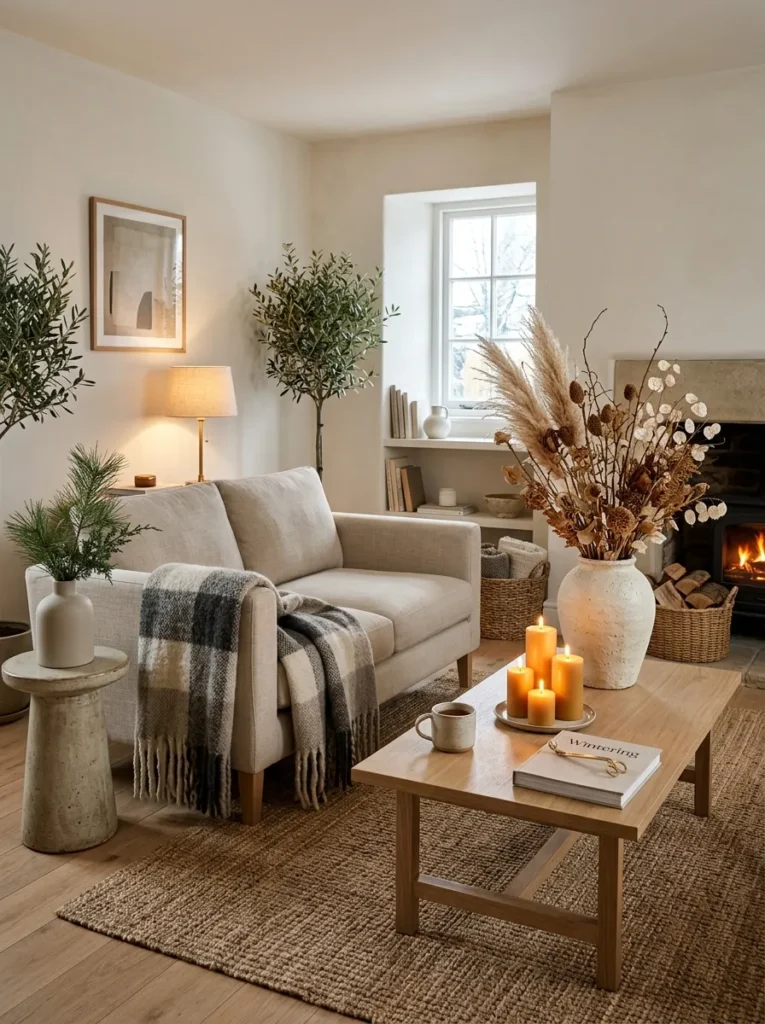
Vibe: The room is seasonal — a neutral living room designed with a permanent warm material base that accepts seasonal styling additions (botanicals, textiles, candles) without any furniture change demonstrates the most practical virtue of neutral palette design: its ability to evolve with the seasons at minimal cost and maximum visual impact.
Why it works: The timeless neutral living room’s most practical design virtue is its seasonal flexibility — the permanent warm neutral base (sofa, rug, furniture, walls) provides the consistent material foundation throughout the year, while seasonal styling additions change the room’s atmosphere quarterly without requiring any permanent change. This is the design intelligence that the neutral palette provides that saturated color rooms cannot: a deep forest green sofa makes a statement in every season, whether appropriate to that season or not; a warm oat linen sofa accepts the pale botanical styling of spring, the abundant floral arrangements of summer, the dried botanical and warm textile additions of autumn, and the candlelit warmth and evergreen accents of winter with equal appropriateness. The seasonal change happens through the room’s styling layer — botanicals, textiles, candles — not through its structural layer.
How to get it: Establish the neutral permanent base (sofa, rug, furniture, walls) as the year-round investment. Create four seasonal styling kits — a collection of objects and textiles for each season — that can be deployed quickly and stored compactly when not in season: spring (fresh botanical vessels, lighter linen textiles, pale ceramic objects), summer (fresh floral arrangements, lighter throws, brighter natural objects), autumn (dried botanicals, heavier wool throws, candlelight, warm spice-scented objects), and winter (evergreen botanical additions, thick wool throws, abundant beeswax candles, warm amber lighting).
Shop The Look
- Stoneware floor vessel dried botanicals
- Wool plaid throw oat grey seasonal
- Beeswax pillar candle set seasonal
- Small evergreen sprig ceramic vase
- Seasonal botanical arrangement autumn
How to Design Your Neutral Living Room
The single most important first decision in designing a timeless neutral living room is establishing the room’s light undertone before purchasing any furniture, textile, or paint. All neutral materials have an undertone — yellow-red (warm), blue-purple (cool), or grey (neutral) — and a neutral living room reads as warm and cohesive when all materials share the same warm undertone, and reads as confused and uncomfortable when warm-undertone and cool-undertone neutrals are mixed without intention. Test wall paint against the existing floor, upholstery samples against existing furniture, and rug samples against both before purchasing — the undertone matching exercise that eliminates future friction is the most important and most consistently skipped step in neutral room design.
The most common neutral living room mistake is substituting grey for warm neutral — choosing the grey sofa, the grey-toned rug, and the cool white walls because grey reads as “neutral” in the conventional sense while actually being a distinctly cool-undertone color that creates the specific quality of cold institutional flatness that most people are trying to avoid when they choose a “neutral” palette. The warm neutral palette is not grey — it is cream, oat, greige, warm white, and the tones of natural materials (linen, wool, wood, stone) in their warm natural states. The distinction between a warm neutral room and a cool grey room is not subtle — it is immediately and viscerally perceptible, and the warm version is consistently more comfortable and more beautiful.
Three neutral living room upgrades under $80 that create immediate, significant improvement: replacing cool-white or cool-grey throw pillow covers with warm oat or cream linen versions ($18–$35 each for natural linen from specialty retailers) that immediately shift the sofa’s tonal register; adding a single large dried botanical arrangement in an existing vessel or a new stoneware piece ($15–$40 in dried botanicals from a craft market or specialty supplier) that introduces the natural material warmth and organic form that manufactured decorative objects cannot replicate; and replacing all existing light bulbs with warm 2700K LED versions ($10–$20 for a four-pack) that transform the room’s evening light from cool-flat to warm-amber and make every material in the neutral room appear more beautiful.
A complete timeless neutral living room — warm white walls, natural linen sofa, white oak furniture, layered rugs, floor-to-ceiling linen curtains, unlacquered brass accents, and a curated gallery wall — is achievable over 6–12 months of intentional accumulation, beginning with the highest-impact elements (lighting, wall color, primary textile) and adding subsequent layers as budget and timing allow. Total investment ranges from $800–$2,500 for a room transformation built on an existing furniture base to $4,000–$10,000 for a complete room with quality furniture purchases. The most important investment insight for neutral living rooms: put the most money into the materials you touch and see most (the sofa upholstery, the rug, the curtain fabric) and the most restraint into the decorative objects — the neutral room’s beauty comes from material quality rather than object accumulation.
Frequently Asked Questions About Neutral Living Room Design
What is the difference between a warm neutral and a cool neutral?
The distinction between warm and cool neutrals is determined by the underlying undertone of the color — specifically, whether the color’s base has yellow-red (warm) or blue-purple (cool) pigment components. Warm neutrals include cream, oat, greige, warm white, warm beige, and the natural tones of wood, linen, wool, and stone — all of which read as inviting, organic, and warm to the eye and nervous system. Cool neutrals include grey, cool white, blue-grey, and the tones of concrete, cool marble, and cool-finished metals — all of which read as sophisticated but can feel cold, institutional, or unwelcoming in residential living rooms without very careful material and lighting management. The most reliable test for a neutral’s undertone is to hold it against both a pure white surface and a pure warm cream surface: a warm neutral will look warmer beside the white and more similar beside the cream; a cool neutral will look similar beside the white and cooler beside the cream.
How do I add visual interest to a neutral living room without adding color?
Visual interest in a neutral living room comes from three sources that do not require color: texture variation, tonal depth, and material quality. Texture variation — the visible difference between a smooth ceramic surface, a woven linen fabric, a knotted wool rug, a rough-hewn wood surface, and a polished stone tabletop — creates the visual complexity that color would otherwise provide, because the eye distinguishes and finds interest in surface quality as readily as in color contrast. Tonal depth — the graduated variation from the room’s lightest tone (warm white walls) through mid-tones (oat linen, natural wood) to darker tones (warm charcoal accent, deep stoneware) — creates compositional depth without any color saturation. Material quality — the visible evidence of genuine natural material in a linen’s slub, a stone’s veining, a wood’s grain, a ceramic’s throwing marks — creates the visual richness that manufactured uniform surfaces permanently lack.
What rug works best in a neutral living room?
The neutral living room rug should be sized correctly first (extending at least 18 inches beyond each side of the sofa — a 9×12-foot rug is the minimum for most standard living room configurations), then selected for material and tone. The three most consistently effective neutral living room rug choices are: a hand-knotted or hand-loomed wool rug in warm ivory and greige (the warmest and most tactilely luxurious option, $300–$1,000+), a natural jute or sisal rug in its natural warm tan (the most versatile and most accessible option, $100–$400), or a vintage or vintage-inspired flatweave wool rug in faded warm tones (the most characterful and most timeless option, $100–$600). The rug’s tone must coordinate with the room’s warm undertone — a cool-grey or blue-toned rug in a warm neutral room creates the undertone conflict that is the most common neutral room design mistake.
How do I prevent a neutral living room from feeling boring or flat?
A neutral living room reads as boring when it lacks the three qualities that make neutral rooms genuinely beautiful: material richness (genuine natural materials rather than synthetic imitations), tonal variation (a range of tones from the lightest warm white through mid-tones to at least one darker grounding element), and light quality (warm-spectrum artificial light from lamps rather than cool overhead fixtures). The specific interventions that most reliably prevent a neutral room from reading as flat are: replacing synthetic upholstery with natural linen or wool, replacing cool overhead lighting with warm-spectrum lamps, adding one textural contrast element (a boucle chair, a chunky knit throw, a rough-textured ceramic), and ensuring that the room’s darkest tone (whether a warm charcoal wall, a dark walnut furniture piece, or a deep stoneware vessel) provides the tonal anchoring that prevents the palette from dissolving into uniform lightness. A neutral room without any dark element reads as bleached; a neutral room with one carefully chosen dark element reads as composed.
What artwork looks best in a neutral living room?
The most consistently effective artwork for neutral living rooms belongs to four content categories that maintain the palette’s warm tonal coherence: vintage botanical illustration (with its warm-green, cream-ground, and organic subject matter); abstract watercolor in warm tones (ochre, cream, dusty rose, warm grey); warm-toned black and white photography (specifically printed with warm rather than cool grey tones — the difference is visible in the paper’s base white and in the grey tones used in shadow areas); and nature photography in warm tonal environments (morning light, golden hour, warm-toned landscapes). All four categories provide visual complexity and genuine art content while maintaining the room’s warm neutral register. Avoid cool-toned blue and grey abstract art, bright primary color prints, and high-contrast graphic design pieces — all of which introduce cool or saturated color that breaks the neutral palette’s tonal cohesion regardless of how beautiful the artwork is in isolation.
Ready to Design Your Neutral Living Room?
These 14 ideas cover the full spectrum of what a timeless neutral living room can be — from the serene tonal monochrome of layered warm linen and wool textiles, to the material sophistication of travertine coffee tables and unlacquered brass accents, from the architectural warmth of floor-to-ceiling linen curtains and the tonal depth of warm charcoal fireplace walls, to the collected quality of vintage finds integrated among contemporary neutrals and the practical wisdom of a seasonal styling system that refreshes the same neutral base four times a year. You do not need all 14 to create a neutral living room of genuine timeless quality — you need the commitment to the warm undertone palette, the investment in two or three quality natural material pieces, and the restraint to let those materials speak for themselves without competing decoration. Start with the light: replace the bulbs with warm 2700K versions, add one lamp for evening warmth, and see the neutral room you already have transformed before any new purchase. A neutral living room designed for the warmth of its materials rather than the novelty of its colors is a room that will be genuinely beautiful in ten years, in twenty years, and beyond — the most durable investment in domestic beauty available. Pin the ideas that named what your room is already reaching toward — those are the ones worth designing toward.