14 Stylish Living Room Ideas That Look Expensive
Stylish living room ideas that look expensive use specific design decisions — in furniture scale and arrangement, in the layering of lighting, in the quality signals of chosen materials, and in the editing out of everything that competes without contributing — to produce rooms that read as genuinely considered and genuinely rich without necessarily drawing on the budgets that premium-brand furniture and bespoke joinery require. This article gives you exactly 14 ideas spanning furniture arrangement, lighting strategy, material upgrades, accessory editing, and the specific detail decisions that most increase the perceived quality of any living room so every budget, every style, and every existing room finds an approach that raises the room’s perceived value.
An expensive-looking living room is not the most furnished living room. It is the most edited one — where every object present has earned its place, where the materials in the room share a considered relationship, and where the lighting works with the materials rather than overexposing them. Here are 14 ideas worth implementing immediately.
Why Stylish Living Room Ideas That Look Expensive Work
The perception of expense in a room is a design problem more than a budget problem. Research in environmental aesthetics consistently documents that human beings assess the quality of an interior through a small number of visual proxies that correlate imperfectly with actual cost: material surface quality (do materials catch and distribute light in a way that communicates density and craftsmanship?), compositional coherence (does each element relate to the others in a way that suggests intention?), spatial generosity (does the room have sufficient clear space between and around objects?), and lighting warmth (is the room lit in a way that makes its materials and the people within it appear warm and considered?). These four dimensions — material quality signals, coherence, spatial generosity, and warm lighting — can be optimized independently of budget through design decisions rather than purchasing decisions.
The specific design decisions that most consistently increase a room’s perceived expense are also consistently the least expensive to implement: removing objects that contribute visual noise without contributing atmosphere (free), adjusting furniture arrangement to create better spatial flow and scale relationships (free), replacing cool overhead lighting with warm table and floor lamps (the cost of one or two bulbs, or one affordable lamp), and grouping accessories into composed still-life arrangements rather than distributing them individually across surfaces (free, or the cost of editing out the lower-quality pieces). These decisions produce rooms that are genuinely better looking — more coherent, more warm, more considered — because they address the underlying design principles of the room’s atmosphere rather than adding more objects to an already complex room.
Style at a Glance
| Element | Expensive-Looking Core | Implementation Edge |
|---|---|---|
| Philosophy | Editing and intention create quality perception | Most improvements are free or low-cost |
| Material Signals | Linen, velvet, natural wood, stone, brass | Surface quality communicates investment |
| Visual Proxies | Coherence, generosity, warmth, proportion |
14 Stylish Living Room Ideas That Look Expensive
1. The Large-Scale Rug — Going Bigger Than Instinct
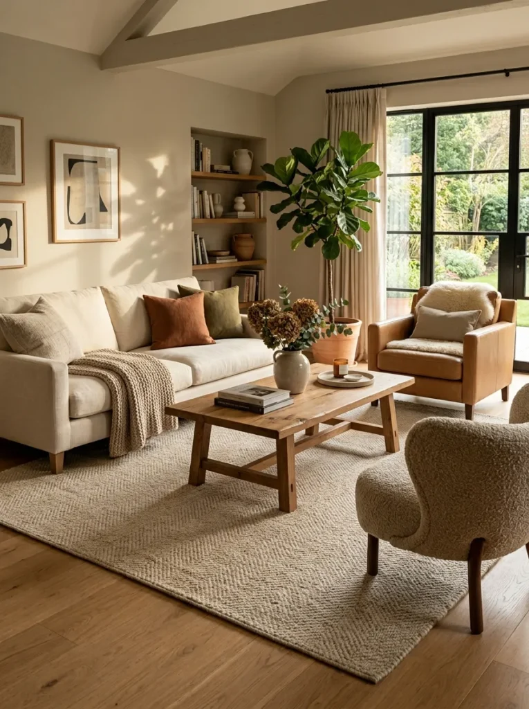
Vibe: The correctly scaled rug makes the entire seating arrangement appear designed — the rug’s boundary organizing the furniture into a zone with the authority of a room-within-a-room.
Why it works: An oversized rug — specifically, a rug large enough for all primary seating pieces to sit entirely on it — is the single highest-impact change available in most living rooms because it simultaneously addresses three of the four perception-of-quality dimensions: it increases apparent spatial generosity (the continuous rug surface beneath all furniture reads as more generous than fragmented floor areas between furniture), it creates compositional coherence (all seating pieces unified on a single surface read as a composed arrangement), and it provides material warmth (the natural wool or fiber rug surface absorbs light and provides the warm, dense material quality that hard floors cannot). The resistance to a large rug is typically the fear that it will make the room smaller — the opposite is true, because a correctly scaled rug makes the room read as having been designed with that room’s specific dimensions in mind.
Budget approach: Natural jute or sisal in the correct large dimensions is available from IKEA, Wayfair, and similar retailers at $80–200 for a 250×350cm format. A quality wool alternative at the same dimensions costs $300–600. The material distinction matters less than the dimension decision — a correctly scaled jute rug produces a dramatically better result than a high-quality small wool rug.
Quick Win: Before purchasing, mark the intended rug outline on the floor with painter’s tape and live with it for 24 hours. The taped outline reveals the correct rug relationship to the room’s dimensions in a way that measuring alone does not.
Shop The Look
| Product |
|---|
| Natural jute rug 250x350cm |
| Wool area rug warm oat large |
| Non-slip rug pad large |
| Rug tape corner holder |
| Natural fiber rug vacuum care |
Also view: 15 Stylish Green Living Room Designs for Every Home
2. Swap the Overhead Light for Floor and Table Lamps
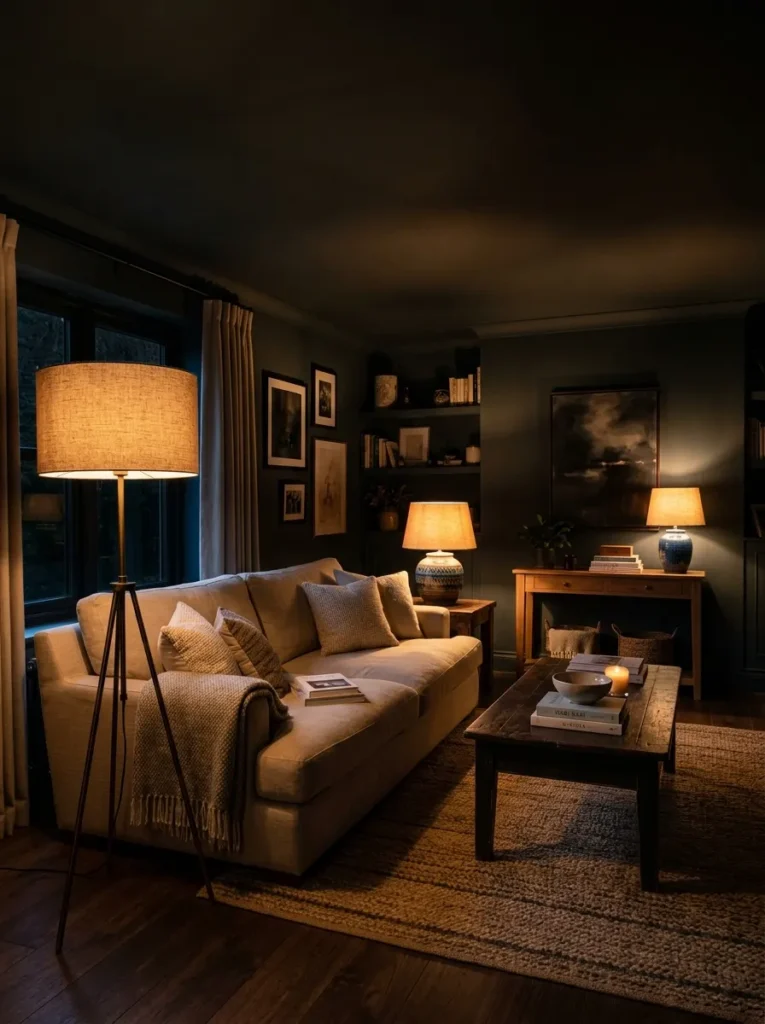
Vibe: The three-lamp living room feels like an interior photography shot made of warmth — the overhead light’s absence converting the room from a lit space to a warm environment.
Why it works: Replacing overhead light with multiple low-level warm lamps applies the most impactful single atmospheric change available in any living room — the overhead light (particularly a central ceiling pendant or recessed downlights at cool temperatures) creates the specific flat, even illumination that removes shadow, flattens material texture, and makes rooms read as functional rather than atmospheric. Three warm lamp sources (floor lamp behind one sofa end, table lamp at the other sofa end, smaller lamp on a console or bookshelf at the room’s far end) create the layered warm light that interior photography consistently shows as the quality signal for high-end residential spaces. The ceiling in shadow — the specific visual consequence of switching all light to table and floor level — is itself a quality indicator: rooms with high ceilings and warm low-level lighting read as more designed than rooms with uniformly lit ceiling planes.
Bulb specification: All three lamps should use 2700K warm white LEDs. Avoid 3000K (“soft white” in some markets) which is noticeably cooler. Use dimmable bulbs and dimmer switches where available — the ability to reduce lamp brightness as the evening progresses is the specific quality that makes a living room feel genuinely designed for the range of activities that occur in it.
Shop The Look
| Product |
|---|
| Arc floor lamp linen shade large |
| Ceramic table lamp pair warm shade |
| Console lamp small ceramic |
| Warm white LED 2700K dimmable |
| Linen shade replacement drum |
Also view: 14 Neutral Living Room Designs with Timeless Style
3. Linen or Velvet Sofa — The Material Upgrade Signal
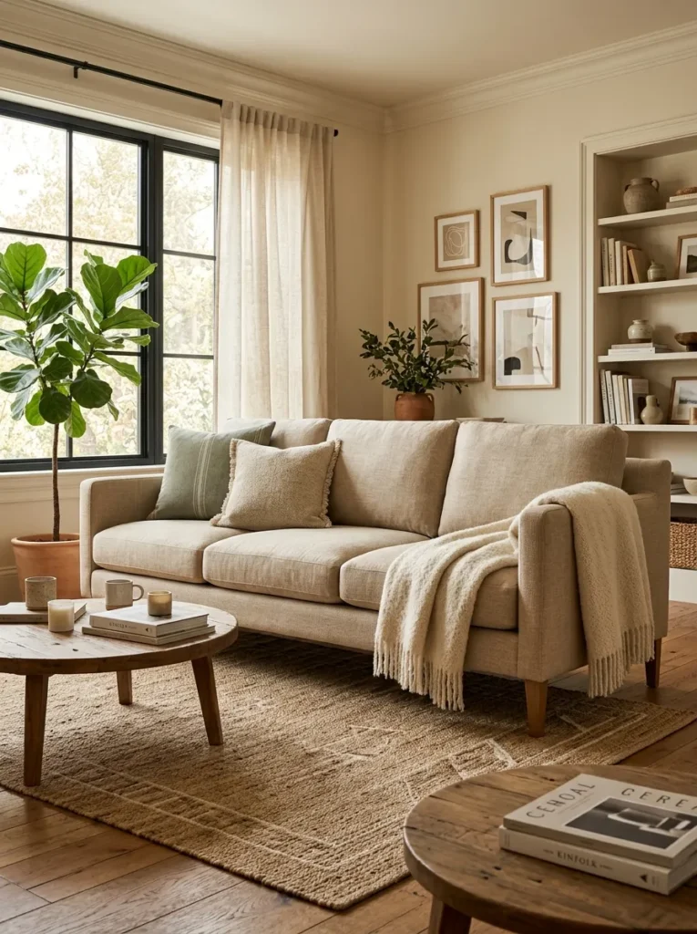
Vibe: The linen or velvet sofa feels like the room made a material decision and committed to it — the specific tactile and visual quality of natural linen or directional velvet communicating investment in a way that synthetic or blended upholstery cannot.
Why it works: A sofa upholstered in linen or velvet applies the primary material quality signal principle — the sofa is the living room’s largest and most consistently viewed piece of furniture, and its upholstery material is the room’s dominant material statement. Linen (100% or high-percentage linen with its natural variation, slight crinkle, and matte light absorption) and velvet (with its directional pile creating the characteristic two-tone light quality as the pile faces toward and away from the viewer) both provide material qualities that read as genuinely premium because they are properties of the fiber itself rather than surface treatments applied to a base material. A linen or velvet sofa at a mid-range price ($800–2,000) in a well-chosen color reads as more expensive than a leather or synthetic fabric sofa at twice the price because the material’s intrinsic quality signals are more consistent.
Color selection: For linen: warm oat, warm natural white, warm honey, or warm mushroom — all warm undertone neutrals that coordinate with the widest range of rooms. For velvet: deep sage, forest green, dusty rose, midnight navy, or warm terracotta — all saturated enough to demonstrate velvet’s specific light quality while remaining within the warm palette that reads as considered.
Shop The Look
| Product |
|---|
| Linen sofa warm oat three seater |
| Velvet sofa sage or navy three |
| Linen upholstery fabric performance |
| Velvet cushion cover coordinating |
| Fabric protection spray linen |
4. Monochromatic Art Grouping — Gallery Wall That Looks Curated
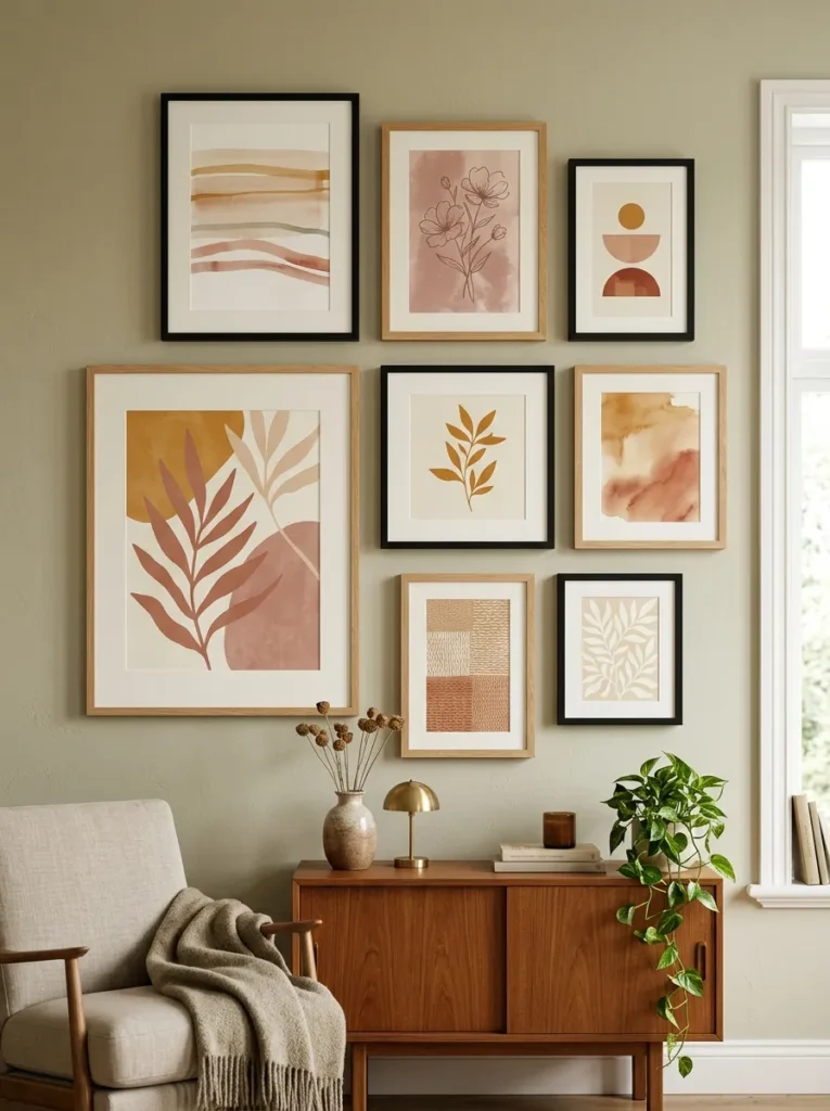
Vibe: The gallery wall feels like the room was organized by someone who understood the difference between a collection and an accumulation — the consistent palette and careful spacing making eight separate frames read as a single composed artwork.
Why it works: A gallery wall with consistent palette and controlled spacing applies the curatorial coherence principle — the specific quality difference between a gallery wall that reads as expensive and one that reads as an accumulation of prints is not the quality of individual frames or artworks but the relationship between them. A consistent color palette across all prints (all in the same warm ochre-dusty rose-cream range regardless of subject), two coordinating frame finishes (not five different finishes — two), and precisely consistent 3–5cm gaps between every frame create the compositional coherence that the eye reads as intention. Art prints in a coordinated palette are available from independent digital artists on Etsy, VSCO, and Creative Market at $5–25 per download for home printing — the perceived quality of a gallery wall is not a function of the individual art’s commercial value.
Layout technique: Plan the arrangement on the floor first, positioning frames until the composition feels balanced. Photograph the floor arrangement. Transfer to the wall by measuring each frame’s position from the intended center point of the arrangement. The consistent gap (the same measurement between every pair of adjacent frames) is the single most important precision detail.
Shop The Look
| Product |
|---|
| Natural wood thin frame set varied |
| Thin black frame set varied |
| Warm palette art print digital set |
| Level tool picture hanging |
| Picture hanging strip damage-free |
5. Curtains at Ceiling Height — The Free Room Upgrade
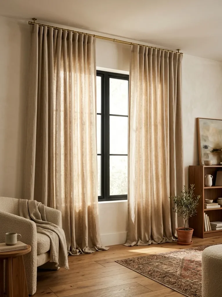
Vibe: The ceiling-height curtains feel like the room was renovated to have taller ceilings for the cost of a curtain rod — the visual height increase creating one of the most dramatic spatial changes available without any structural work.
Why it works: Curtains mounted at ceiling height rather than above the window frame apply the vertical dimension amplification principle — the eye registers the curtain as beginning at the ceiling and ending at the floor, interpreting the full curtain drop as the room’s ceiling height. In a standard room with 240cm ceilings, ceiling-mounted curtains create the apparent height of a 270–290cm ceiling. The window itself appears significantly larger (the curtain extends 30cm beyond the window on each side and from ceiling to floor, creating the impression that the window occupies a much larger wall area than its actual dimensions). The natural linen material adds the specific warm, light-diffusing quality that sheer synthetic curtains lack — the linen’s slight irregularity and warmth creates the specific quality of light that differentiates a room’s atmosphere from a hotel corridor’s.
Installation: Mount the curtain rod within 5cm of the ceiling (or on the ceiling itself using ceiling-mount brackets). The rod should extend 30cm beyond the window’s actual edge on each side to allow the curtains to fully clear the window glass when open. This specific combination — ceiling height, extended width, floor puddle — is the complete implementation of the principle; omitting any one element reduces the effect substantially.
Shop The Look
| Product |
|---|
| Natural linen curtain oat floor length |
| Ceiling mount curtain bracket set |
| Curtain rod extended length brass |
| Curtain ring clip set brass |
| Floor puddle hem guide measure |
6. The Edited Coffee Table — Three Objects, One Rule
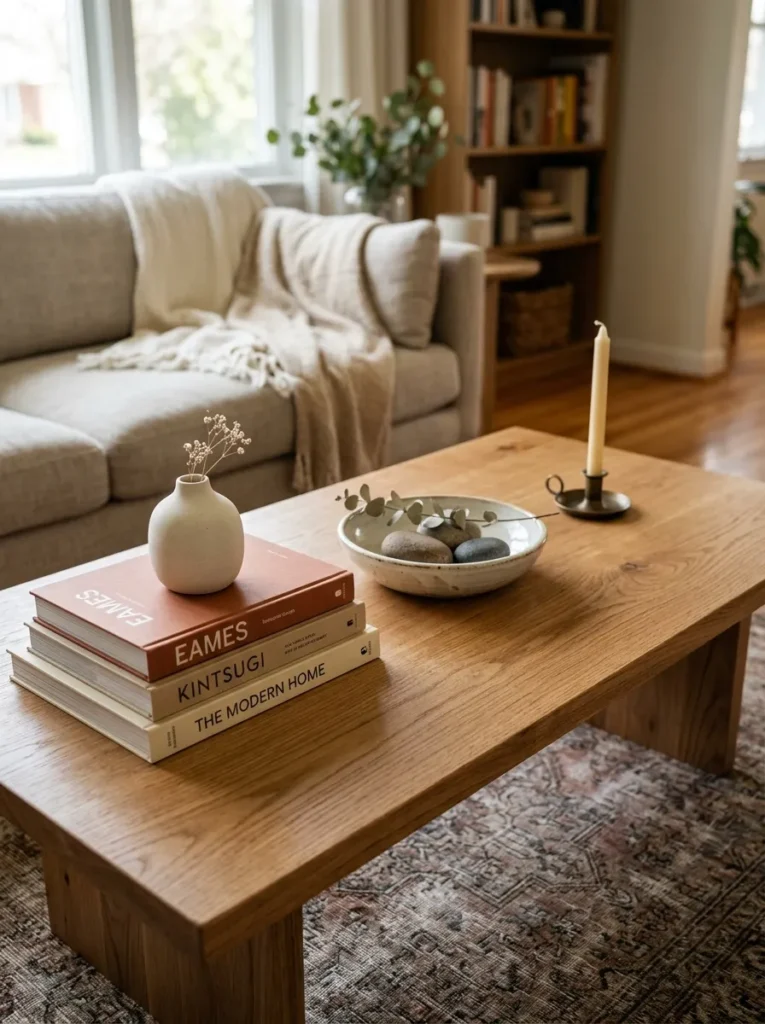
Vibe: The edited coffee table feels like it was styled by someone who removed more than they added — the clear surface creating the negative space that makes the four selected objects read as chosen rather than accumulated.
Why it works: A coffee table styled with a maximum of four objects and a minimum of 60% clear surface applies the still-life editing principle — a coffee table covered with objects (remote controls, magazines, multiple plants, multiple candles, accumulated cups, various books) reads as a surface that things are placed on; a coffee table with four deliberate objects and generous clear space reads as a designed composition. The four-object formula (books as plinth + object on the plinth, bowl or low vessel at center, single candle at opposite corner) creates a composition with height variation (the plinth), visual center (the bowl), and punctuation (the candle) — the three compositional requirements of a successful still life — while leaving the majority of the table surface clear and available.
The book plinth: Two or three large-format coffee table books stacked flat (spine facing the room’s primary seating position) create the most effective plinth because they simultaneously add height variation, communicate cultural and aesthetic identity, and provide an appropriate base for the ceramic or sculptural object resting on top. The books’ value is their collective composition, not their individual content.
Shop The Look
| Product |
|---|
| Large format art or design book set |
| Small ceramic sculpture display |
| Low ceramic bowl center table |
| Smooth river stone set three |
| Simple candle holder single |
7. Linen or Velvet Cushion Discipline — Three and Done
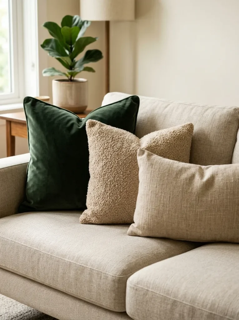
Vibe: The three-cushion arrangement feels like someone understood that the cushion’s contribution diminishes with every cushion added after the third — the edited selection allowing each individual cushion to communicate rather than compete.
Why it works: Three decorative cushions in varied sizes and textures within a consistent palette applies the cushion editing principle — the most common sofa-styling mistake is accumulating cushions in matching sets (all the same size, all the same fabric, from the same purchase occasion), which reads as undifferentiated upholstery rather than as a composed textile arrangement. Three cushions in different sizes (large, medium, rectangular) and different textures (velvet, boucle, woven linen) within the same color palette (the three in this idea all share the warm neutral and deep botanical palette) creates a textile composition with sufficient variety to be interesting and sufficient coherence to be resolved. Beyond three decorative cushions, the sofa begins to read as over-furnished — the cushion’s function is to provide texture and color accent, not to multiply.
The palette rule: All three cushions must share the same color palette, even if they have different patterns, textures, and scales. “Same palette” means they share dominant hue families — in this case, warm neutrals and deep botanical green — rather than that they match identically. A cushion in a pattern that includes forest green, oat, and warm gold reads as part of the same palette as the solid forest green velvet and the solid oat boucle.
Shop The Look
| Product |
|---|
| Forest green velvet cushion 55cm |
| Oat boucle cushion 45cm |
| Natural linen woven cushion 60×40 |
| Cushion inner pad set three |
| Linen sofa base neutral |
8. Statement Pendant Light — Replacing the Standard Ceiling Rose
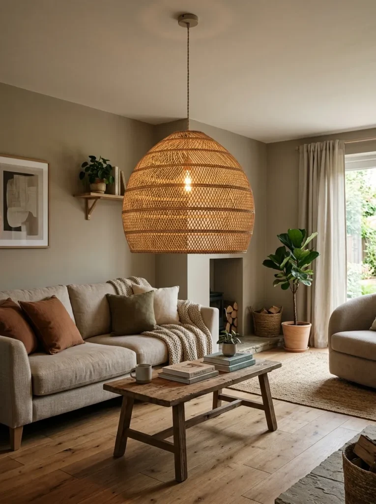
Vibe: The statement pendant feels like the room was given an architectural centerpiece that generates warmth as well as light — the pendant’s scale and material creating a focal point that makes the room feel designed rather than furnished.
Why it works: A statement pendant light replacing a standard ceiling rose applies the focal architecture principle — the standard ceiling rose with a generic pendant fixture is present in virtually every living room because it is the default electrical installation, not because anyone chose it. A large, sculptural pendant (natural rattan, aged brass, paper or resin) at a lower-than-standard height above the coffee table (approximately 180cm from the floor) converts the room’s most visible overhead element from a functional default into a design statement. At 50–60cm diameter, the pendant occupies significant visual space and creates the warm diffused light that a small pendant produces in concentrated form, providing a gentle overall ambient contribution rather than focused task illumination.
Hang height: The 180cm hang height (measured from floor to the bottom of the pendant) is lower than standard pendant installations (which typically hang at 200–220cm) — this lower position creates the intimate, human-scale quality of pendant lighting in restaurants and design-forward residential spaces, where the light source is at eye level for a standing person or slightly above eye level for a seated person.
Shop The Look
| Product |
|---|
| Natural rattan pendant large 50cm |
| Aged brass pendant sculptural |
| Pendant cord adjustable length |
| Pendant ceiling canopy matching |
| Warm LED bulb pendant 2700K |
9. Natural Wood or Marble Coffee Table — Surface Material Signals
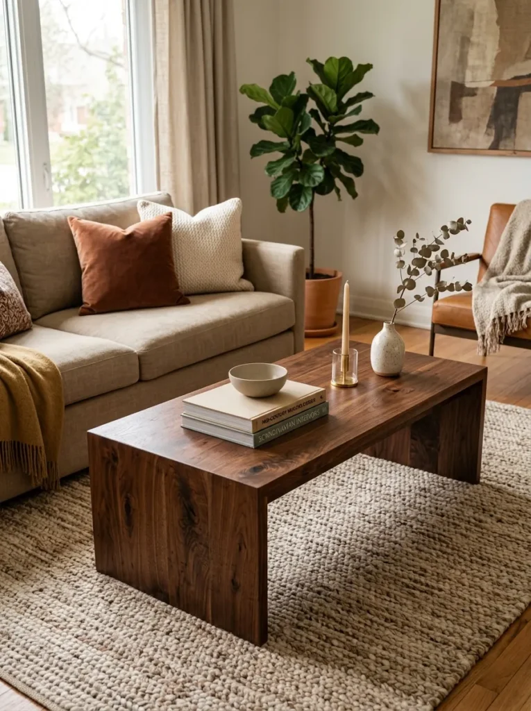
Vibe: The material coffee table feels like the center of the room justified itself — the marble vein or walnut grain communicating material investment as clearly from across the room as from close range.
Why it works: A solid wood or marble-top coffee table applies the material quality proxy principle — the coffee table is the living room’s central, most examined, and most multi-purpose surface piece, and its material communicates the room’s investment level more directly than almost any other single piece. A solid walnut table’s visible grain and warm dark tone communicates genuine material quality; a white marble top’s vein pattern and cool translucent surface communicates geological rarity. Both read as expensive not because they are necessarily costly (a walnut coffee table from independent makers or vintage sources can be found for $150–400; a marble-top table for $200–600) but because the material’s properties are inherent to the material rather than applied as a surface treatment — the grain is real, the vein is geological, neither can be mimicked convincingly by laminate or veneer at close range.
Proportion rule: The coffee table length should be approximately 60–65% of the sofa length, and the table should be positioned so the front of the sofa and the far side of the table maintain 40–50cm of clearance — enough for comfortable movement around the table while maintaining the visual unity of the seating arrangement.
Shop The Look
| Product |
|---|
| Solid walnut coffee table natural |
| Marble top coffee table white vein |
| Coffee table natural oak warm |
| Coffee table book arrangement |
| Low ceramic bowl table center |
10. Layered Neutral Textiles — The Throw and Rug Combination
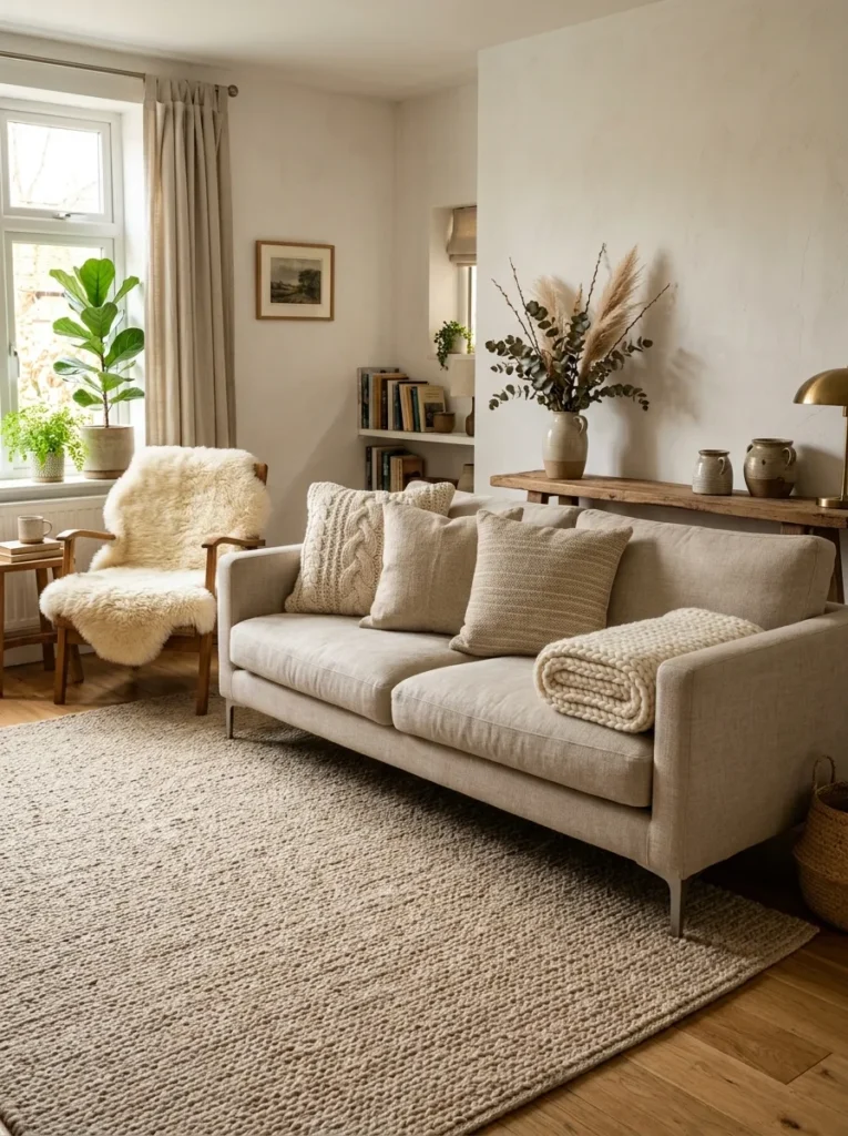
Vibe: The layered textile living room feels like warmth has been given multiple physical forms — the rug, the throw, and the sheepskin together creating a material abundance that no amount of furniture achieves with the same warmth.
Why it works: Layered neutral textiles in a living room apply the material accumulation warmth principle — the specific quality of warmth that expensive-looking living rooms consistently demonstrate is not primarily color-based but material-based: the accumulated presence of multiple natural fiber types (wool rug, knit throw, sheepskin, linen cushions) creates a warmth that is simultaneously visual (the varied textures catching light differently) and tactile (the invitation to touch communicated by the materials’ visible softness). Importantly, all these textile layers can be in the same neutral palette (oat, cream, warm natural) — the textural variation within the neutral palette creates the richness without any color contrast.
The throw fold: A throw folded and placed over a sofa arm is a significant styling detail — it should be folded deliberately (in half lengthwise, then folded in half again, placed over the arm and seat corner with the fold’s clean edge visible) rather than draped or thrown loosely. The folded throw communicates intention; the draped throw communicates abandonment.
Shop The Look
| Product |
|---|
| Chunky knit throw cream large |
| Natural sheepskin rug armchair |
| Wool throw warm oat quality |
| Jute rug large natural |
| Natural fiber cushion set |
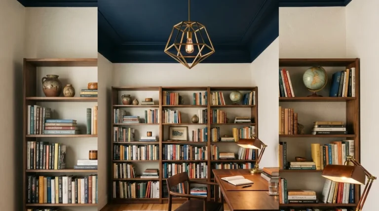
11. Alcove or Bookcase Styling — Books and Objects Together
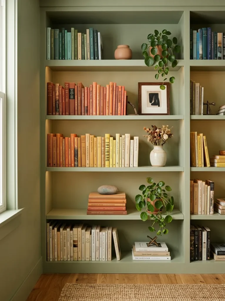
Vibe: The styled bookcase feels like it was designed for the room rather than placed in it — the wall-color paint match converting the bookcase from a piece of furniture to a piece of architecture.
Why it works: A bookcase painted the same color as the wall behind it applies the built-in integration principle — the most significant quality difference between a freestanding bookcase and a built-in bookcase is the color relationship between the bookcase and the wall. When a freestanding bookcase (even a budget IKEA BILLY) is painted in exactly the same color as the surrounding wall, it loses its furniture-adjacent-to-wall reading and gains the built-in reading, appearing to be part of the room’s architecture rather than an addition to it. This transformation costs the price of a tin of paint and a weekend’s work and produces a result that reads as custom joinery from any normal viewing distance.
Paint specification: Use a satin or eggshell finish on the bookcase (more durable and more washable than matte) in the exact same color as the wall (matte finish). The slight sheen difference between the painted bookcase surface and the matte wall surface adds subtle dimension while maintaining the color unity.
Shop The Look
| Product |
|---|
| IKEA BILLY bookcase floor to ceiling |
| Wall color paint satin bookcase |
| Small ceramic bookcase display |
| Small trailing plant pot shelf |
| Smooth stone shelf object |
12. Consistent Metallic Finish — All Hardware One Tone
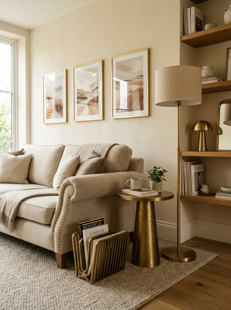
Vibe: The consistent brass living room feels like a single material decision made once and applied everywhere it could go — the coherence of the warm metallic across multiple object categories creating a room that reads as genuinely designed.
Why it works: Consistent metallic finish throughout a living room applies the material family cohesion principle — the most common material quality failure in living rooms is the accumulation of multiple metallic finishes (chrome lamp, silver candleholder, brass tray, gold picture frame, nickel side table hardware) that each seem individually inoffensive but collectively create a metallic cacophony that reads as a series of separate purchasing decisions rather than a design intention. Specifying one metallic finish — warm brass for a warm-toned room, brushed nickel for a cooler room — and applying it to every metallic-finish object that enters the room (lamps, frames, small tables, hardware, accessories) creates the coherence that reads as designed rather than accumulated. This is achievable at any budget — warm brass equivalents in affordable versions exist for every product category mentioned.
Shop The Look
| Product |
|---|
| Brass floor lamp base warm |
| Thin brass picture frame set |
| Brass small side table |
| Brass magazine holder stand |
| Brass lamp pull chain set |
13. One Large-Scale Artwork — Editing to a Single Statement
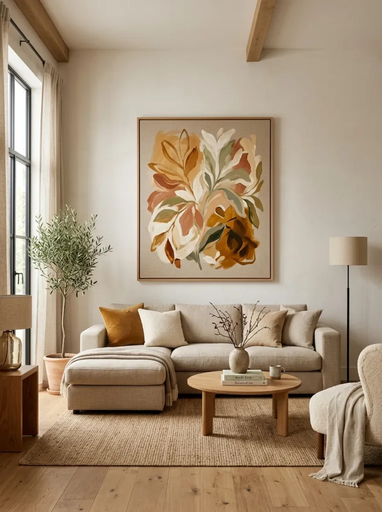
Vibe: The single large artwork feels like the room has a confident point of view — the decision to have one large piece rather than many small ones communicating the design certainty that expensive rooms consistently demonstrate.
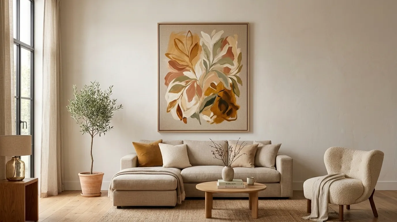
Why it works: One large-scale artwork on the room’s primary wall applies the focal authority principle — the specific quality difference between a room with one large artwork and a room with multiple small artworks is not the quantity of art but the compositional authority. A single 100×120cm artwork on a living room wall reads as a focal statement: the eye goes to it immediately on entering the room and returns to it as the primary visual anchor. Multiple small artworks on the same wall compete for attention without any individual piece achieving the authority of a room anchor. This principle is specifically important for the perception of expense: expensive-looking rooms have confidence; confidence in interior design means the willingness to have one large thing rather than many small things.
Affordable implementation: Large-scale artworks at the dimensions required for this impact ($400–1,500 for a commercial equivalent) are available significantly more affordably through: Etsy independent artists (original and print works at 100×120cm from $80–250), poster services that print at large scale (Desenio, Society6, Minted: $30–90 for digital download plus printing), or DIY canvas approaches (purchasing a stretched artist canvas at the required dimensions and painting an abstract wash — no painting skill required for a successful warm abstract wash in the room’s palette).
Shop The Look
| Product |
|---|
| Large abstract canvas artwork |
| Large botanical framed print |
| Digital art download large format |
| Large format printing service |
| Large picture hook weight rating |
14. Surface Editing — The Removal of Visual Noise
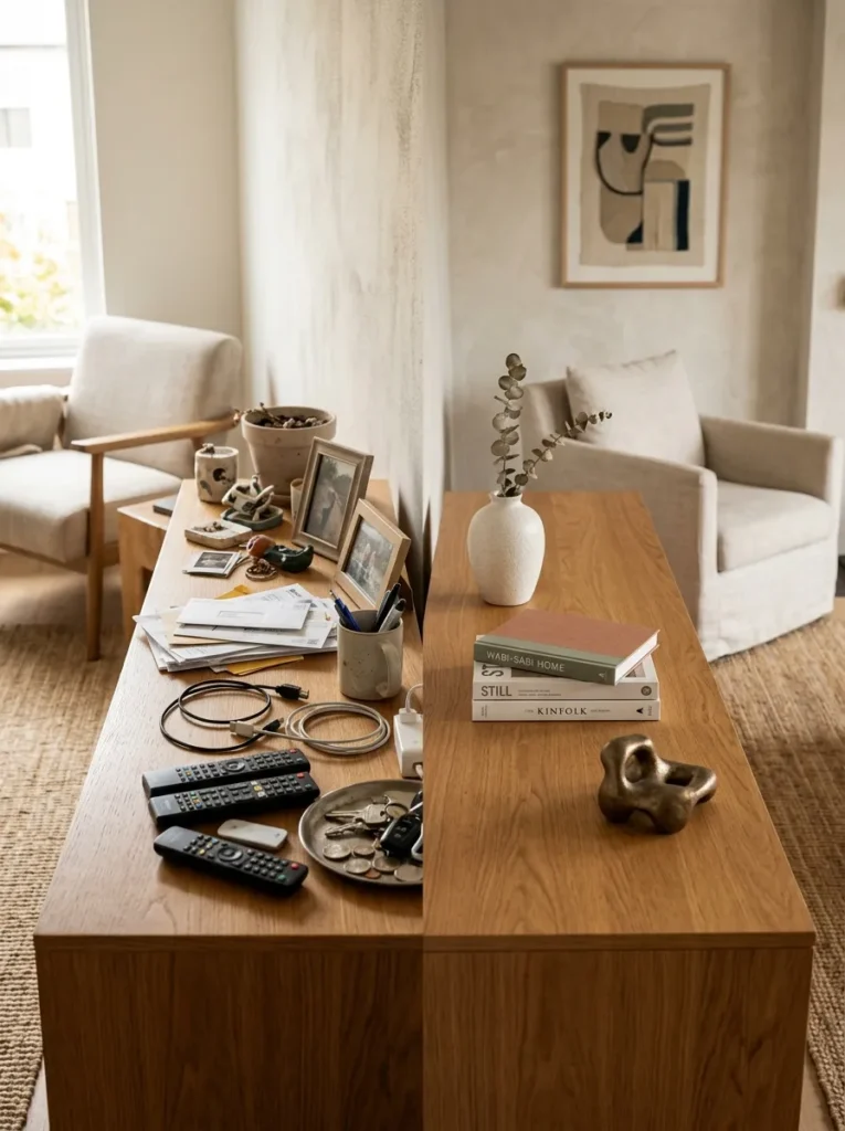
Vibe: The edited sideboard feels like the room took a deep breath and the surfaces are the result — the three composed objects and the surrounding clear space creating a quality of consideration that a loaded surface cannot achieve regardless of what it holds.
Why it works: Surface editing — removing objects from all flat surfaces to a composed minimum — is the single highest-impact free living room upgrade available, and also the most consistently under-implemented. The accumulated objects on living room surfaces (remote controls, coasters, accumulated mail, multiple candles, various plants, drink coasters, miscellaneous small objects) create the visual noise that makes a room read as domestic rather than designed. Removing all objects from a surface and returning only those that pass the test (does this object contribute to the room’s warmth or aesthetic, or does it merely need a place to be?) typically reveals that most surfaces benefit from 60–80% fewer objects than they currently hold.
The three-surface test: Take every object off the room’s three main surfaces (coffee table, sideboard, bookshelf). Photograph the surfaces empty. Return objects one at a time, stopping when the composition reads as resolved. Most people discover that two or three objects per surface is the correct number — the resolution point is always earlier than the starting point.
Shop The Look
| Product |
|---|
| Ceramic vase slim single stem |
| Dried botanical stem display |
| Small ceramic sculpture display |
| Coffee table book stack two |
| Small sculptural object display |
How to Start Your Expensive-Looking Living Room
The single best first move in improving any living room’s apparent quality is spending thirty minutes editing rather than adding — removing every object from every surface and every piece of excess furniture from the room before making any purchasing decisions. This editing exercise consistently reveals three things that planning from within the existing room cannot: which objects are contributing to the room’s quality (a beautiful ceramic vase, a natural plant, the coffee table books) and which are merely occupying space without contributing (the accumulated small objects, the duplicate cushions, the undersized rug that is not serving its compositional function), which furniture pieces are at the wrong scale for the room (the coffee table that is too small for the sofa, the rug that is too small for the seating arrangement), and what the room’s actual proportional relationship between floor, walls, and furniture looks like when the clutter is removed. A room that has been edited often needs no new purchases at all — the existing quality elements, revealed by the removal of the elements competing with them, are sufficient to produce a room that reads as considered and warm.
The most common mistake in attempting an expensive-looking living room is adding rather than removing — purchasing additional objects, additional cushions, additional plants, additional accessories — when the room’s quality failure is not the absence of things but the presence of too many things at the wrong scale and in insufficient compositional relationship. The rooms that read as expensive are almost always the rooms with the fewest objects in the most considered positions, not the rooms with the most objects.
Three specific investments under $100 that produce the highest return in any living room: a set of matching slim cushion covers in linen or velvet at two sizes ($25–50 for three coordinating covers in two sizes, replacing a set of mismatched cushions — the discipline of matching covers is the most immediately visible quality improvement to any sofa arrangement); a pack of warm white 2700K LED bulbs for all existing lamps ($15–25, replacing any cool or daylight bulbs and converting the room’s existing lamp arrangement to warm light without purchasing any new fixtures); and a set of two large-format coffee table books in the room’s aesthetic ($20–40 for secondhand editions from a charity shop or secondhand bookshop — the books serve as the plinth and identity-communicating element of the coffee table composition). These three investments combined for under $80 address the sofa’s textile quality, the room’s light quality, and the coffee table’s compositional authority — three of the four primary perception-of-expense dimensions identified at the start of this article.
Frequently Asked Questions About Stylish Living Rooms That Look Expensive
What is the single most important factor in making a living room look expensive?
The single most important factor is lighting color temperature — specifically, the shift from cool white overhead light to warm (2700K) lamp-level light. The reason this single change outranks every other single factor is that it simultaneously affects the quality of every other element in the room: a linen sofa in warm lamp light appears richer and more textured than the same sofa in cool overhead light; a marble coffee table in warm light shows its vein quality more beautifully; a gallery wall in warm light casts the shadows that make the framed arrangement read as art rather than as decoration. No other single change improves every element of the room simultaneously — bulb replacement addresses everything at once.
How do you make a living room look expensive without spending much money?
The highest-return free or near-free improvements are: editing all surfaces to remove accumulated objects (free — typically reduces visual noise by 60–80% and reveals the quality of the remaining objects); adjusting the furniture arrangement to ensure all seating faces each other at a conversational distance of 180–250cm (free); moving all floor lamps and table lamps to operate as the room’s primary light sources and switching off the overhead light (free, or the cost of new 2700K bulbs at $15–25); folding the existing throw blanket deliberately over the sofa arm rather than draping it (free); and grouping the existing accessories into two or three composed groups rather than distributing them individually across surfaces (free).
What colors make a living room look expensive?
The colors that most consistently read as expensive in a living room are warm neutrals with clear material intention: warm oat, warm mushroom, warm cream, and warm sage on upholstery (rather than gray, which has trend associations, or beige without warmth, which reads as absent); deep botanical colors on accent pieces (forest green, midnight navy, dusty rose, terracotta — all from the warm-toned jewel palette that communicates deliberate color choice rather than default); and warm white or warm limewash on walls (rather than cool white or stark bright white, which reduces the warmth of all other elements in the room). The common thread is warmth — all the colors that read as expensive in a living room share a warm undertone, because warm undertones are associated with natural materials and natural light, both of which are the quality signals that the perception of expense registers.
How important is the sofa in making a living room look expensive?
The sofa is the most important single piece in a living room for perceived quality because it is the largest and most consistently viewed piece of furniture, and its upholstery material is the room’s dominant material statement. A sofa in linen, velvet, or quality boucle reads as expensive because the material’s properties are intrinsic to the fiber rather than applied as a surface treatment — the linen’s slight irregularity, the velvet’s pile direction, the boucle’s looped texture are all qualities that cannot be convincingly imitated by synthetic alternatives at close range. However, the sofa’s perceived quality is also significantly affected by its relationship to the other decisions in the room: a quality linen sofa in a room with cool overhead light, a small rug, and a cluttered coffee table reads as less expensive than a mid-range sofa in a warm-lit room with a large rug and an edited coffee table. The sofa is the most important single piece but not the only factor.
What makes a living room look cheap despite good furniture?
The most common causes of a living room reading as cheap despite good individual furniture pieces are: mixed metallic finishes (chrome, silver, brass, and gold all present simultaneously create a metallic inconsistency that undermines each individual piece), an undersized rug (a rug that does not extend under all primary seating pieces fragments the floor and makes the room read as a collection of separate pieces rather than a unified composition), cool or harsh lighting (overhead cool-white light flattens materials and reduces the perceived quality of every surface it illuminates), overcrowded surfaces (accumulated objects on coffee tables and sideboards create visual noise that competes with and reduces the quality signal of the furniture beneath them), and cushions in mismatched sizes and finishes (five cushions in the same size from the same range read as undifferentiated, reducing the sofa’s visual interest while adding clutter rather than warmth).
Ready to Make Your Living Room Look More Expensive?
These 14 ideas move through every dimension of what makes a living room look genuinely expensive — from the foundational spatial intelligence of a large-scale rug and ceiling-height curtains, through the material quality signals of linen and velvet upholstery and warm wood or marble surfaces, to the atmospheric transformation of warm layered lighting and consistent brass hardware, to the design confidence of a single large artwork and the disciplined editing of surfaces and cushions. Starting with the editing exercise — removing everything from every surface and returning only what passes the contribution test — is the beginning that reveals what the room’s quality already is before any purchasing decision is made. It costs nothing, takes thirty minutes, and consistently produces a more visually resolved result than any number of additions to an un-edited room. Remove the visual noise first. Light the lamps. Fold the throw deliberately. Then look at the room and see what it is asking for next. Pin the ideas that address the specific gaps that the editing reveals, and implement them in the sequence that produces the largest return on the smallest investment. When the room is warm and edited and every object present has earned its place — that is the room that looks expensive, because that is the room that was genuinely considered.